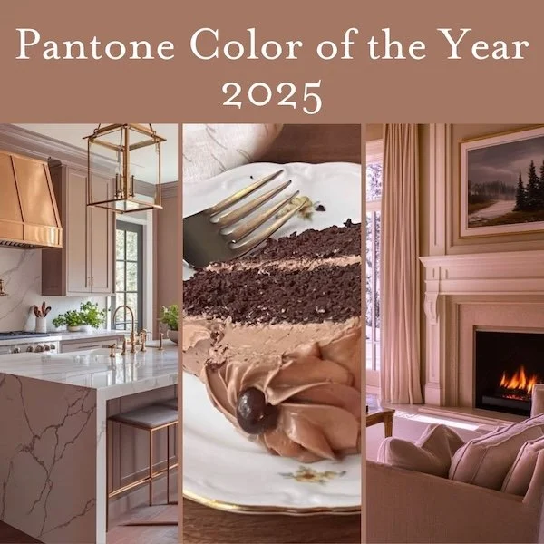
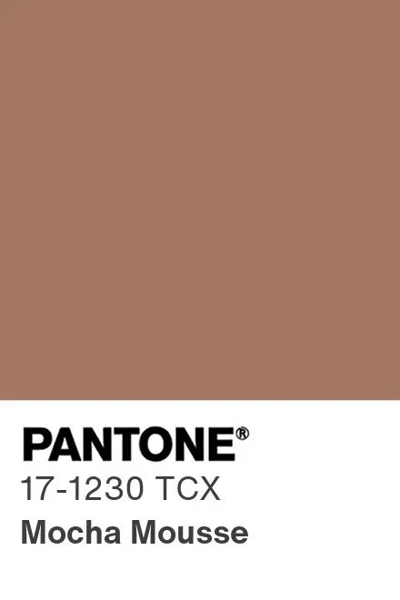
Pantone released their Color of the Year for 2025 last month and I feel about it pretty much the same as I did about the Sherwin Williams choice for 2023.
The Pantone choice of Mocha Mousse sounds delicious…I am a fan of almost ANYTHING mocha. And it IS almost exactly the shade of the mocha buttercream we use to frost our favorite chocolate cake.
Pantone describes mocha mousse as embracing the desire for comforting warmth and life’s little indulgences (like coffee and chocolate).
BUT it is almost exactly the same color as the SW Redend Point only slightly deeper and, ironically, slightly redder. Spoiler alert, I was not overlyimpressed. Mocha Mousse is more 80’s suntan pantyhose while Redend Point is more 80’s nude pantyhose, but still….
I understand the embracing of warmer neutrals in interior decor after too many decades of gray everything.
And I like the enveloping warmth and coziness of rich browns, but Mocha Mousse feels more like a brown with commitment issues. Too light to engender a cozy vibe and too dark to recede into truly neutral background territory.
Color is a very personal and emotional choice - often because of associations, pleasant or otherwise with said color - and reactions to any tone will vary widely.
As far as color trends - they should not ever dictate what you do in your own space, but they are going to inform what is available for products from home textiles to accessories, and Pantone is one of the more influential voices.
As an interior decor color, I could see Mocha Mousse as a fabulous mohair velvet for upholstery. I’m less excited about it as a wall color, though anything can work given the right circumstances.
Here I’ve imagined a living room in warm neutrals with a mocha mousse sofa (AI generated image from midjourney)
midjourney AI image, living room with mocha mousse sofa
In any case it pairs nicely with warmer metals like gilded iron, brass, or copper, and works much better with creamier ivories than purer whites. It will work with a lot of wood tones, especially ones with hints of red like mahogany and rosewood.
And it will work nicely with black accents (doesn’t everything??), as well as blue spruce and evergreen shades.
Here I’ve imagined it as a kitchen cabinet cabinet color paired with brass and classic marble and it’s…not awful.
midjouney AI image, kitchen with mocha mousse cabinets
All in all I’m sort of neutral (haha) on this color, personally, but as with pretty much any color, I could work with it.
And if it’s not your thing to decorate with colors reminiscent of pantyhose and makeup foundation, you can always enjoy the chocolate cake with mocha frosting and feel virtuously ‘on trend’!
Other posts you might enjoy:


