Travel is always inspiring in some way. Some hotels very much give us a glimpse of what NOT to do, and some give us some insight into creating good design for a comfortable welcoming home.
I just returned from a design conference held at the Grand Hyatt in Atlanta. It was a great few days seeing some of my friends in the industry and connecting with new ones!
Cinnamon bun French toast - yes it is as delicious as it looks!
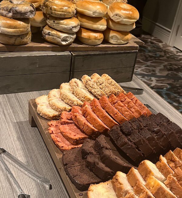
The food at the hotel was exceptional. And it was always beautifully presented, from individual meals to the breakfast and cocktail hour buffets at the conference.
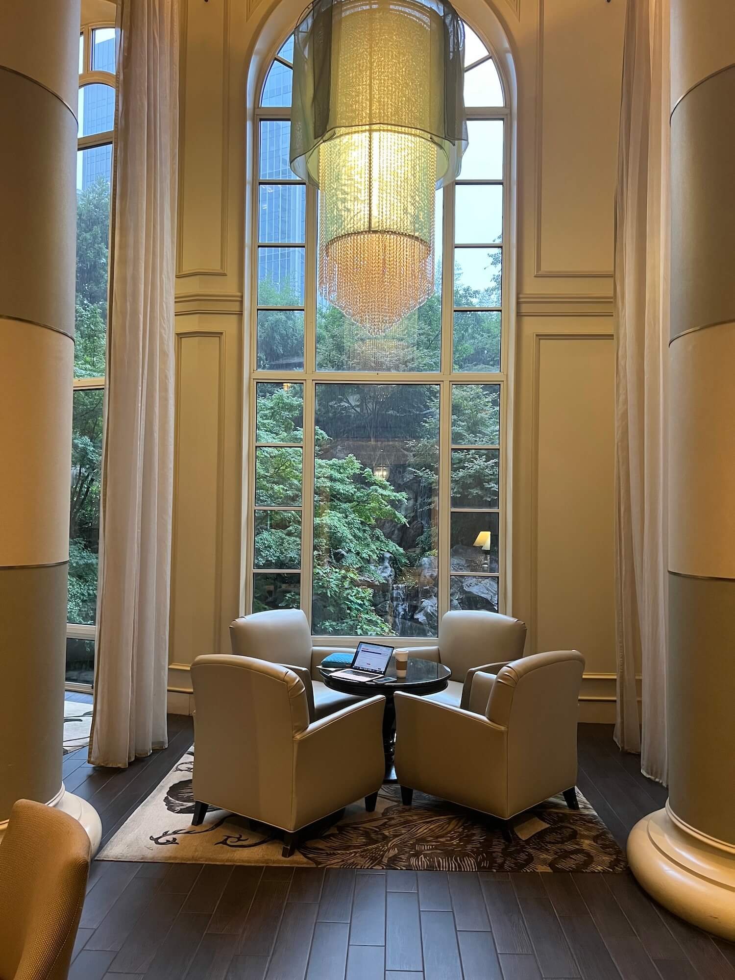
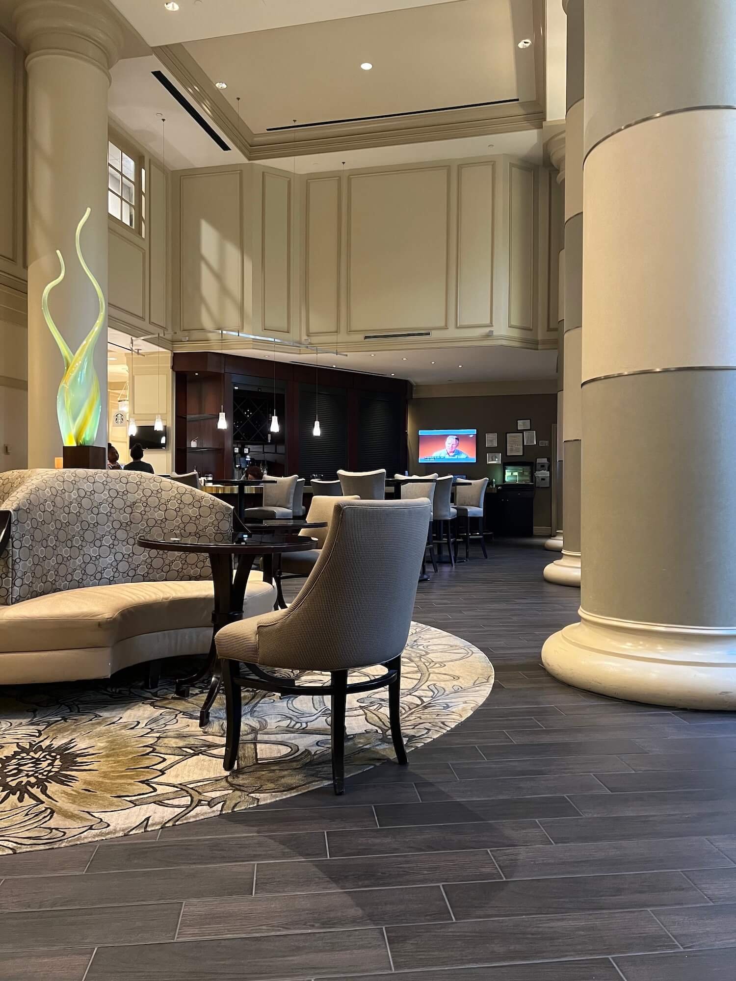
The public spaces were elegantly appointed, and the views from the lobby and restaurant windows overlooked a gorgeous secret garden with a waterfall.
And I have got to say the accommodations were a serious improvement from my previous two business trips, but honestly, there was nowhere to go but up!
First of all, right at check-in, they offered me a mimosa (YES, please!). Way to make a great first impression, Hyatt!
Mimosas at check in? Yes please!
My friend, designer and lifesizing expert Mitzi Beach, just posted a little story on lighting using her hotel room from the conference which is one of the things that inspired this post. So here, in no particular order, are 6 areas of design with lessons from my hotel room.
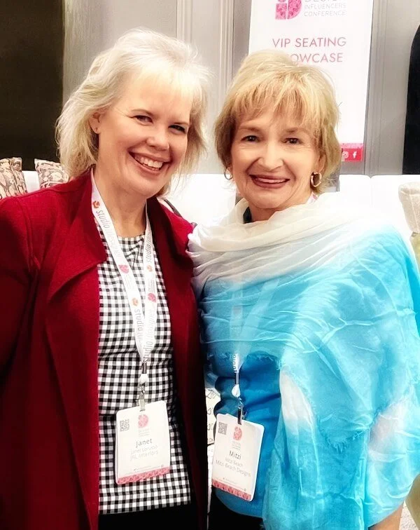
Mitzi and I trying very hard not to freeze to death during the sessions in the grand ballroom!
Lighting
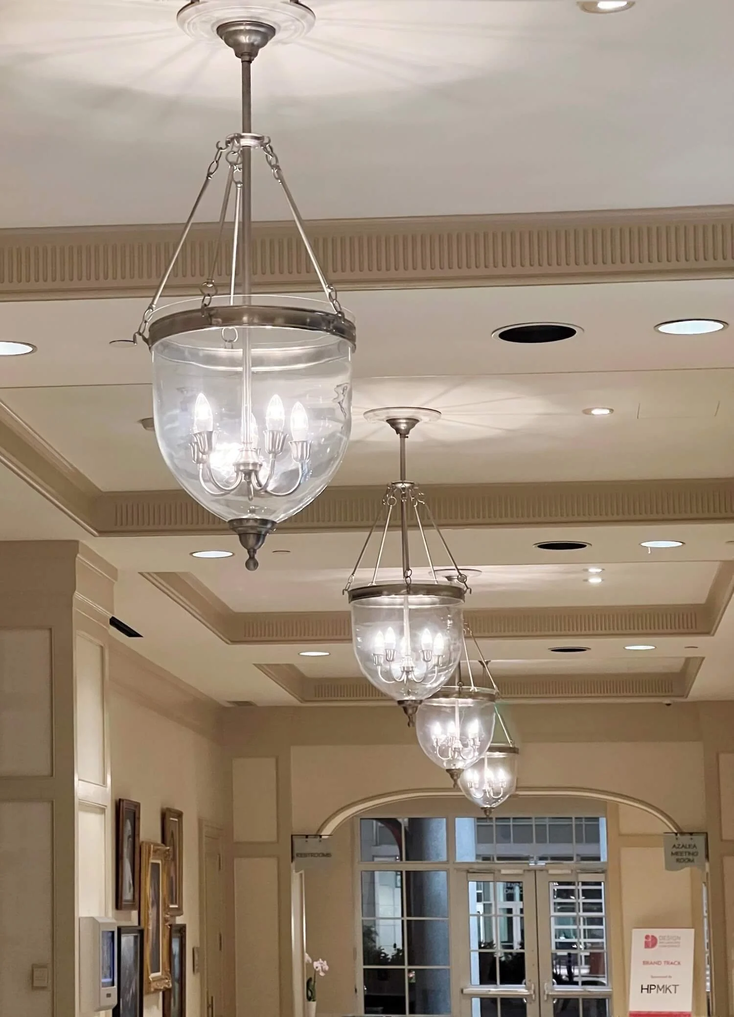
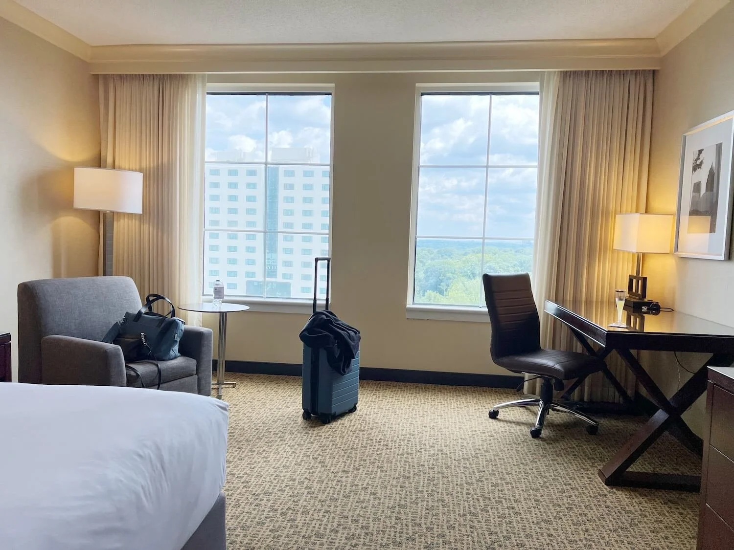
So lighting is the first, and arguably most important design lesson. The hotel room had 4 lamps plus ceiling lights in the entry and beverage bar area and a light in the closet that went on when you opened the doors.
Every room needs at LEAST 3 points of light and 4 is even better. And they need to be scattered around the room to provide even illumination and banish any shadowy corners. Lamp light is more friendly and pleasant than overhead light, and warmer temperature bulbs are ESSENTIAL to creating a pleasant atmosphere.
If you are perplexed as to why your room feels uninviting, the first thing to investigate is the light bulbs. This post has a guide to light bulbs and what to avoid (unless of course you are performing interrogations).
Color, Personality, and Finishes
Most hotel chain rooms are guilty of a lack of personality. And rightly so, as they are meant to be comfortable, appealing, and restful for a wide audience of guests. I guess yawn-inducing is okay for a place where you are meant to sleep?!
And while this hotel room was blandly neutral, it did incorporate a mix of textures and some subtle pattern in the headboard and carpet. It also had substantial millwork with applied molding on the doors, and crown molding at the ceiling. Nicely scaled millwork ALWAYS ups the elegance of any space.
In your own home, PLEASE inject some personality into your room in the form of pattern or color or art or meaningful ingredients even if you are drawn to a monochromatic neutral palette.
And please don’t just default to neutrals because they seem safe. Neutral by intention is fine, neutral by indecision or default is not.
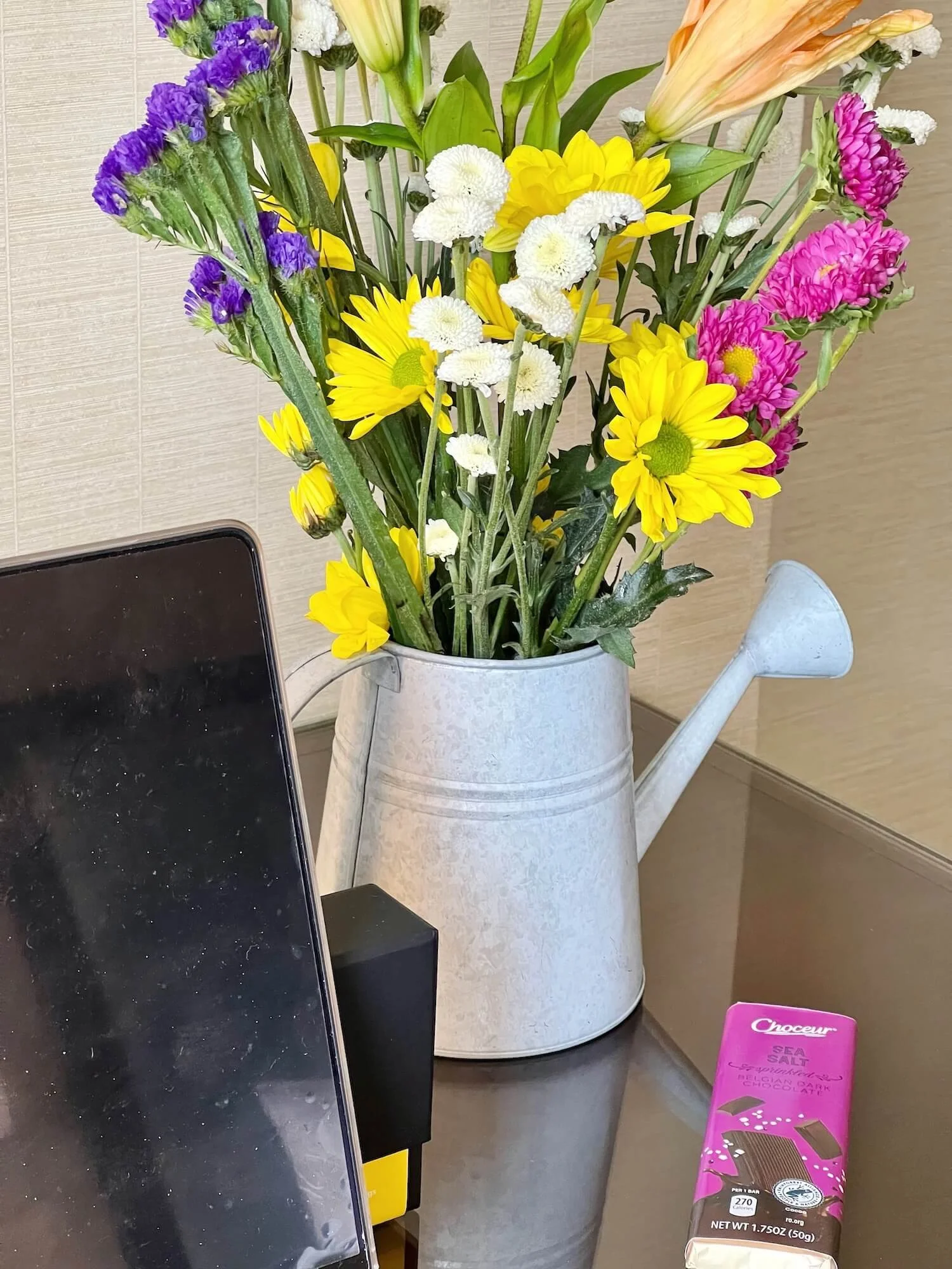
To up the character of my home-away-from-home for a few days, I took a tip from my friend designer Linda Merrill’s blog and bought a bouquet of flowers for my room! Also, chocolate, tea, and sparkling water, but that’s another story.
Flower (and chocolate!) add a dose of color to a neutral hotel room
Convenience and Comfort
Every hotel room I’ve stayed in (even the HIGHLY questionable ones like these) has had seating space in addition to a bed. If at all possible, squeeze in at least a chair or a bench in your bedroom spaces. Even if it is nothing more than a holder for laundry, it is a nice alternative to always having to sit (or pile laundry) on the bed.
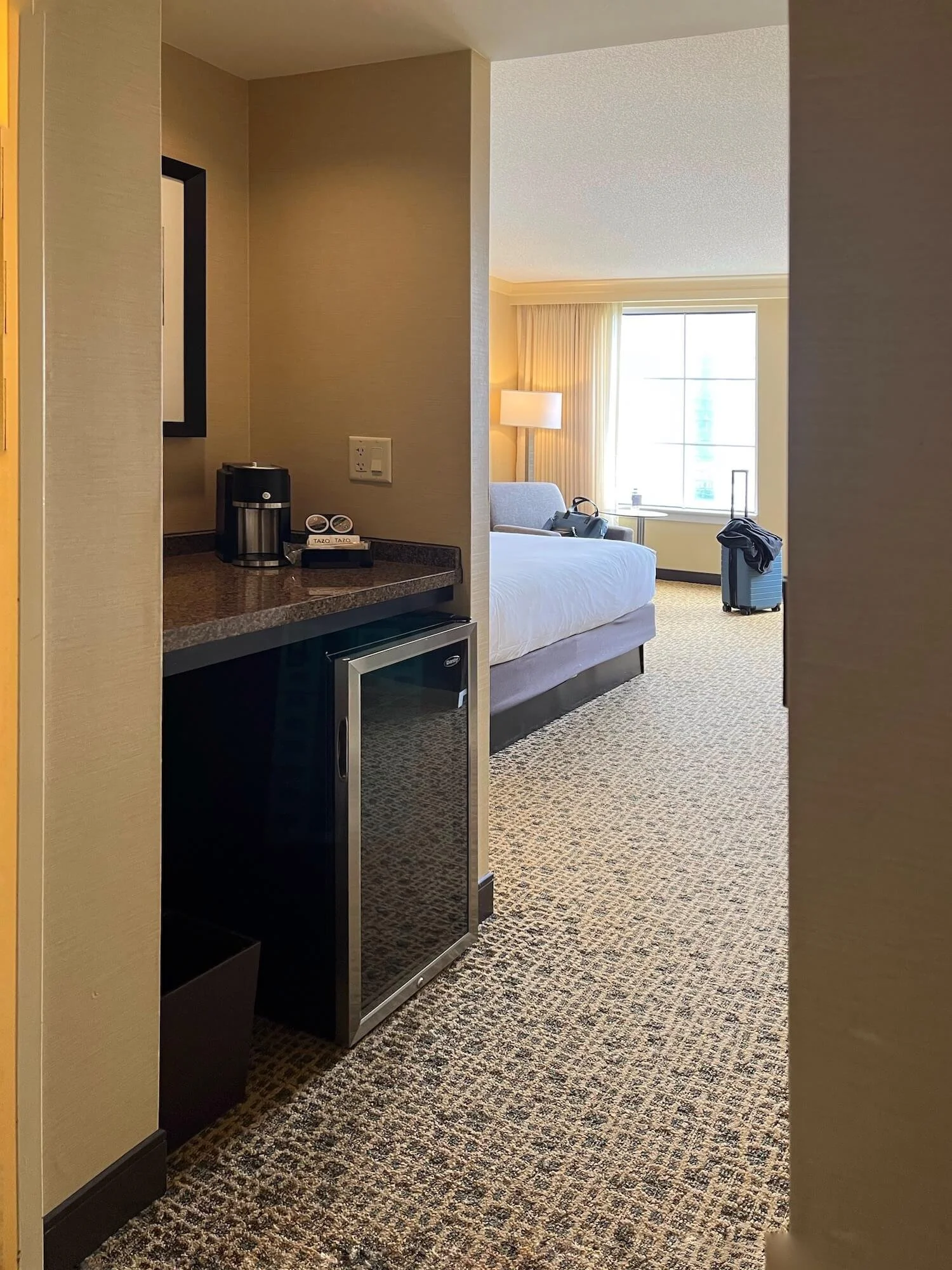
This room also sported a mini fridge and coffee maker. If your primary suite is not near the kitchen, or you don’t want to have to leave it to get to your morning coffee, this is a nice little luxury.
Any room not near the kitchen where you might want snacks or beverages can benefit from this and it doesn’t require anything more complicated than a counter and some outlets. It is the perfect addition to a finished basement or attic, game room, family room, library, home office, or enclosed porch.
A hotel room beverage station is a nice luxury you can easily duplicate at home
My room also came with a luggage rack. This is an excellent addition for a guest room and it will keep your guests from having to open their suitcase on the bed or inconveniently on the floor.
Bathrooms
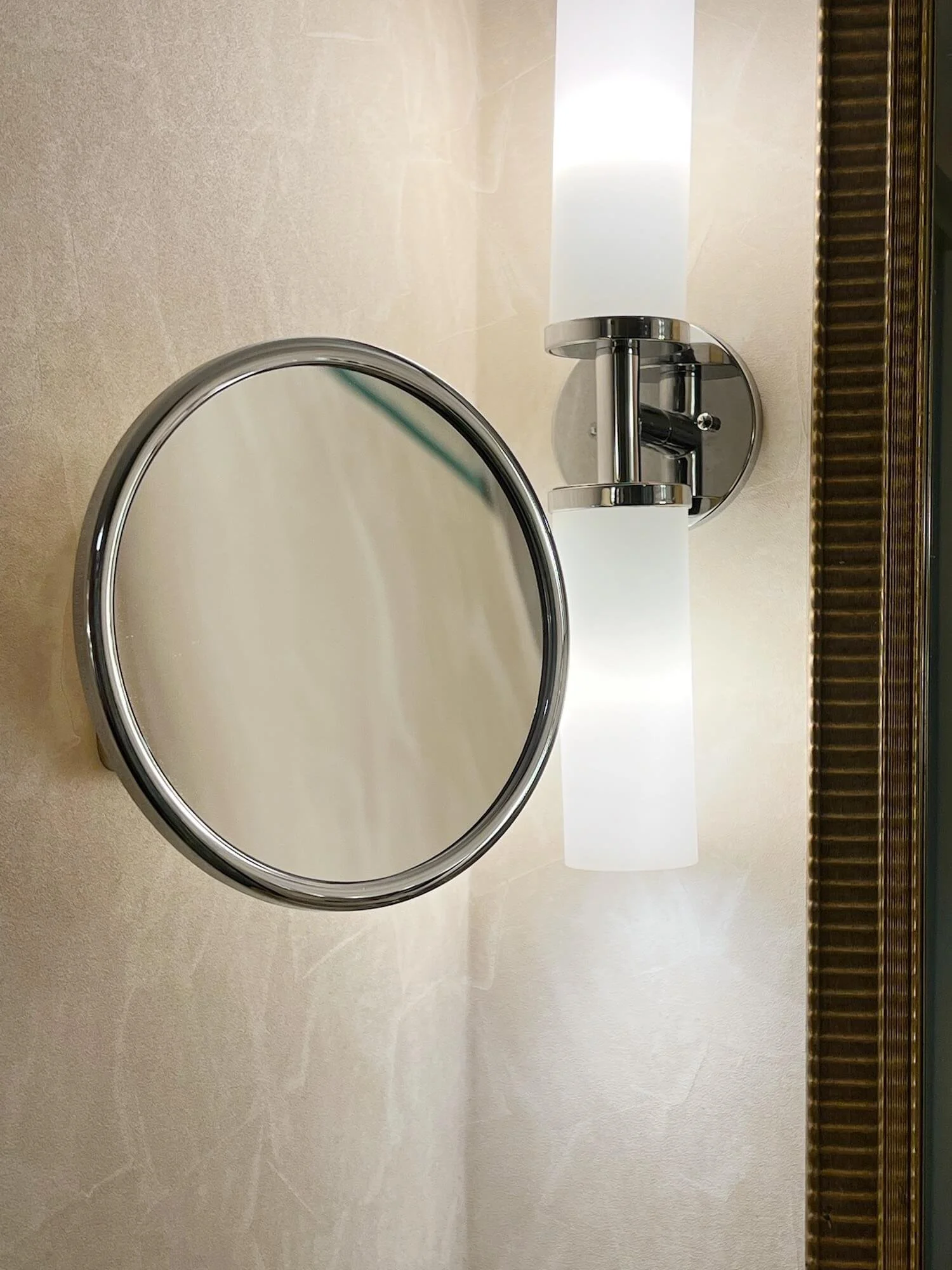
As we discussed recently, the vanity lighting was on either side of the mirror, an optimal choice. Recessed ceiling lights illuminated the shower/tub and toilet. And I was ecstatic to see a magnifying mirror beside the vanity as well.
I discovered the wonders of having a magnifying mirror at another hotel years ago and promptly installed one in my own primary bathroom. For those of us in the $#**-my-eyesight-is-not-what-it-used-to-be years, this is a godsend.
Little luxuries like marble finishes, recessed niches with shelves for accessible storage, a curved shower rod to amplify the elbow room in the shower, and specialty French toiletry products were welcome additions.
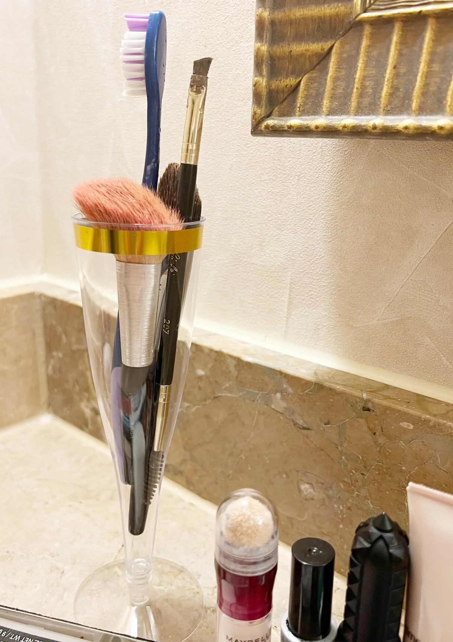
I like organization, and being organized with a morning routine lets me get out the door early enough to make those cruel 7:30 am meeting times. I recycled the champagne flute into a holder for my toothbrush and makeup brushes for the week. Let’s be clear, I personally do not schedule ANY meetings at that hour for anyone ever. BUT the conference didn’t ask me?!
The bathroom flooring was marble and included a rectangular design inlaid in a contrasting marble, a nice cost-effective way to up the elegance.
The marble floating vanity had a curved profile to add extra room without taking up much additional space.
The plumbing installer might have helped themselves to a few of those mimosas as the right hand faucet was decidedly off kilter?!
hmmmm….I wonder what the plumber was drinking…
Window Treatments
All nicer hotel rooms have layered window treatments. Usually this involves a sheer layer of curtains on one track and a blackout layer of fabric on a separate track. This allows for flexibility which is always a good idea.
The tracks are on the ceiling and, in this case, behind the crown molding and spanning the whole window wall well beyond the actual windows. When the blackout layer is drawn, this eliminates light leakage for those who need a bat cave in order to sleep.
It allows for filtered light if just the sheers are drawn (PSA: you are backlit here if the lights are on in the room and it is dark outside, so this does NOT provide privacy).
OR you can have all the curtains open and off the windows to let in as much natural light as possible and enjoy the view.
In your own home, flexible window treatments are ideal. I like to layer wooden blinds for functional privacy and light control, under softer drapery panels or valances for pattern and color (and another layer of lilghtblocking if they are operable and that is needed).
These always add an undeniable finish to the room and can change the perceived proportions of the room or windows like magic if they are installed with intention.
Nature
While my room did not have a view of these gardens, most of the public spaces did. Bringing the outside in either via views of nature, greenery, floral arrangements, or natural elements is an essential component of a well appointed space.
Greenery (real or very good faux) is the easiest way to add nature to your rooms if you don’t have spectacular garden views. Other options are through art, flowers, or organic elements or finishes that bring the outside in.
Beautiful zen gardens and waterfall at the Grand Hyatt in Atlanta
From millwork to textiles, lighting (ESPECIALLY lighting), to finishes, it all adds up to either comfort and welcome, OR boredom and unease. Details Matter.


