Sherwin Williams just announced their official Color of the Year for 2024. This is from the paint company as opposed to the SW HGTV Home selection I reported on a few weeks ago.
To be honest, I like this one better than the SW HGTV pick and waaaaay better than the 80’s pantyhose color SW selected last year!
In a departure from the current trend toward warmer, earthy tones, this color is a classic pale gray blue called Upward, and the marketing description for the color and the name includes words and phrases like…
Tranquility
Calm
Constancy
Personal progress and peace
To move up, rise above, ever ascending
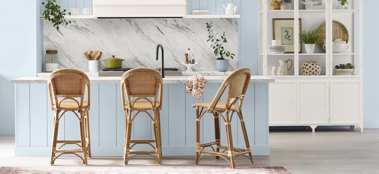
It is a pretty classic shade of blue with enough complexity to not be cloyingly sweet. In a purer hue, this might read ‘baby boy nursery’ on steroids, but because it has a lot of nuanced shades in it, it is a more sophisticated color suitable for many spaces.
image via Sherwin Williams
Sherwin Williams points out it is a cool color that offers balance to the warmer hues that have been emerging in popularity.
And that it is also perfect for classic coastal and casual Nordic styles. I would totally agree with that. It looks great with the natural fibers like wicker, bamboo, and seagrass that are hugely popular right now. Driftwood and sand colored shades of cabinetry and flooring enhance the casual feel of perpetual summer it evokes.
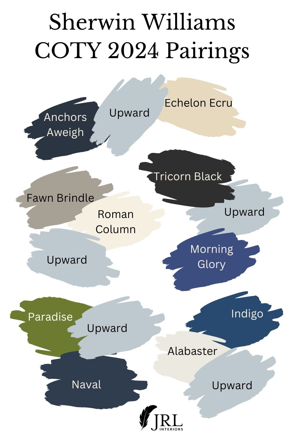
They describe it as pairing well with the recently popular chalky, bluer whites, which it does, but I would be cautious about using all those cool tones in a north facing room. Their own images pair it with a much warmer toned white!
Image via Sherwin Williams
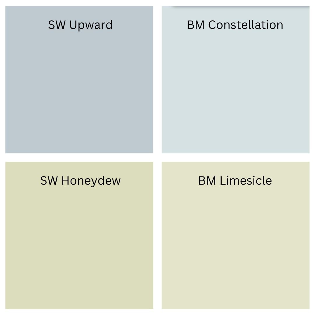
SW Upward is not unlike my one of my foolproof Benjamin Moore colors, Constellation. It is similar in value and slightly grayer and cooler than Constellation.
In the images above, it looks more like the Constellation swatch than the Upward swatch, which only serves to show that trying to get the same look in your own home as a picture in a magazine or on the internet by repeating the color it says the paint is, is not terribly effective!
They’ve also suggested companion colors for it and one of them, Honeydew, is almost identical to another from my foolproof Ben Moore collection, Limesicle.
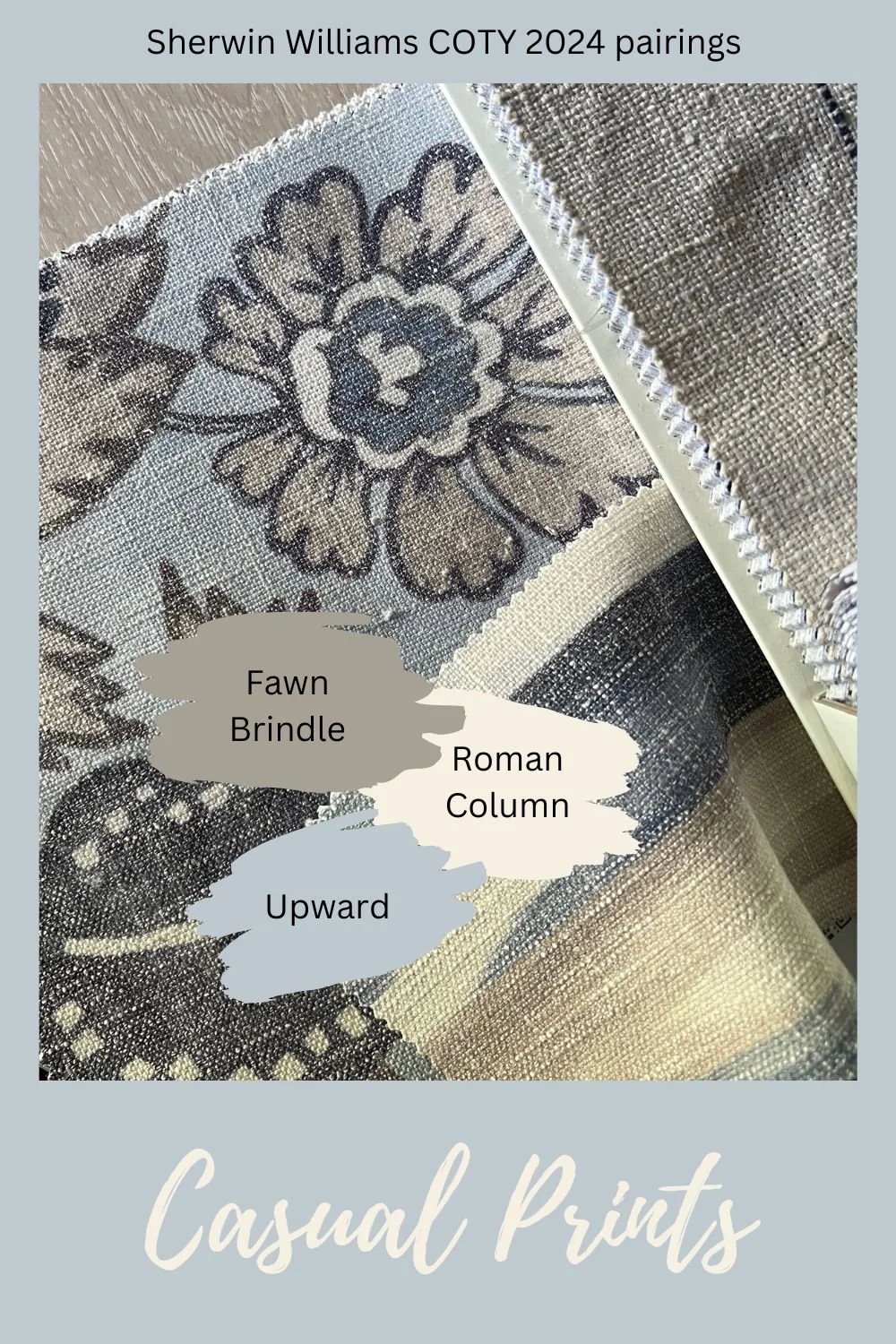
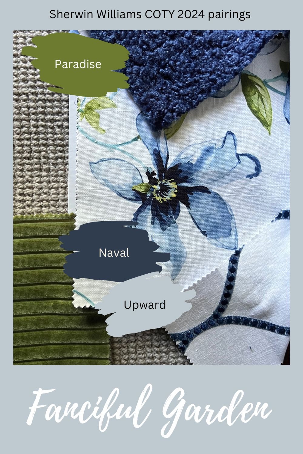
It works very well with blues, greens, tans, and taupes, and, since a box of brand new fabric books just arrived, I’ve collected some fabric and finish pairings for Upward in the images below.
Textured wallpaper printed with stems in shades of blue, touchable chenille and geometric jacquard fabrics, along with a seagrass rug pair with Upward for a charming coastal feel.
Here we paired it with a leafy embroidered fabric, a nubbly bouclé, a soft woven stripe, and a bleached wood floor for an easy breezy mood.
Printed blue and taupe linens in a fun, casual floral and watercolor ikat, and an embroidered taupe stripe alongside fawn oak flooring offer a subtle, playful look.
Embroidered stylized flowers and organic leaves pair with a sophisticated stripe for a more elegant, formal space
This fanciful garden palette pairs a watercolor printed garden floral with an embroidered arabesque pattern, a thick nubbly navy bouclé, and a super soft loden green chenille stripe atop a wool sisal carpet.
What do you think of this pick for the Sherwin Williams Color of the Year? What do you predict Benjamin Moore will pick next month for their Color of the Year 2024?
