Warm coral and earthy red colors are definitely trending this season. And given that fall has officially arrived, these classically fall colors seem especially appropriate now.
I am generally less than enthusiastic about fall because while fall colors are pretty, especially here in New England, fall means the cold and dark of winter is coming…which may be why I start sulking when the leaves start falling.
But warm colors do help create a cozier atmosphere.
Even the ever popular neutrals have been edging away from cool grays to warmer beige tones.
The Sherwin Williams pick for Color of the Year 2023 was a warmer beige…some called it the new millennial pink, I called it something else entirely. You can read my review of the Sherwin Williams Color of the the Year 2023 HERE if you missed it.
But alongside nature-inspired blues and greens, warmer coral pinks, cinnamon reds, and earthier tones have been showing up in the latest fabric and furniture collections.
Coral pink is a color that makes everyone look good….pink light bulbs and pink lampshade linings have been longstanding tricks to create a flattering glow. Hmmmm, maybe THIS is the reason these colors are gaining popularity!
We’ve curated some fabric and paint palettes from our current sample library to illustrate what I mean.
Romantic Coral Pinks
This softer side of earth tones features something more like Millennial pink. This romantic palette would be perfect for a bedroom or dressing room, but could be equally at home anywhere a soft, light touch is desired. Here the pinks are paired with pale neutral sage and taupe in a floral embroidered fabric. A complementary subtle windowpane check, and lush textured velvet are joined by exuberant tassel trim and a crunchy wool sisal textured neutral rug.
Spicy Coral and Terra Cotta
This spicier palette includes stronger colors and bolder patterns for a little drama. The warm cinnamon is balanced with a nearly equal amount of green-blue in this textured embroidered Jacobean floral. A sassy leopard print cut velvet and multicolored stripe sit atop a teal family-friendly rug.
Opposites attract and green-blue is opposite orange-red on the color wheel. That tension of opposites helps create a little drama. A least in the world of colors, a little relationship drama is a GOOD thing!
Cozy Brick Reds
This cozy palette features more brick tones in another gorgeous embroidered fabric - here paired with olive green accents and a hint of ocean blue. I fall for embroidered fabrics every time. A cut velvet geometric pattern, neutral geometric tone-on-tone woven, and flirty tassel trim are gathered on a classic sisal rug.
Please ignore the names of the paint colors - WHO comes up with these? Burnt Peanut Red? Really, have you SEEN a burnt peanut?? I do not think it is this color. Beautiful color, horrible name. For a hilarious look at the top 12 bizarre paint names check THIS out!
Garden Rose Hues
This garden palette contains rosier pink tones in mid to deep hues. The embroidered (again!) linen fabric is a profusion of garden colors with flowers and butterflies. The sheer linen embroidered (?!) stripe adds pastel notes.
Soft Clay Colors
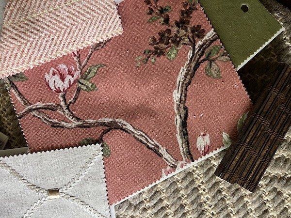
These clay colors lean toward the peachier undertones. A printed linen lends a cozy English country vibe, and is paired with a herringbone weave, a velvet, and a neutral embroidered geometric. Woven wood shades and a sisal and wool carpet add warm texture.
Paint Color Pairings for Warm Coral and Brick Colors
Warm orange-red paint colors can marry well with analogous warm neutrals in pale or deep tones like taupes and chocolate browns to create a calm or cozy atmosphere. They can also be paired with their opposites, blues and greens, to create dynamic contrast and energy.
The 60-30-10 Rule
The easiest way to successfully deploy color in a room is with the 60/30/10 rule. This means an arrangement of hues with 60% the main color, 30% a secondary color, and 10% an accent color. Usually the walls make up the majority of that 60% in a room, and these palettes offer some inspiration for color choices.
Whether you go all in with these trending colors for the main color of a room, or just use them as an accent to update a space is entirely up to you. But if coral and brick hues make your heart sing, I predict you are about to have a lot of choices in furnishings, paint, and fabrics for adding these colors to your home!


