Designing small spaces is a unique challenge. Like all good design, function, appearance, and comfort are all supremely important, but in small spaces, every inch counts.
I just sent my youngest off to live in a teensy tiny studio apartment in Montreal for grad school. It is in a section of the city affectionately called the McGill ghetto for its proximity to campus…and it is really not a ghetto at all, but rather a very charming enclave with a mix of really old buildings and some newer apartments. Like any city living, spaces are small. And this one was particularly tiny. The measurements we got ahead of time were a bit, well, sketchy...the only thing that was abundantly clear was that there was very little space for anything not working double duty.
This is the layout we did before he left. It was based on measurements he got from the landlord that turned out to not be exactly accurate along with some relatively uninformative cell phone photos taken on his apartment hunting trip...I mean, a closeup of the radiator and the inside of the closet were not all that helpful...to be fair, at the time he thought he had selected an entirely different apartment, but that tale of woe is a long story for another day.
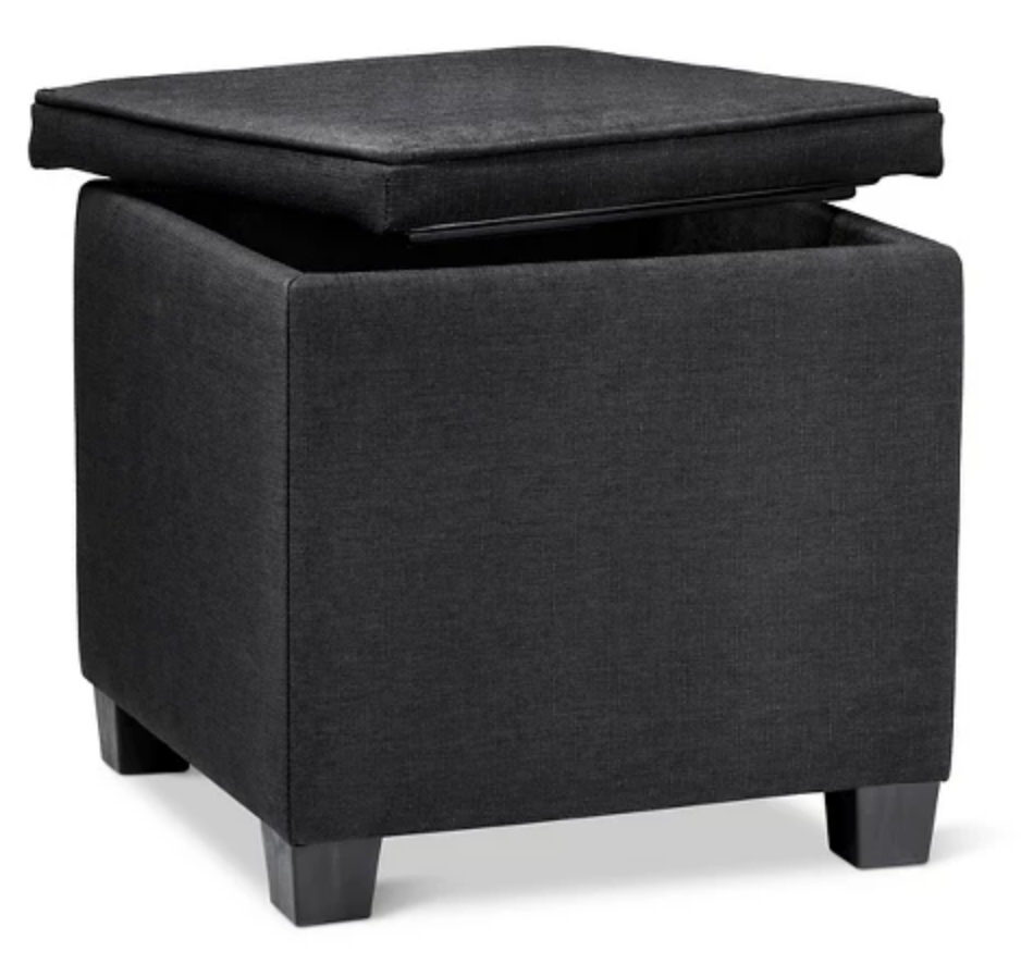
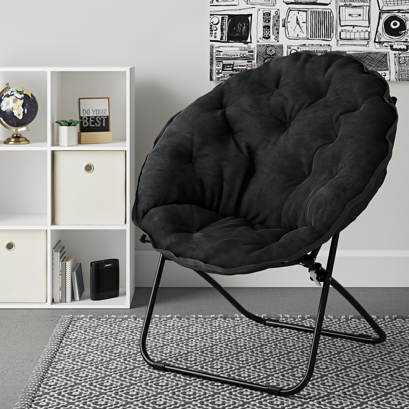
From undergrad apartment life he had a couple of small 3 shelf bookcases, a small nightstand with a drawer and cabinet, a folding saucer chair, and a storage ottoman which would all fit in his car along with a set of black bedding and a carefully curated collection of kitchen supplies edited to fit in the VERY limited cabinet space. Oh, and he also had a black/tan/cream area rug.
Black is a great color for helping inexpensive furniture look more sophisticated than it is…also, it doesn’t show dirt…
So when he arrived with his carload of absolute necessities and a tape measure, we got to work creating possible layouts to furnish this tiny, one-room living space. A daybed was a given as the bed would have to double as a sofa and clearing out the space to pull out a sofa bed every evening was impractical, not to mention less comfortable than a conventional mattress. A Murphy bed would have similar furniture shuffling issues and was too great an expense for a temporary situation.
Actual measurements of the apartment...as taken by his father, who is an engineer, so they came with notes like 1 square = 4.71"?! In any case, at least now I had accurate measurements to work with. The wall near the entry was a bit shorter than advertised, and the closet a little skinnier. But the window wall was a few precious inches longer than we thought...okay only 3", but that's better than shorter, and now we knew exactly where the window and photogenic radiator were located.
We had requested the addition of a stove and full fridge since he enjoys cooking (the unit originally came with a only a microwave and dorm fridge), so that took up additional precious floor space. But the apartment was still sunny and charming with high ceilings, thick millwork, a large window and hardwood floors. It boasted a walk in closet (too skinny to be as useful as it sounds, but still better than average), and the surprise of some shelving built into the only uninterrupted wall. I had originally thought an IKEA shelving unit would be needed for additional storage, but we decided that with the bonus built-in shelves, a small table and chairs would be a better choice.
I love a challenge, and this kind of puzzle is my favorite kind, so it was time to roll up my sleeves and get busy…at 9:30 at night from 5 hours away. With additional, more accurate measurements in hand, 2 hours later I had created 3 different layouts that all used the same pieces of furniture, and had refined the shopping list for the next day. Below is the layout he chose and, while not exactly spacious, it will make a very livable space.
We placed the daybed in front of the built-in shelves since it is low and doesn’t block access, and the nightstand near the end of the daybed, The ottoman serves as a coffee table of sorts and a footstool for the chair. The bookcases live next to the fridge for extra kitchen storage, and the table nestles into the corner near the window. For impromptu dinner guests, the furniture could easily be rearranged so that both sides of the table are accessible.
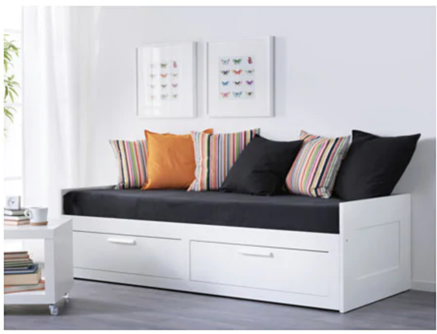
An IKEA daybed with storage drawers and a table and chair set was his first purchase and the weekend was spent in assembly mode.
Side note: he texted from IKEA to ask advice on whether he should get the white or the black daybed (the table/chairs only came in white) and I am delighted to report he has absorbed some design sense because he correctly concluded white would look better since all his bedding would be black. Color me proud! Also, repeating white on another piece of furniture besides the table is a good idea to create a pleasing visual rhythm.
I’m looking forward to a Facetime tour later once he gets everything in place, and I’m already itching to get up there and see him again and put some finishing touches on the apartment!
Tips for small spaces:
- ALWAYS measure and draw up floor plans before you purchase furniture. This is true for ANY space, but is especially crucial when space is limited.
- Look for furnishings that do double duty…a daybed works as a sofa too, a nightstand doubles as an end table, a table also functions as a desk. A short bookcase can double as a compact end table, and an ottoman can be a coffee table with the addition of a tray.
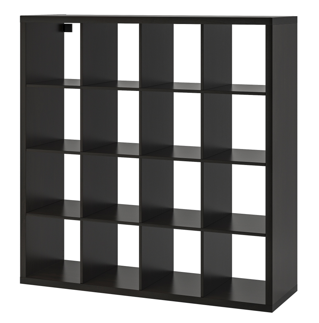
- Look for furniture that includes storage. Storage space is always at a premium in small spaces and every inch counts. Use vertical space with shelving or cubby units (the IKEA Kallax series is a perennial favorite for inexpensive, stylish storage with coordinating basket, drawer, and door accessories available), ottomans that have storage inside, beds with drawers underneath, and side tables with cabinets or drawers. Covered storage is especially important...having everything on display in a small space will feel too overwhelming.
- Look for furniture that folds or stacks. Drop leaf tables are great for this – they go from very skinny to capacious instantly with no need to find a place to store leaves. In our studio apartment, the dining chairs are stackable and the saucer chair folds flat if more floor space is needed.
- Limit your color palette. In a small space, a riot of disparate colors will be overwhelming. Stick to a handful of neutrals and one or two accent colors to keep the space interesting but not chaotic.
What are your design dilemmas? Let me know what topics you would like to see on the blog! Need a personalized solution? Contact us to start the conversation!

