How do you arrange furniture in a long narrow room? It is a question I’ve gotten a lot over the years. It is a very common type of room here in suburban Boston - the long narrow living room. These are typically front to back rooms in Colonial style builder homes and are 12 to 15 feet wide and 25 to 30 feet long. Such proportions can be challenging to furnish. Coupled with awkward proportions, they usually have around 6 windows and 2 door openings, and often a fireplace on the largest section of uninterrupted wall.
Staging project for a typical front to back long narrow living room
The following is a case study from a virtual consultation with a lovely couple who contacted me for help with this very dilemma.
While furniture arrangement is only one aspect of designing a successful room, it is an important one.
I know you want a place to sit down and you want it yesterday, but when you are starting any decor project, before you rush to purchase a room full of furniture, you MUST have a plan. Everything starts with a plan.
You can’t know where to wire the TV, or where to hang the art, or even what kind of window coverings would work best until the furniture arrangement has been decided.
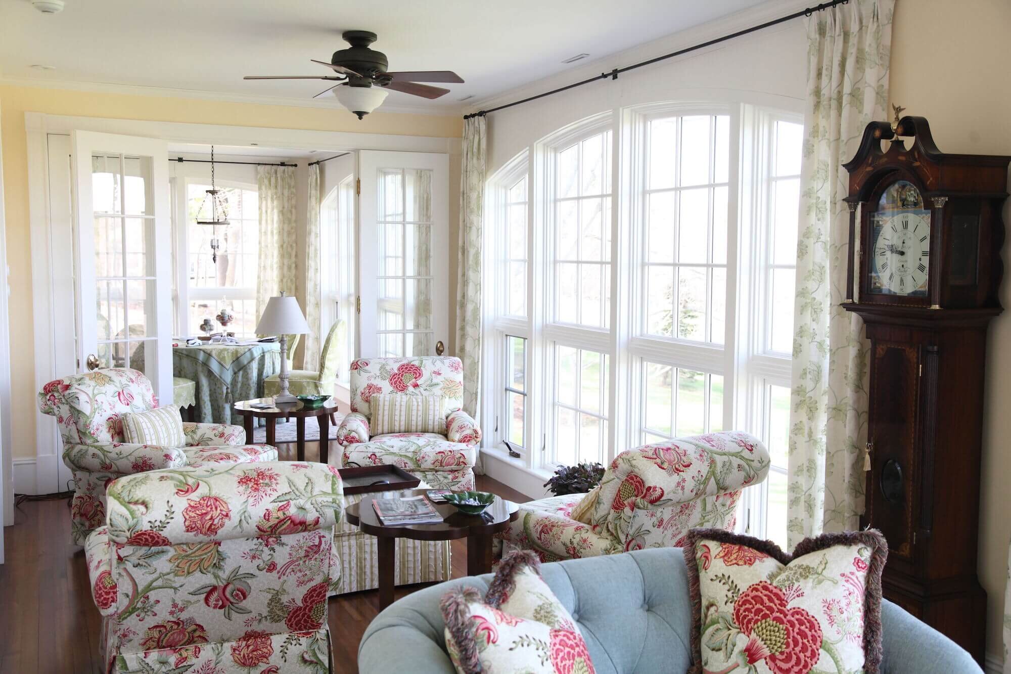
This long, narrow sunroom that extends the length of the house was divided into 3 coordinated but separate seating areas.
Every design project we do starts with a floor plan. It is much easier and less expensive to move around pictures of furniture on a piece of paper (real or virtual) than it is to keep dragging the furniture to different spots in the room or ordering things that don’t actually fit the space properly.
Most people think of furnishing a room in terms of what fits on the walls, and in rooms like these, with so few feet of wall space, the answer is “very little”! And even if it did fit on the walls, it would be spread out too far in a room this long for comfortable conversation.
The answer to furnishing a long narrow room is to divide and conquer!
For my virtual consultation clients, first, I asked a lot of questions. These are the same questions to ask yourself at the outset of designing any space in your home.
How do you typically use this room right now?
How do you want to be able to use the room?
What activities happen in here?
How many people do those activities typically involve?
What kind of stuff do those activities require?
What do you love about the room?
What do you find frustrating?
The answers to these questions will start to inform the zones of the room. For this family, they wanted reading/play space for 2-4 people, TV watching space for 4+, and study/work space for 1. They also wanted to be able to seat 8 people or more for future entertaining. They loved that is was light and bright and that it had a bay window with a pretty view.
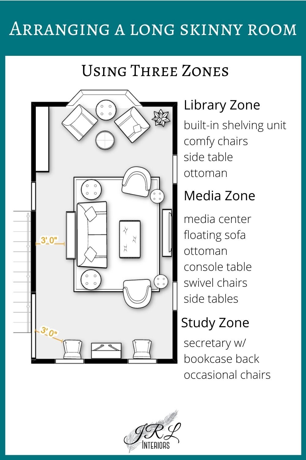
By floating the furniture for the main seating group in the center part of the room, we are left with two other zones to accommodate different activities. In this case reading/play and studying.
We opted for the reading zone to be by the pretty bay window. The room already had a built-in storage piece that was a natural fit for the library zone, and the clients had a family piece, a bookcase-back secretary, that would work beautifully for the study zone at the opposite end of the room and provide a tall piece to balance the built in.
The wall opposite the media wall, in whichever layout they choose, can accommodate a picture gallery.
There are several options for layouts - here are a few:
This layout uses a pair of sofas in the main seating section. For a less formal option substitute a pair of swivel chairs and end table for one of the sofas and consoles. The location of the media center might also be the location of a fireplace.
The main seating area contains a sofa and two swivel chairs for easy TV viewing. A console table makes a prettier view from the entry than seeing the back of the sofa.
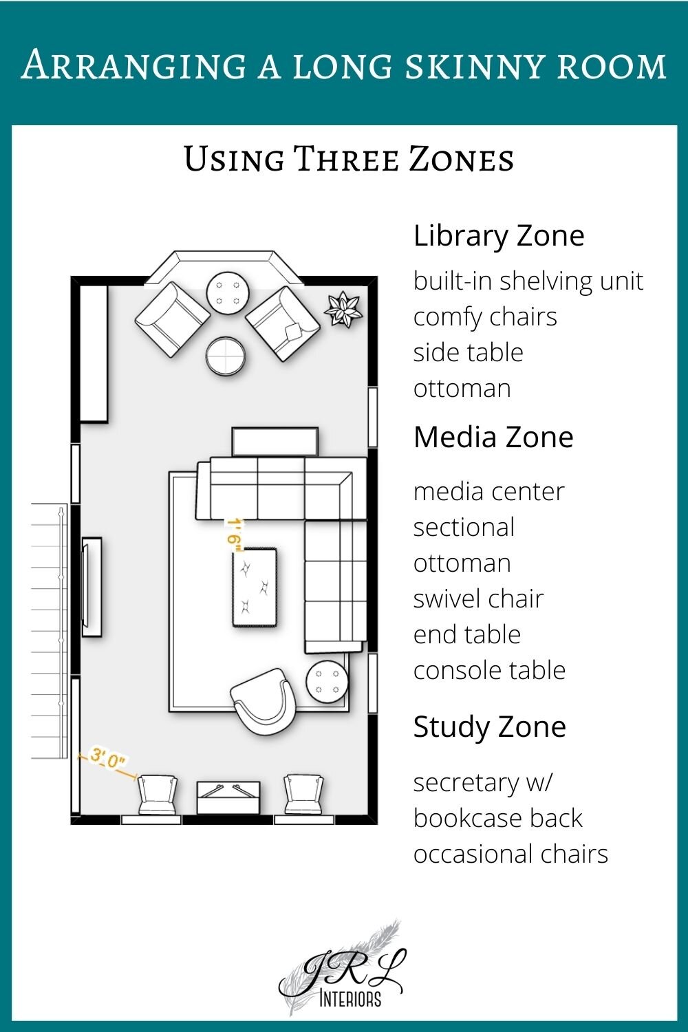
While it is not ideal to have the main traffic path between the TV and the seating it is sometimes necessary to get the best layout. This arrangement offers a lot of casual seating and a pleasing vista from the doorway as well as ample walk space. And because the stairway wall is not centered opposite the window wall, a sectional is the perfect solution to adjust for that and look visually correct.
Other variations include replacing the library area chairs and ottoman with a game table and 4 chairs, or using a drop leaf table for the console that backs up to the library area so that it can open up for puzzles or games. With arrangements that put the TV on the outside wall, you could even add a direct vent fireplace below it.
When arranging living room furniture there are a few guidelines to keep in mind:
Passageways should be at least 3’ wide for comfort. This is really important if one (or both) sides of the walkway are tall pieces of furniture or walls. If the passageway is between lower pieces, like a console table and a sofa, you can get away with slightly less floor space because the space above the furniture is wide open.
Try to position the furniture so that passageways are not between the seating and the TV interrupting viewing every time someone enters or exits. This is not always possible, but it is the ideal.
Distance between the cocktail table and the sofa should be around 14”-16”, optimally. If it is a cocktail ottoman, closer to 12”
Comfortable conversation distance is no more than 8’, so seating farther than 8’ apart is in a different conversation group. Don’t leave any chairs isolated in time-out that are meant to be socializing! And conversely if you want seating for a solitary activity like reading, placing a comfy chair farther away from the rest of the group will discourage interruptions when you are immersed in the latest novel!
Every seat should have access to a handy place to set down a book, phone, drink, or snack, so plan for some surfaces to accommodate that.
Floating a sofa exposes the back, so assess the design details. Console tables are a great way to dress the back of a sofa. They provide a surface for lamps, display space, and can sometimes serve in place of an end table. And, depending on the style, a console table can offer a place to tuck stools for extra seating.
There are so many other aspects of designing a room to consider, the colors, textures, styles, personality, window treatments, lighting plan, storage solutions, and technology plan, but it all starts with the floor plan. So get out your measuring tape or laser measure, and draw up the room or cut out full size paper templates and move them around the room.
Or you can always contact us to design the best solution for you :-) We offer virtual room design services with everything you need for you to implement the design yourself, OR full concierge-level design from concept to beautiful finish.
Please note: this post may contain affiliate links meaning I may make a small commission on any purchases at no extra cost to you.


