Walls can be styled in SO many ways. What you hang on the walls gives life and personality to a space. It doesn’t always have to be art, either. You can use mirrors, textiles, baskets, sculpture, plates/platters, collections, lights or candle sconces, even plants, as well as photographs and art!
Assess your belongings - you probably already own all kinds of things that could go on a wall! I once had a whole kitchen wall hung with decorative shaped baking pans! Honestly, it was the only way to store my excessive collection at the time, AND it looked great and was a very personal statement - one that said I like to bake and I like cake :-).
Wall styling compositions can be symmetrical or asymmetrical, but they must always be balanced or they will feel unsettling. Symmetrical arrangements, like grids of identically sized and framed prints, are inherently balanced (and very tricky to hang….my installer is STILL complaining about the grid of 12 calendar prints he hung for me over 10 years ago!). Asymmetrical arrangements are a bit trickier to get balanced.
See THIS post for the do’s and don’ts of artwork sizes, heights, and placement. But for the purposes of this post, let’s look at the different elements that can make up that composition for different wall spaces.
The wall over a sofa
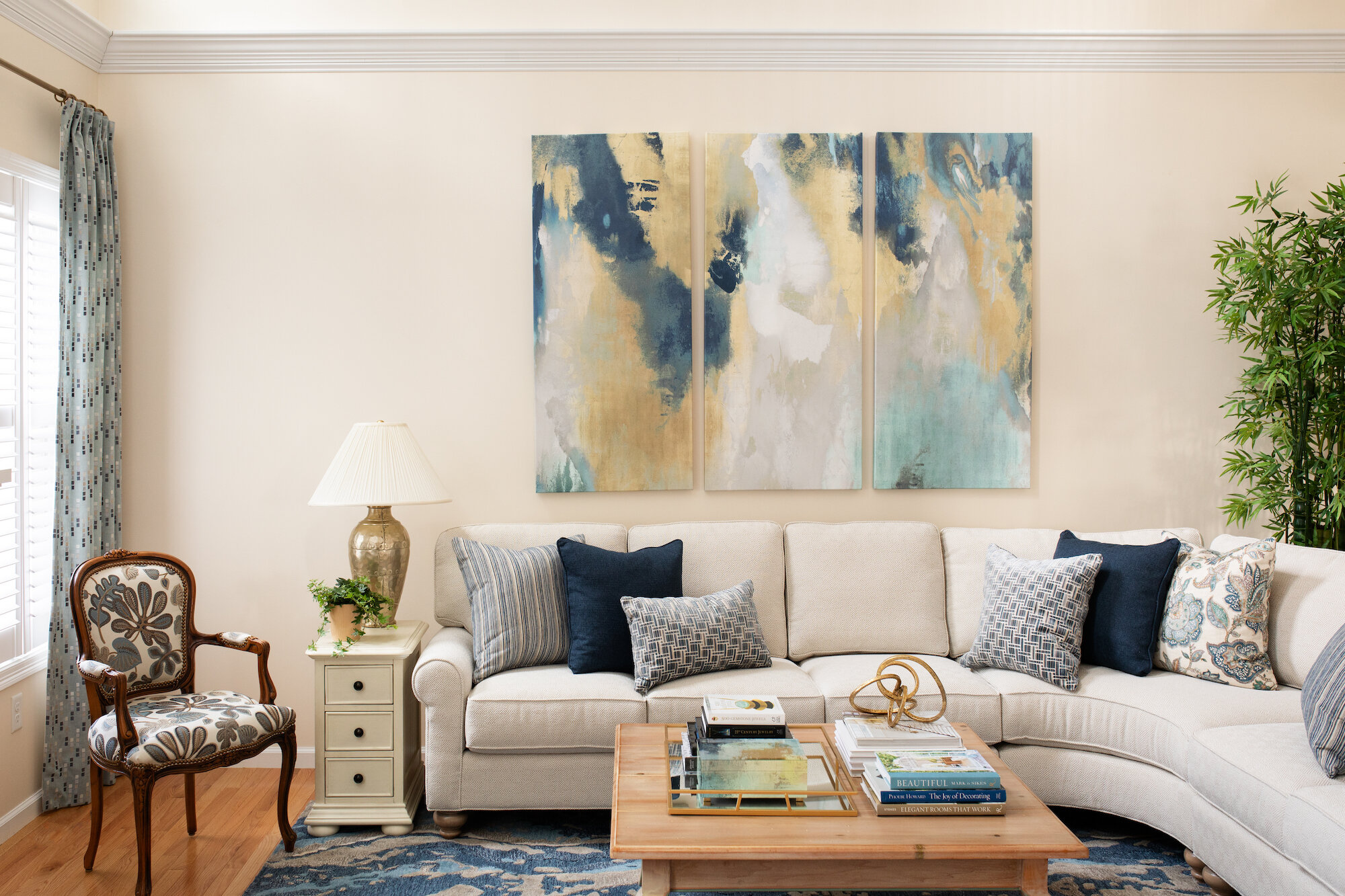
In this very tall living room, we chose a large scale triptych painting for the wall over the sofa. The colors in the art are repeated throughout the room. The vertical lines between the pieces are good in this tall space and the large scale fills a good portion of the wall over the sofa. The sofa, the pillows, the tree, the lamp and end table, the added millwork, and even the adjacent chair and window curtain panel all become part of the balance of the wall composition. For more photos of this room see THIS post.
Great room where a large scale triptych art piece is a part of the whole wall composition. Design by JRL Interiors, Photo by Emily O’Brien #wallart #twostoryfamilyroom
We reframed a couple of the travel photos from the client’s collection to increase the size and change the frame color when designing this composition for the main wall in the space below. The sofa, lamp, and existing door all factor into the placement of the art. The peaked ceiling is highlighted and filled with a very large scale round piece. In this case we used a clock, but a round plaster relief piece or a round architectural fragment (like a vintage round window frame) would have worked too. The adjacent wall features a collection of round plates over the sliding door to the patio. The round shape of the plates repeats the round shape of the clock. Repeated elements create a rhythm that moves your eye around the space connecting like things - sort of a visual “connect the dots” cue. Click HERE for more on this room.
Vaulted ceiling family room with a wall composition that includes travel photos and a large scale clock. Design by JRL Interiors #vaultedceilingfamilyroom #wallclock #cubeottomans
The wall with the TV
In this room, a composition of pieces with a dose of black help integrate the TV into the wall so it isn’t just an awkward blank black rectangle. (See THIS post on more ideas for how to decorate around a TV). A mix of horizontal and vertical pieces were incorporated, and the touches of red echo the rug and pillows in the room. The round clock is a critical addition to give a bit of relief from all the angular pieces.
The TV is hidden in plain sight when it is incorporated into a wall composition. Sitting room wall styling by JRL Interiors. #hidingtheTV #artwalls
The wall over a sideboard or entry table
The most obvious item to include over a sideboard or entry table is a mirror. In a dining room, this can have the pleasing effect of reflecting the chandelier, and in an entry it gives you and your guests a place for a quick check to see if you have spinach in your teeth before heading out the door…so it’s practical AND pretty! I tend to prefer vertically oriented mirrors because this allows you to have it come close enough to relate to the furniture and still be high enough to not chop off anyone’s head. Decapitating your family and friends is quite inhospitable! You can fill the space around your mirror with plates or some smaller art pieces if needed, and flank the whole composition with a pair of lamps like we did in this dining room.
A Venetian mirror and Wedgewood plates don’t compete with the wallpaper and are a gracious addition to this sideboard composition. #diningroomwallpaper #mirror #decoratingwithplates
For the dining room in this country estate, we arranged an oil painting and a collection of blue and white plates on the wall above the sideboard. A pair of buffet lamps and an Imari bowl on the surface become a part of the composition. Design by JRL Interiors, Photo by Eric Roth #diningroom #countryhouse #wallhungplates
Or, for a less formal arrangement, you can use a single lamp on one side and balance it with a couple of things on the other side that add up to similar visual weight…a vase with branches, a plant, etc. The things on the table become part of the composition as well - a bowl, boxes, stacks of books used as risers or on their own, leaning art, or pictures or plates on easels that overlap the things on the wall. PLEASE PLEASE PLEASE don’t crowd your surfaces with a gazillion 5 x 7 framed photos of your family. Hopefully, they already know you love them, and you really cannot appreciate the photos when there are so many competing for attention anyway. If you are going to display family photos, choose no more than 3 for any given shelf or tabletop surface, and make sure they are different sizes and shapes and preferably in complementary but not matching frames. If you want to display a lot of family photos, this is best accomplished in a gallery wall.
Gallery Walls
Gallery walls are a whole subject by themselves. THIS post on an anniversary surprise gallery wall we designed has tons of info on the size and type of photos and frames to select for a family gallery style wall.
For gallery walls, mix up frame styles and/or colors, but balance the layout so that similar ones are spread throughout the arrangement in a pleasing rhythm. And you can mix in unframed canvas wrapped pieces and other more sculptural elements for interest and variety like we did in this mini gallery composition over a bed in a guest room.
This mini family gallery wall was created in the guest room for our clients. A mix of canvas wrap and matted and framed photos and a large scale letter work together to make a balanced composition. Design by JRL Interiors #gallerywall #guestroom
Stairway walls
Stairway galleries can be tricky because of the height and the angle. In general, you want to follow the angle of the stairs or bannister as you plan out your arrangement. I like to start in the middle of the stairway and work out from there in both directions so that the whole composition will be centered when it is done. A stairway is a natural location for a family gallery wall as it is usually the transition space from public areas of the home to more private areas, and we have created and hung many, many stairway gallery walls over the years. It can also be a place for a more restrained approach with the decor provided only by millwork or patterned wallcovering. Some stairways feature curved walls which makes hanging artwork difficult but not impossible as long as you choose pieces the right size. For this pretty curved stairway, we hung the owners collection of antique architecture prints.
Art hung on a curved stairway wall needs to be narrow enough to not stand off the wall. These stacked pairs of antique architecture prints follow the line of the wainscoting down the stairwell. Design by JRL Interiors #stairwaygallery #gallerywall #curvedstaircase
Fireplace walls
In most rooms containing a fireplace, the fireplace wall is the natural focal point. How you treat the wall will vary depending on the space and whether or not there are light fixtures, a mantel, or millwork that you need to factor in. Many fireplaces are masonry which requires special tools to drill into for hooks. If you have a brick fireplace, there are THESE nifty hooks that clip onto the surface of the bricks for hanging pictures. For mantel styling, THIS post has all the rules and how to break them :). For fireplaces without a mantel, treat it as you would any other wall - filling 2/3 of the space and taking into account the firebox as a part of the whole composition.
We added the millwork above the mantel in this two story great room to frame the clients favorite art piece, and highlight the dramatic soaring ceilings. A vase of greenery and a piece of glass sculpture flank the art. Design by JRL Interiors, photo by Emily O’Brien. #twostoryfamilyroom #vaultedgreatroom #fireplacewall
Choosing wall items
Everyone has a different level of tolerance for stuff on their walls. Maximalists like the comfort or energy of seeing every nook and cranny filled, and minimalists like the calm of just a very few items displayed. Most people fall somewhere between these two extremes.
Like anything in decorating, judicious editing is sometimes needed. You probably do not need all 12 years worth of school pictures of each child on display at once! Just choose your absolute favorites (and by that I mean favorite pictures, not favorite children!) Put the rest away, or have them transferred into bound books (with a service like Shutterfly or Snapfish) so they can still be enjoyed without adding unnecessary clutter and chaos.
Group the meaningful things you want to display by compatible color or subject matter and prioritize them so that the ones you MOST want to see get hung in the most prominent locations. We just hung 48 pieces for a client who recently downsized to a two bedroom condo, and we went back the next week when the rest of the furniture was placed to hang 23 more! She had a collection of art, textiles, and ceramic pieces collected over years and with memories attached. We grouped things keeping shape, size, color, and subject matter in mind, and prioritized the things she most wanted to see in the spaces she spends the most time. Her condo now feels like home and is a wonderful reflection of her personality (and the envy of her neighbors!). Careful attention to placement keeps it from feeling cluttered in spite of the number of pieces!
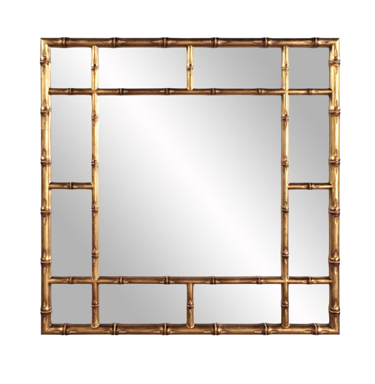
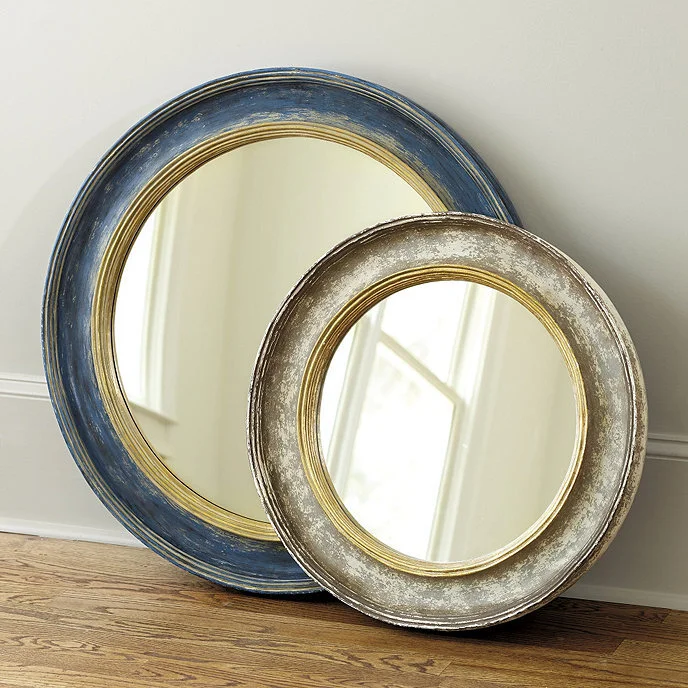
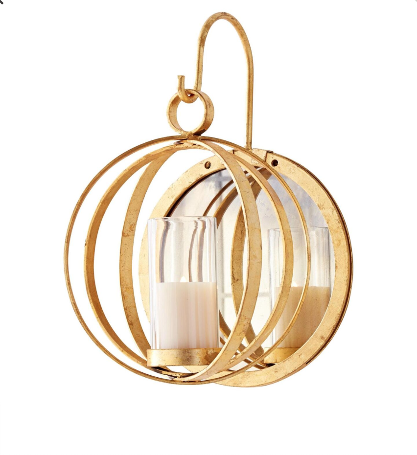
If, by some miracle, you don’t have enough things to keep your walls from looking bare, or you are starting over or want to freshen your look here are some pretty additions to consider (click on image for link to purchase):
Please note: this post contains affiliate links. Any purchases may result in a small commission for me at no extra cost to you.


