Kitchen renovation or kitchen refresh? That is the question!
How to Decide Between a Kitchen Renovation and a Refresh
A full kitchen renovation is both expensive and disruptive, but sometimes a whole renovation isn’t necessary. Cabinets are usually the most costly piece of a kitchen redo. The questions to ask are: does the basic layout work efficiently? and Are the cabinets good quality? If the answer to both of those questions is yes, then a kitchen refresh may be in order instead.
Element of a Kitchen Refresh
There are many options for updating a kitchen without replacing the cabinets. Cabinets can be refreshed, if needed, with new paint, new doors, new organizational inserts, and/or new hardware.
Replacing the counters and backsplash tile is a high impact change for much less disruption, and changing lighting and cabinet hardware is an easy update.
A Peek at a Refresh Project in Progress
While we are waiting for all the furniture and built-ins for the garden inspired library project to come in, we’ve been working on a refresh for the adjacent kitchen and breakfast room.
With the goal of a cohesive, fresh, and vibrant color palette for the main floor of this gracious home, we are working with garden colors again in this space.
The BEFORE
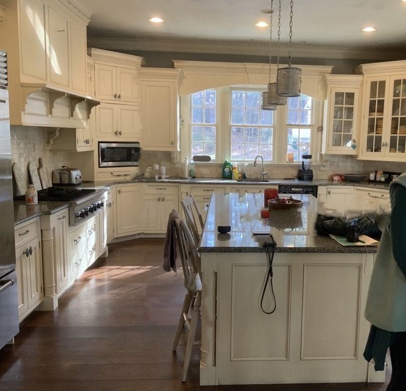
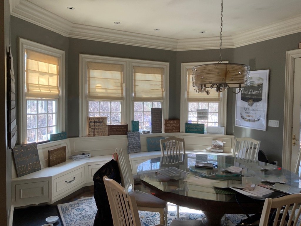
This Georgian style home was built in the early 2000’s with copious millwork, generous 10’ ceilings, and nice quality elements. The kitchen and breakfast room overlook the back patio and beautifully landscaped gardens. The kitchen, featuring ivory cabinets, tumbled limestone backsplash, and speckled granite counters is almost classic, but a little bit “of an era”, especially the backsplash and granite.. At some point before my clients purchased the home, the kitchen walls were painted battleship gray - likely in an attempt to ‘update’, but the color is not doing it any favors and is not in keeping with my clients wish for a brighter, fresher aesthetic.
What started this whole project was the need to recover the windowseat cushions. The cushions were in storage because they were covered in a red plaid that was far from compatible with anything else.
We chose a multicolored striped accent fabric to recover the cushions that we had specified for sofa pillows for the library. This fabric has all the colors that will be repeated throughout the main floor and gives us a nice segue into the breakfast room and multiple colors choose from.
The Mood
To begin this refresh project, we put together this moodboard that reflects the design direction for a brighter, more playful vibe in this kitchen.
The Elements
The aforementioned stripe will cover cushions on the generous window seat that wraps the bay in the breakfast room, as well as the seats of the counter stools in the heart of the workspace.
The window seat offers plenty of space for a variety of fun throw pillows to reinforce the accent colors and garden feel.
The gorgeous aqua blue from the library ceiling coffers will make a splash as the wall color for the kitchen, and the ivory millwork will be freshened with the same soft white we are using for the library trim. Into this envelope of aqua blue and white, we will add accents of the coral and green also featured in the stripe.
The chandelier from the library, a bronze metal cage with candelabra arms, will find new life in the breakfast room - repainted in a vibrant coral with the shades trimmed with braid.
The existing large round neutral stained breakfast table works perfectly for this family of 8 and suits the space nicely, so it will remain.. The chairs will be replaced with green painted bamboo chairs with seats covered in a multicolor floral print.
A coral lightly patterned rug will anchor the table space providing a warm garden color accent.
Windows will be treated to playful shaped valances in a light geometric pattern and trimmed with tape and fun tassels to highlight the shape and bring in another kick of fresh color.
In the kitchen proper, we are keeping the cabinets, which is the biggest expense in a kitchen redo. Since the layout works and the cabinets are nice quality, there is no real need to start over. We can, however, update to freshen the feel of the space.
The cabinets will be painted the trim color and the island will be painted an accent color - most likely a garden green. New cabinet hardware will be in a warm champagne finish.
A pair of new island lights of a more substantial scale in champagne gold tones will replace the trio of undersize pendants currently in place.
Other eventual changes in discussion are a new mosaic backsplash and new marble-look quartz counters.
The final part of the kitchen is a walk in pantry and a desk area both adjacent to the breakfast room. This area is not on the refresh agenda quite yet, but may be phased in after the kitchen and breakfast room.
I am lobbying for the desk to be replaced with a more useful tall piece of built-in furniture that has the aesthetic of a hutch but incorporates specialized space for the kitty essentials and a command central organization area for this busy household.
The walk in pantry closet itself is an opportunity to have fun and I’d love to see this with the shelves all painted in the happy coral color and backed with a fun wallpaper, and all finished with a more interesting pantry door…but that is all a project for the next phase!
I can’t wait to see this all come together - it’s going to be SO fresh and pretty! Here is a peek at the concept rendering for the breakfast room - fresh, vibrant, and fun!
Other posts you might enjoy:
A Garden Inspired Library Plan
How to Choose the Right Kitchen Island Lighting
Planning a Kitchen Remodel (mine). and no, I still haven’t started it…”the cobblers children” and all that…


