Just recently I checked in on a family room project in progress. This is the exciting stage after months of waiting when the room actually starts to take shape.
The furniture was ordered right after the design was completed and that will arrive soon, and the new windows were installed, and the built-ins are in progress - all exciting to see.
Here is a peek at the design process and some progress shots…
Our first meeting with these lovely clients, we discussed a variety of projects to update the house they have lived in for many years. They have children and grandchildren nearby so have decided to stay in this house and wanted to make some changes.
We honed in on the family room as the project to start on first since it is the most used and most visible living space in the house.
As always, we start with a wish list of what the clients want the room to do and be and what isn’t currently working.
Existing Conditions
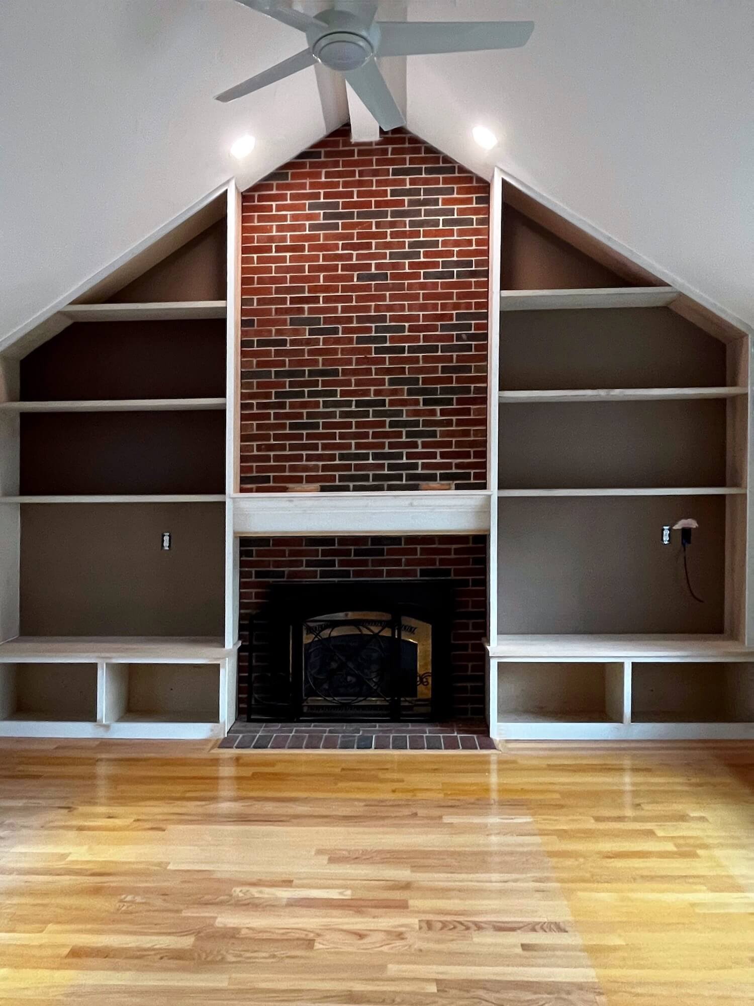
The fireplace wall has never been a favorite of this family and we wanted to upgrade it and camouflage the red brick. Additionally, the mantel was undersized and shallow for the scale of the chimney breast.
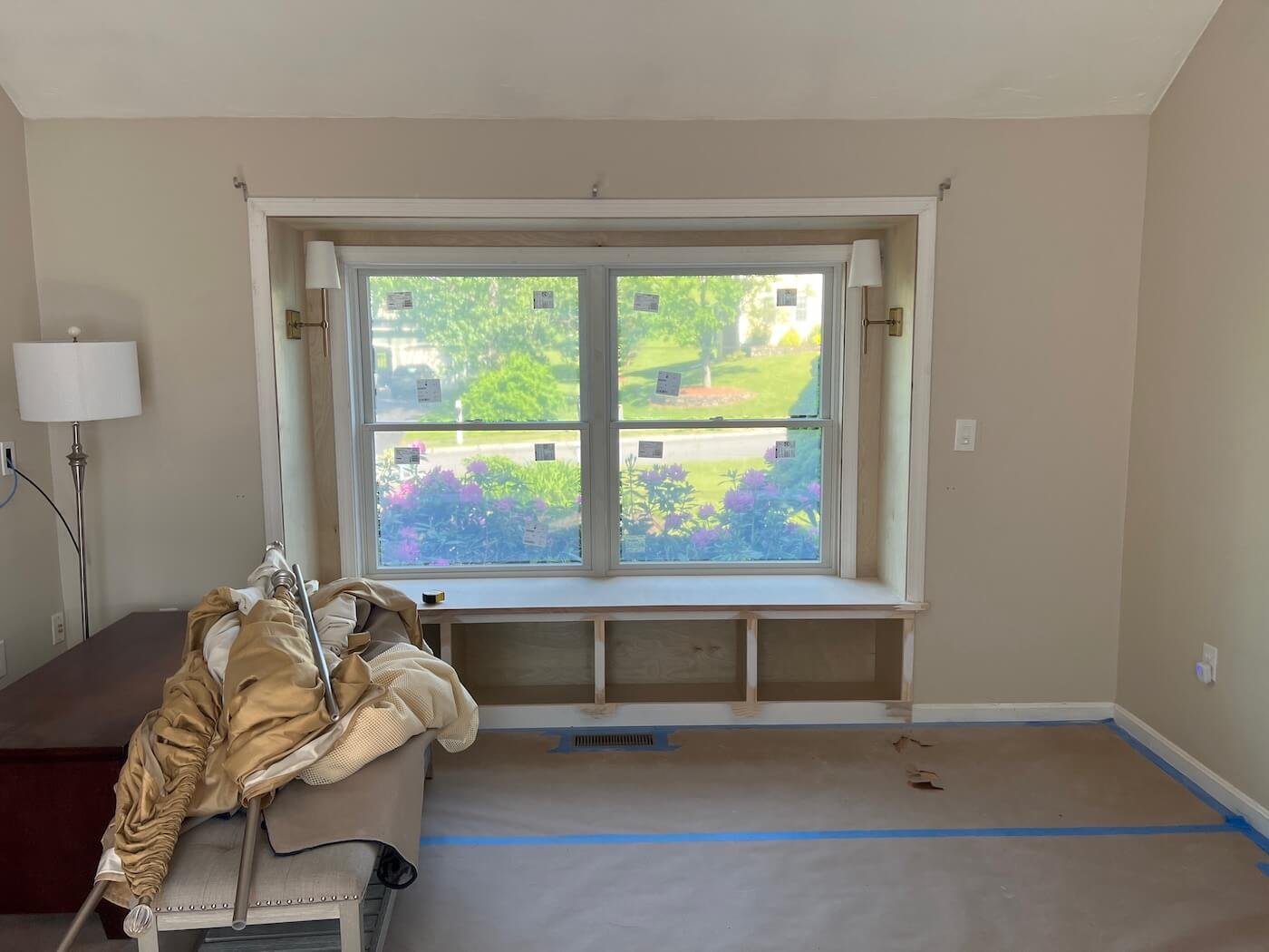
They were also interested in replacing the existing bay window with an eye toward gaining a windowseat space.
Existing assets include nice hardwood floors, an abundance of light, a surprisingly gracious size, and vaulted ceiling. The masonry fireplace also already had a gas insert.
Design Solutions
At our first meeting, I sketched a concept for building in the fireplace wall and painting the brick to create a more cohesive and attractive focal point in the room.
A dark background behind the shelving would camouflage the TV and offer a nice backdrop for displaying family treasures.
Covered storage in the lower sections would offer a place to stash toys and necessities.
Changing the bay window to a boxed out windowseat would allow us to create storage space underneath for cubbies with baskets to store toys.
The windowseat will provide additional seating when the whole family gathers, and will be a favorite perch for reading.
We arrived at two layouts that use the same size furnishings and TV location, so can be used interchangeably.
Window panels in a striped fabric will be hung at the ceiling and extend past the windows to visually enlarge them without impeding the light. White wooden blinds will offer privacy and light control.
A patterned rug and hard working textures in performance fabrics on the furnishings will enhance the teal and robins egg blue/green and taupe color scheme and work beautifully with the kitchen finishes this room opens to.
Progress Photos
Here are the windowseat and the built-ins going in…so exciting!
The end is in sight and it is going to be amazing when it is all put together!
I’ll be back with a reveal post in the coming weeks when everything is in place and photographed 😁


