Today, we are sharing a condo kitchen renovation. While the condo is a corner unit with an abundance of big windows and natural light, the kitchen was sorely in need of attention.
It is in a mid century building with a fair number of restrictions due to not only the usual complication of a multi-unit structure, but also the way the building was originally constructed.
I was originally hired to help with a renesting move plan for this lovely, long-time client. We had done this rodeo many years prior when she downsized from a sprawling Vermont farmhouse to a 2 bedroom rental condo here in Massachusetts.
This time she was moving just down the hall to a similar size condo, but wanted to start fresh and edit a bit further. And she would own this one, so she wanted to make some updates.
During our conversations about furniture placement she realized I could actually help with the overwhelming number of kitchen and bath renovation decisions as well, so she added our Designer By Your Side services ! 😊
Existing Kitchen Conditions
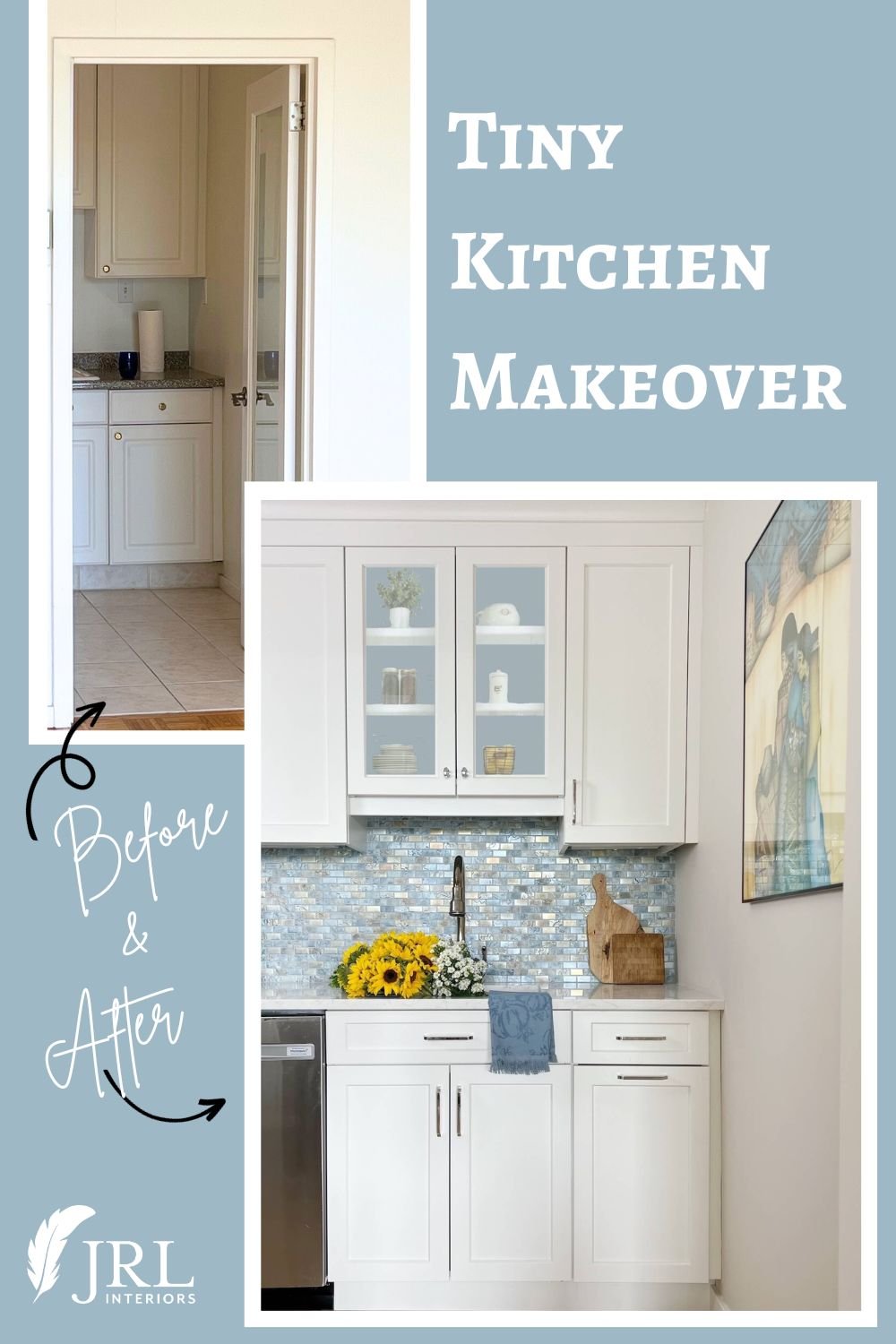
The existing layout was a galley kitchen with two facing walls of cabinetry and work space with a corridor between them. While a galley kitchen is a super efficient layout from a working standpoint, this kitchen was dark and claustrophobic, making it feel even smaller than its diminutive size.
The finishes were very dated, and the quality of them was subpar for the unit. And the installation work was less than stellar with a weird small gap between the upper cabinets and the ceiling.
While our client was not planning on making endless elaborate gourmet dinners or indulging in marathon baking sessions, she did want a pleasant place to prepare meals and treats for herself and her guests.
She had few must-haves, except this short list:
Kitchen Goals
add some light and openness to the kitchen, but without opening it completely to the living room
a section of counter where she could pull up a stool to work (something she enjoyed about her current rental)
keep the same basic cabinet and appliance layout for simplicity since rearranging would be a bigger challenge in this building
We shared the before pictures and some of the finish options back in this post and she had selected a different one at first and then reselected to this one. While any one of the choices would have been stunning, the one she ultimately went with was the overwhelming favorite of readers at the time! .
We opened up the kitchen by strategically removing the door all the way to the ceiling and some of the wall adjacent to the living room.
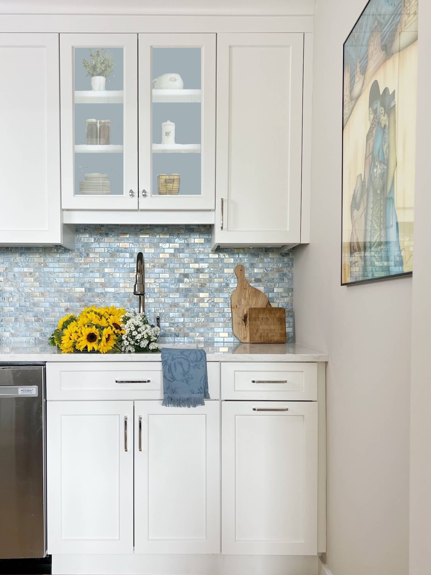
The wall opposite the entry is the sink, which now has this pretty view. The large artwork piece not only adds charm and color to the end wall, but also covers the electrical panel!
White cabinets quartz counters and iridescent backsplash tile make for a light bright kitchen view
While in a perfect world, I would have added ceiling lights, solid concrete ceilings here meant we were limited to the existing single surface mount fixture, but under cabinet lighting and the spill of light from the adjacent space now nicely supplement that.
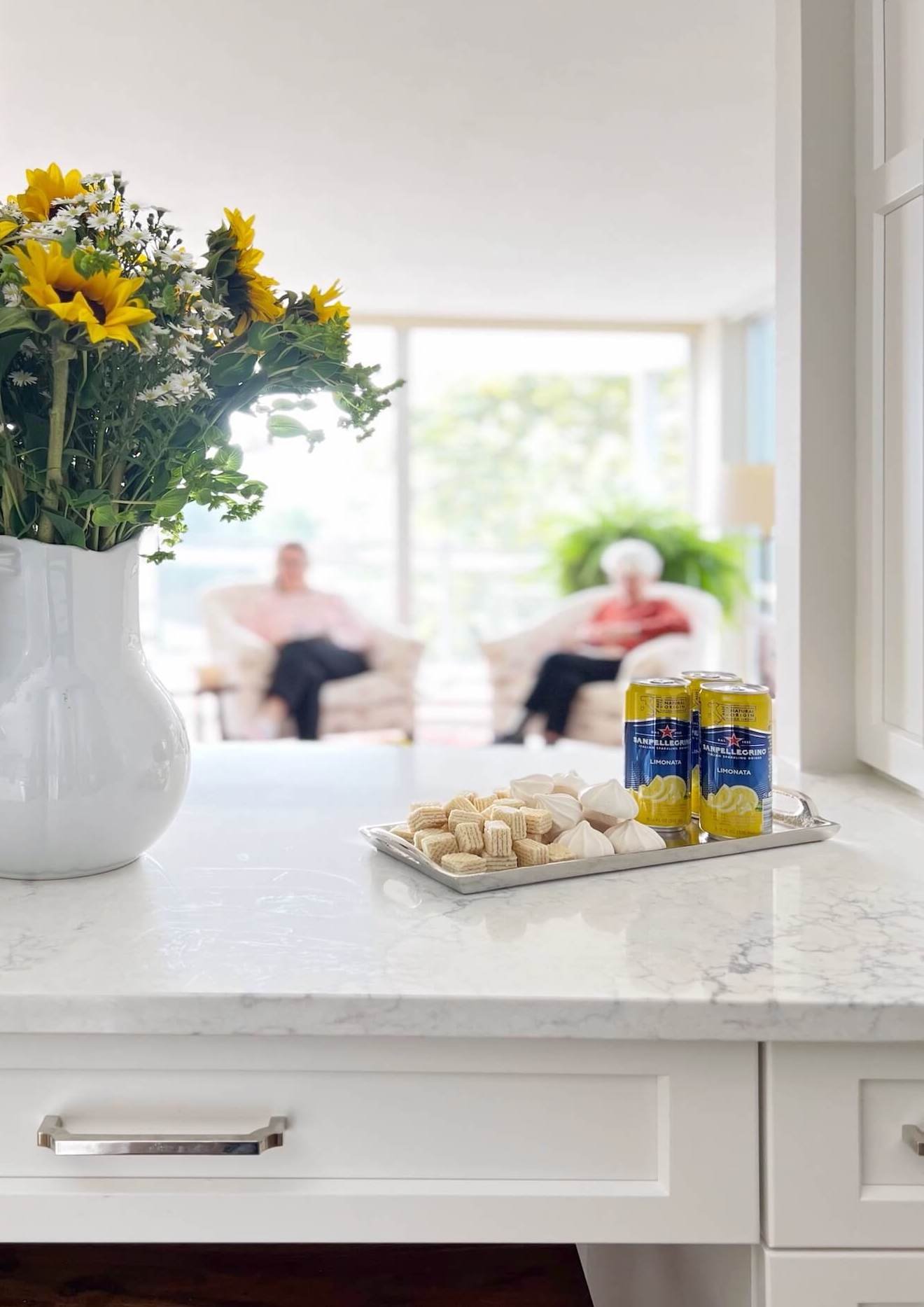
Partially opening a wall to the adjacent living space fills this tiny kitchen with borrowed light
New wood flooring in a tone that blends into the adjacent original parquet floor and wall paint that extends into the living room further expand the space.
Classic finishes in a small condo kitchen
New classic style white cabinets trimmed with crown molding extend to the ceiling. The cabinets are a mix of stock and semi custom lines to get the features we needed to maximize the storage in this tiny kitchen, like the slim pull out pantry in the sliver of space between the refrigerator and wall.
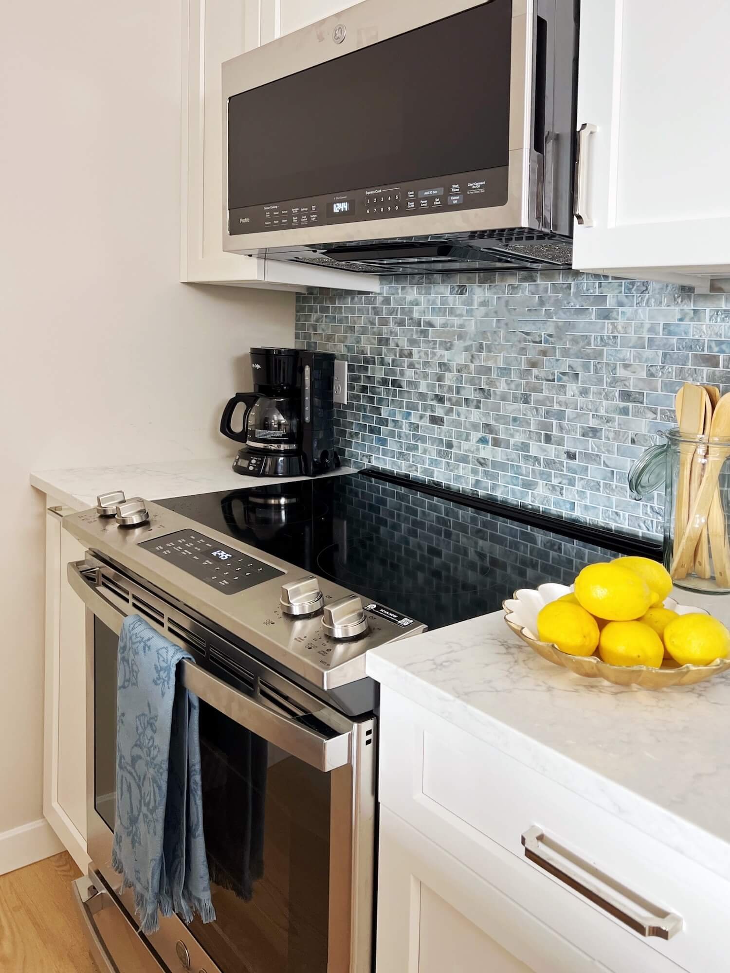
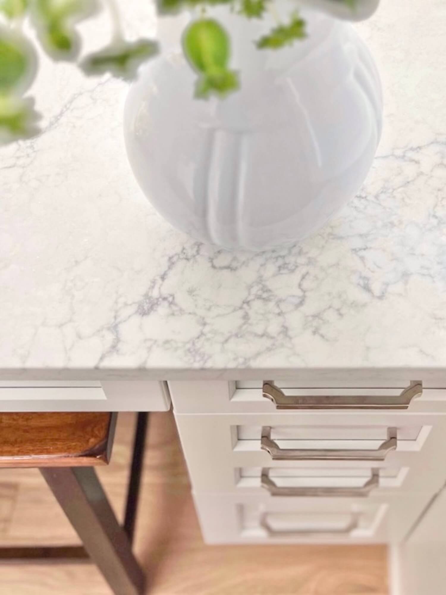
New stainless steel appliances, and marble-like quartz counters are low maintenance classics. Small details like a paneled wall for the refrigerator side elevate the view from the adjacent living room.
a counter with space for a pull up stool provides sitting space in this small kitchen
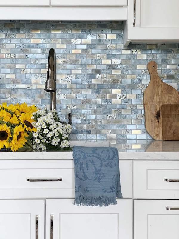
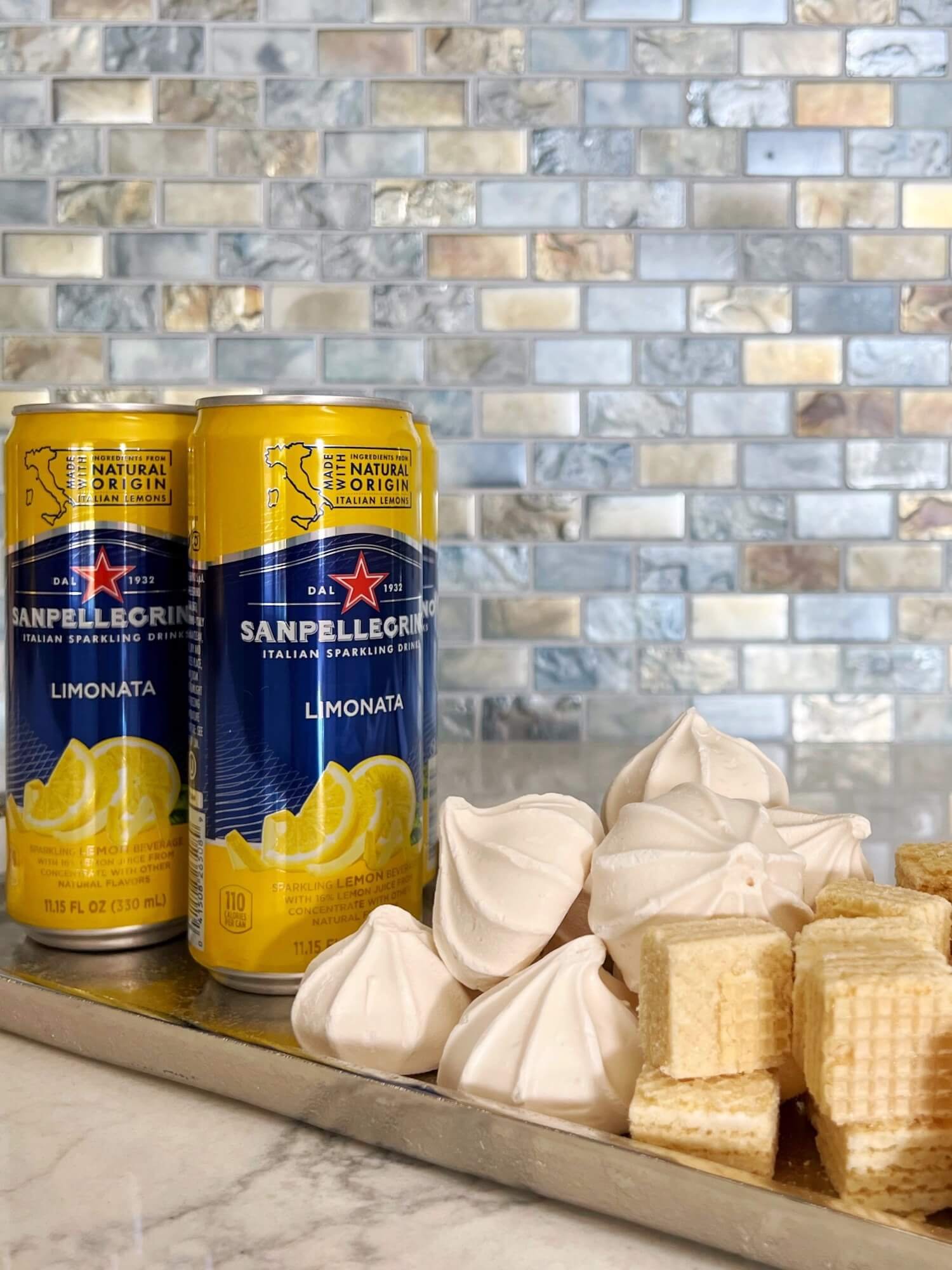
And a stunning iridescent blue backsplash with colors that shift with the changing light throughout the day, and pretty polished nickel cabinet hardware add sparkle.
The result is a fresh, beautiful, and functional space that is exactly what she hoped for!
We’ll be back next week to share the remarkable primary bathroom transformation in this condo!

