One of the most common problems in planning a design layout is dealing with an ‘open concept’ space. The charm of open concept has worn a bit thin with so many people working and schooling from home over the past couple of years.
While open plan is not for everyone and there are a myriad of reasons NOT to choose it, which I’ve talked about HERE, I concede that they do have their place.
Open plan or open concept spaces are popular for one main reason - they maximize a feeling of spaciousness by combining the main common living areas into one big happy room….whether it is really all that happy depends mostly on the combination of lifestyle and occupants, but that is for YOU to wrestle with - I’m here to help you figure out how to deal with the fallout of arranging furniture in a space with a suspicious lack of walls.
Please don’t make the mistake of lining furniture up around the perimeter of a big open concept space with a gaping ballroom dance floor in the middle - unless, of course, you are hosting daily dance classes or some indoor sporting event! An open plan space may LOOK like one big room, but it is really multiple rooms…just with less walls.
KEY STEPS TO PLANNING AN OPEN CONCEPT SPACE
Determine Zones and Activities
Decide first what zones and activities need to happen in the space. Most open concept spaces incorporate a living and dining area and sometimes also a kitchen, but you may have different requirements if the open plan space is in a different location like a basement, attic, or outbuilding. You might be looking at TV, game table, exercise, and bar space. Or you may need to add a home office area or play space or craft space into the mix.
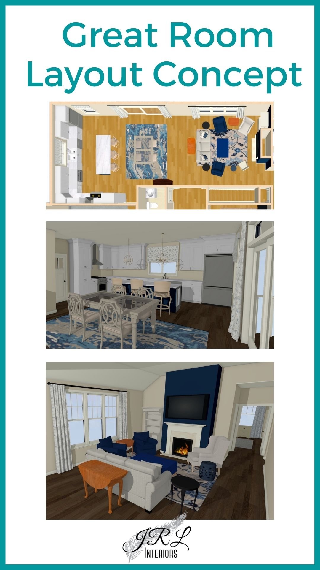
But if we are talking about a typical main floor great room, defining the kitchen is easy - especially if this is an existing room and not a new build. Hint: cabinets, counters and appliances are a big clue 😏. If you have choices about where to locate the kitchen and how much space to allocate for it, that is a much bigger conversation and those answers will be determined by a number of factors. We reconfigured the builder plans for this new build to give the clients the kitchen of their dreams. Read more about the design process of this kitchen/great room HERE.
After that, deciding what goes where will depend on your goals. Do you need seating that focuses on a view…or a TV…or a fireplace or all of the above?
How far are you willing to walk with food from the kitchen to the dining area?
What do you see as you approach the space?
We redesigned the entire kitchen as part of the great room overhaul in this beach front vacation home, but the view is the star of the show and everything is arranged to take full advantage of it.
In this project we are working on for a city loft space, we defined a dining zone that doubles as an entry/hub for the space along with two seating areas. The thought process went like this:
Create a sense of entry for the view as you come into the space with a foyer table. That table will double as a dining table since it is convenient to the kitchen.
Create two seating areas that take advantage of the views and the natural division created by support columns. These areas will have different moods - one set for more intimate conversations and one to accommodate larger groups.
Reuse/reupholster some existing furnishings and add some new furnishings including a chaise near the windows.
Define the Areas for Each Zone
One of the simplest ways to define an area is with a rug. Sometimes that is not practical for each zone, for example if it will mean the rug extends halfway into a main walkway forcing you to walk half on/half off a rug…this is no bueno. But most of the time at least two of the zones can accommodate a rug. Another way to define zones is with a change in ceiling height or with lighting…such as a chandelier over a dining table.
Multiple complementary (NOT matching!) rugs in an open concept space are great, multiple chandeliers are usually not (though there are exceptions).
How big a rug should be is determined by the room and the furniture. PLEASE don’t use yoga-mat-sized rugs forlornly sitting in front of the furniture. This is never good, but is especially bad in a larger space. THIS post has a handy guide for how to select the right size rug.
Chandeliers should be sized appropriately for the furniture and the room and hung at the right height (more on how to get light fixtures right HERE).
This open concept basement space was planned for the owners desire to have a TV and exercise space in addition to a pull down wall bed for occasional visitors.
The rug in this space was sized so that it wouldn’t interfere with the path to the kitchen. This space is open to the kitchen on one side and to the rest of the main floor on the other, so a complementary rug was selected for the adjacent dining area.
this contemporary abstract rug was chosen as a part of the pattern mix and sized to work with the seating group without impeding a main walkspace
the dining area in this open floor plan repeats the colors used elsewhere and contains a rug with a complementary large scale floral pattern
Arrange the Elements for Each Zone
Treat each zone like you would if it were its own room…because it sort of is! But, like in all homes, it is vitally important that the spaces work together or “flow”. This can be accomplished with consistent and complementary colors and finishes.
By consistent I do NOT mean matchy-matchy, I mean they work together in an artful composition with a rhythm of repeating elements…those elements may be colors, finishes, styles, and shapes. That rhythm is so important. It is what prevents the chaotic result that might otherwise occur in a big space with a lot of different pieces.
You also might want to have one or two outliers in the mix to give the space a jolt of energy, but everything cannot be competing for attention. Pick one or two “stars” and select the rest of the pieces to complement and support, not detract.
Your stars might be artwork, rugs, or a bold textile pattern. More advice on mixing patterns HERE.
An artful pattern mix enlivens this great room sitting area
On the other hand DO pick something to be the star. Even if you are after a clam, serene minimalist aesthetic, something to court your attention or incite conversation is what keeps a space from being terminally boring.
Of course, as always, before you do ANYTHING - say it with me - you must have a plan. Whether you choose to enlist the eyeballs and experience of a professional or tackle it on your own is up to you, but if you are purchasing new items, even a consult may help prevent expensive mistakes.
If you are DIYing your project, take comprehensive measurements and draw everything out on graph paper, or outline it on the floor with painters tape to get an idea for how it will feel.
Also, while your space may be large enough to handle massive furniture pieces, always look at the path to get them TO the space to make sure they will fit through any doors, halls and stairways on their way in…many furnishings are not returnable and you REALLY don’t want an expensive lawn ornament!
Other posts you might enjoy:
Is Open Concept the right choice for you?
How to arrange furniture in a long narrow room
Modifying another builder kitchen layout


