You never get a second chance to make a first impression…and neither does your home! The paint colors you select are a big part of the face your home shows to the world, choose wisely! Choosing exterior paint colors is totally different than selecting interior colors. With interiors, the colors intensify and with exteriors the colors wash out - especially in sunlight! There are many factors that influence exterior color selection.
Pay attention to the quality of light around your home
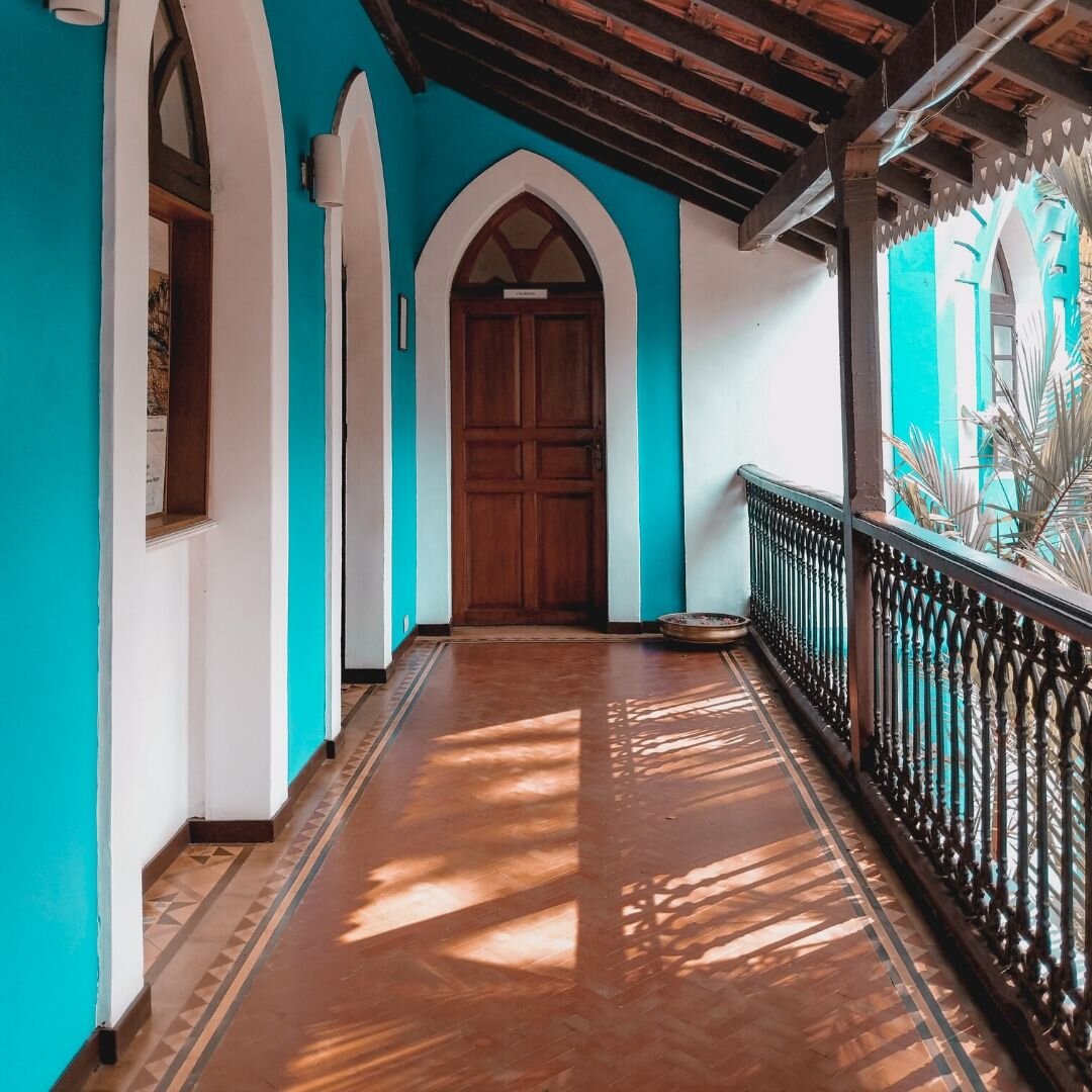
Tropical climates with stronger light can handle much purer and brighter colors and look charming - as opposed to looking like Fisher Price plastic toys, which is the vibe those same colors will give off in a different area of the world!
A tropical home in a clear, bright turquoise and white
Pay attention to the architecture and personality of your home
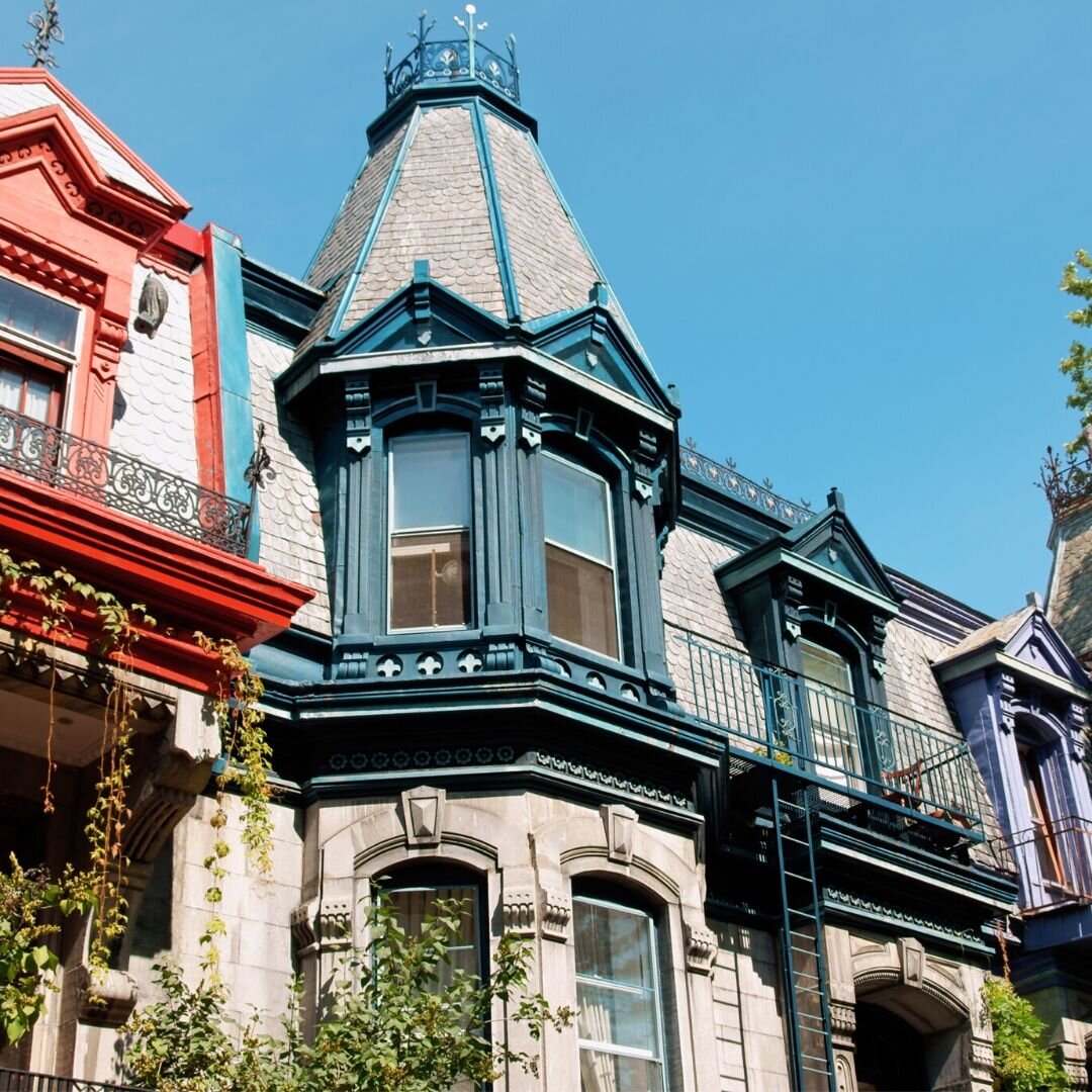
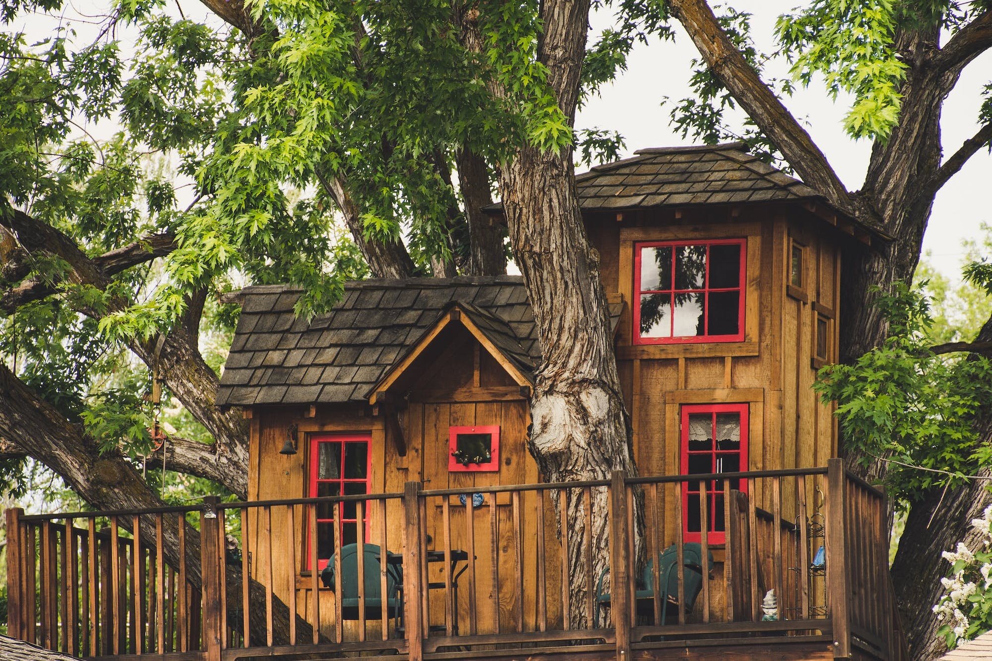
A farmhouse calls for a different color scheme than a Craftsman bungalow or a Queen Anne victorian. Contemporary homes and cabins are often designed to harmonize with nature and are then suited to wood tones of browns and grays. Historic style homes are most appropriately attired in classic colors that make reference to their vintage. And alongside these architectural considerations, you need to determine the personality you want your home to convey. Is is to be striking or charming? classic or artsy? dramatic and edgy or calm and serene?
Colorful trim sets apart these Victorian limestone rowhouses
Pay attention to the fixed elements of your home
Don’t forget to take into account the elephant in the room - the roof! Ignoring the roof color is the single biggest error I see. A reddish brown shingled roof is never going to look good with slate gray paint on the siding. You must also take into account any masonry stone or brick on the house and in the landscaping. That neutral “safe” taupe if it is the wrong shade, can look pink next to stone that has yellow or green tendencies. All pigments, and most particularly neutrals, are made up of a variety of hues, and what you perceive as color is influenced by its immediate surroundings.
A charming treehouse in natural wood stain blends with the trees, but a dash of vibrant red trim adds personality
I recently got an inquiry for our new virtual paint consultation service from a previous client. She currently has a charming cottage in a coastal New England town and wanted to recreate the color scheme of her former home. We asked for pictures from various angles and set out to make some selections. Her old house was a cape style house with lemony yellow siding with white trim and a purple door. Her current home, however, is a refurbished antique with a stone foundation, gravel paths and driveway, and a red brick front walkway and chimneys.
Front BEFORE painting
Driveway side BEFORE painting
Rear BEFORE painting
The gravel is quite prevalent and has a warm reddish orange tinge, as does the brick. We needed a warmer creamy color to blend nicely with these fixed finishes rather than a greener yellow. The house is currently an ivory color with the same color trim and a startlingly white fence. I think we can nudge the house in a yellower direction for her with the right choice and choose a lighter creamy shade to highlight the trim a bit and tone down the fence. In terms of purple for the door, a rich eggplant/plum shade of purple on the redder side of the spectrum is the right solution.
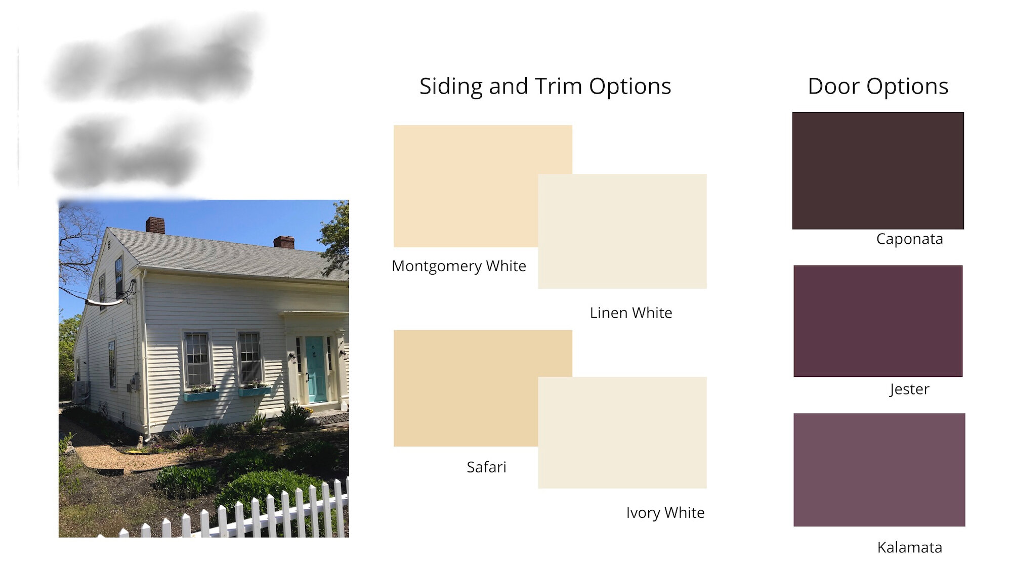
Benjamin Moore exterior paint color scheme
Here are the color options we proposed. As with all things paint, I recommend getting larger swatches of the colors under consideration and viewing them in the location you plan to use them to confirm your choices before you start.
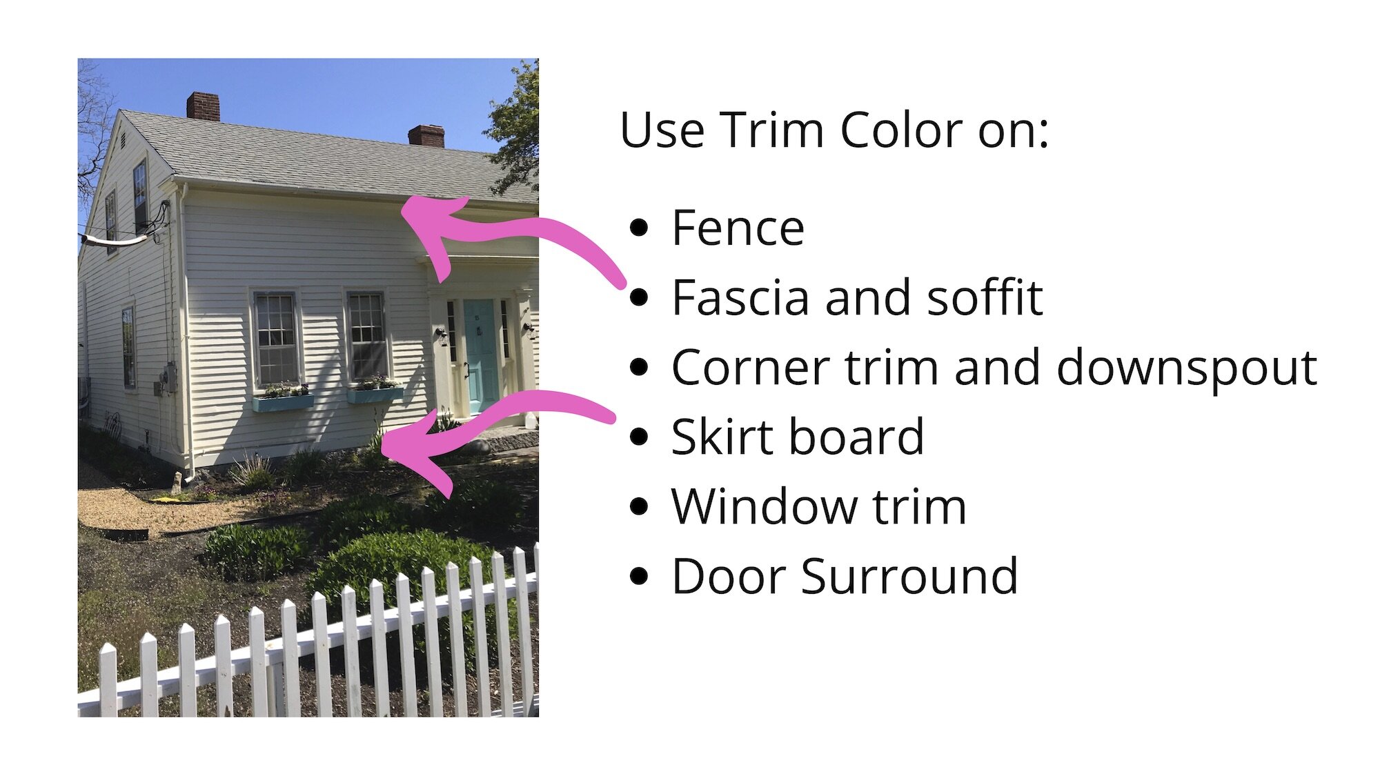
We offered 2 options of a buttery yellow in different intensities for the clapboard, and a pair of ivory options to highlight the trim. We also offered 3 shades of plum in varying degrees of depth for the door, and outlined the placement of colors as shown in the document below.
The door colors ranged from a plum called Kalamata, to a deeper, more saturated plum call Jester, to a nearly black eggplant color called Caponata.
Want to see what she chose?
She opted for the Montgomery White with Linen White trim and for the accent color chose Kalamata. Although she really liked the Jester color, it turns out, her painter was from Kalamata, Greece, so was there really any other choice?! Side note: please don’t judge paint colors by the names. There are some lovely colors with the MOST bizarre names. You can read an entertaining post about some of the weirdest paint names here.
She was delighted with the outcome and kindly sent me some photos and a note:
“The house looks great, even better than the pics, thank you for your help! The Montgomery White looks like butter…I’m very happy! All my neighbors love the colors! “
CK, Massachusetts
Painting your home is an investment, and you will likely live with your choices for the next 8 to 10 years so choose well! If you would like to explore getting professional personalized guidance for your choices, you can read more about our Virtual Paint Consultations HERE, or purchase our guide to Choosing Paint Colors with Confidence HERE.


