We are working on a kitchen and bath renovation project right now with a dear long time client that is moving from a rental condo into a condo down the hall that she has just purchased. And it needs some love.
The building is vintage - built in the early 1960’s, and as such, is a bit quirky. The flooring is the original parquet, I believe, and the kitchens and baths were updated in an unfortunate design era.
I was originally contracted to help with furniture layouts and planning what to move, but as the need for renovations and the myriad of decisions that needed to be made started piling up, our Designer by Your Side service was added to help facilitate the materials selections and layout decisions for those spaces.
Tight timelines, and the limitations of working in an older condo building meant many things could not be changed or moved.
Here I’ll focus just on the kitchen renovation.
Existing Conditions
While the layout of the galley kitchen was efficient, if small (all the kitchens in this building are small - the architect clearly was not a cook!), the materials and installation were just not up to the level of quality the unit should have.
My client’s biggest issue with the kitchen was not the size - she has been living with a similar size kitchen for many years - no, her biggest issue was the claustrophobic coffin vibe of a dead end completely enclosed galley kitchen that is taller than it is wide. And the lack of natural light and poor artificial light was not doing it any favors.
The kitchen is a windowless closet enclosed in a corner of a large light, bright living space with a whole wall of windows. She knew she wanted to open it up a bit to acquire some light, but didn’t want a fully open concept kitchen.
Solutions
Lighting
I suggested the coffin-vibe would be mitigated by opening part of the wall all the way to the ceiling. We’d open the existing framed doorway area…which inexplicably has a door?! Just what were the former owners doing in that kitchen that they needed to close themselves in?? And we’d open a portion of the wall above the counter as well.
This solves the natural light problem. Now the kitchen would be flooded with the light from the living room. In addition, the new cabinets would have under cabinet light strips to light the counters and some decorative ceiling fixtures as well.
Finishes
The cabinetry was largely determined by our need for short lead-times, and we wanted the warmth of wood flooring to continue into the kitchen as well. The existing living room flooring will be stained to match the new kitchen floors.
The cabinet over the sink will have seeded glass doors for a ‘window’ feel that breaks up the unrelieved wall of blank doors.
For the cabinet hardware, lighting, and faucet, we opted for the warmth of polished nickel. The curved detailing on the cabinet hardware is echoed in the curves of the light fixtures. Repeated elements and finishes create a cohesive rhythm.
We offered three options for countertop and backsplash:
Option one is a beautiful granite in a soft leathered finish with a handmade subway tile laid in a herringbone pattern.
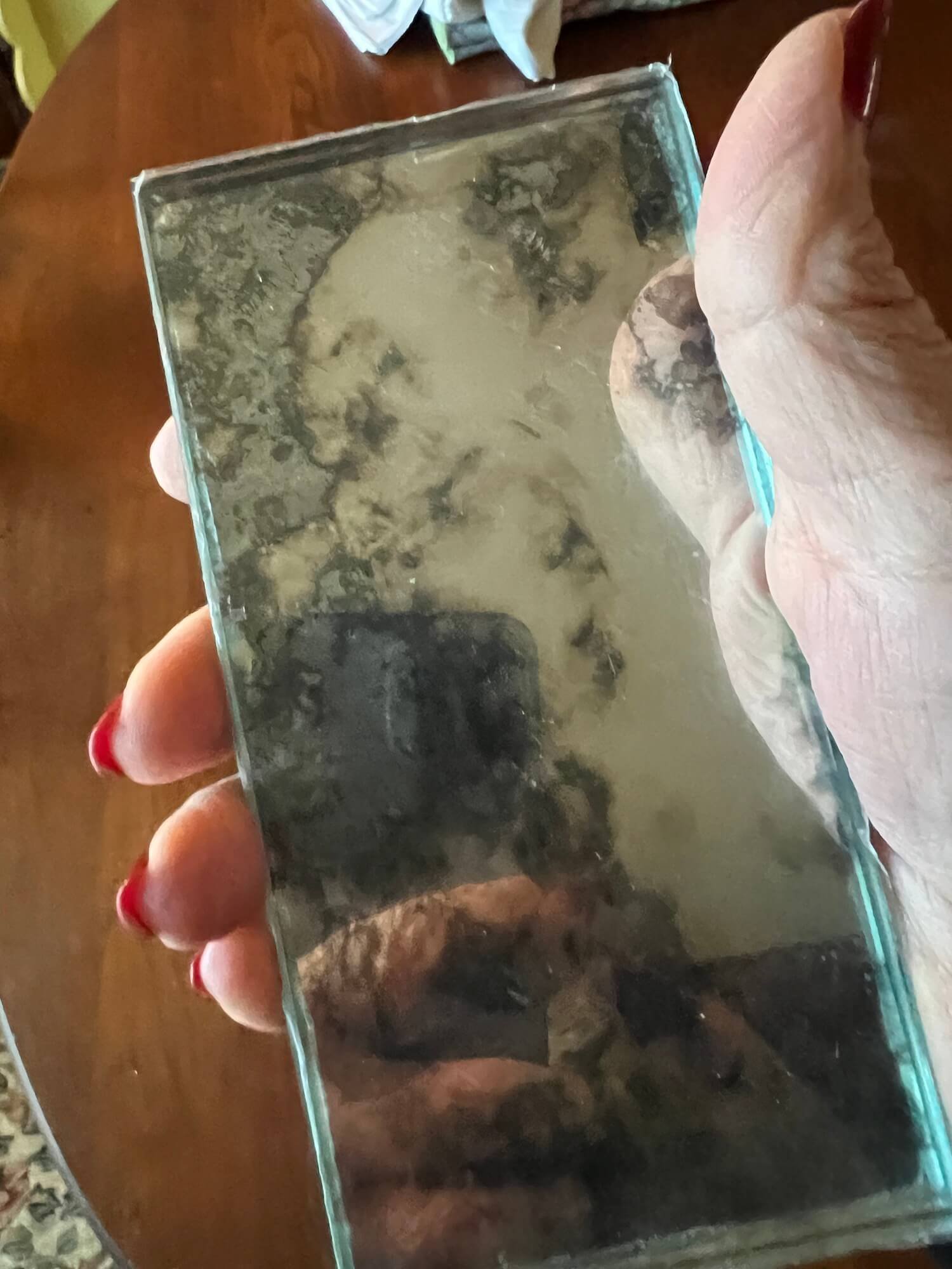
Option two is a classic soapstone counter with a touch of glamour in a gorgeous antiqued mirrored tile backsplash.
Options three is a light marble-look quartz counter with a pretty iridescent glass mosaic tile.
In the end, we decided on Option one - the warmth and colors are a perfect complement to her furnishings and the variegated nature of the stone means a lot of flexibility in choice of accent colors.
It was my favorite option for this project, and I can’t wait to see it all come together!
The mirror tile from option 2 is spectacular in person. The pictures don’t do it justice. It is going to HAVE to go on a backsplash somewhere (maybe my house?)…with black glossy cabinets and gold hardware it would be SOOO stunning.
I have been hunting for antique mirror tile for my own kitchen backsplash for YEARS and finally they are starting to make it, but a lot of it is beveled or elongated, which is fussier than I want. This one is the closest to perfect I’ve found yet.
antiqued mirror tile
What option do you like best?
I’m so happy with all we’ve chosen and more importantly, so is my client. I’m so looking forward to seeing it installed - it will be SUCH an incredible change!


