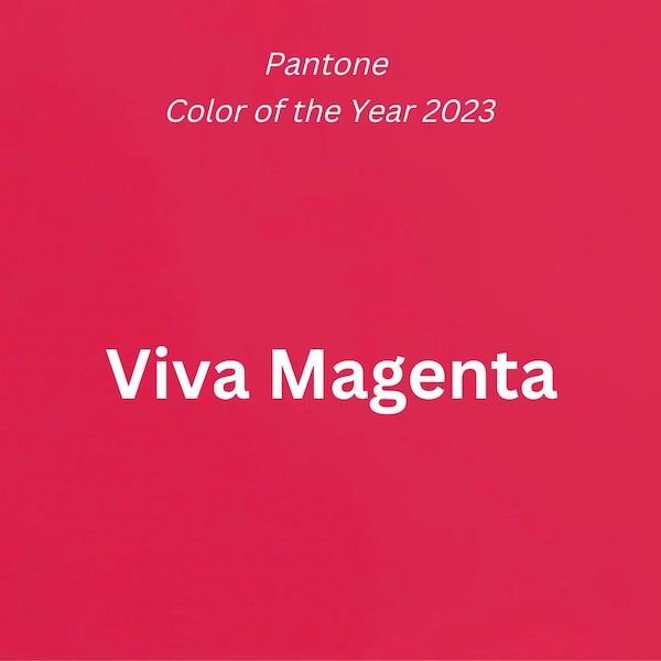
Pantone color of the year 2023 was just released this week…and the color is NOT GRAY! Yay! Instead, Pantone has chosen this vibrant red-pink, Viva Magenta.
It is interesting to note that several of the paint company color of the year selections are warmer colors and red leaning. Sherwin Williams chose a complete dud IMO (you can read the review HERE if you missed it), but it was a warmer earthier shade, and Benjamin Moore chose a vibrant red with more coral in it than its name implies (that review HERE).
The Pantone COTY 2023 pick also is a warmer hue in the red family. With this edgy graphic, it has been inspired by the colorful world of the metaverse, which they have branded the “magentaverse” for this color announcement.
Here is the Pantone description:
“An unconventional shade for an unconventional time, Viva Magenta is a signal of strength, inclusivity, and self-expression”
That’s a lot of pressure for a color?! But I do see it as a positive, happy, energetic color, in spite of the rather sinister graphic. Color always elicits an emotional response, although that response is as individual as the person.
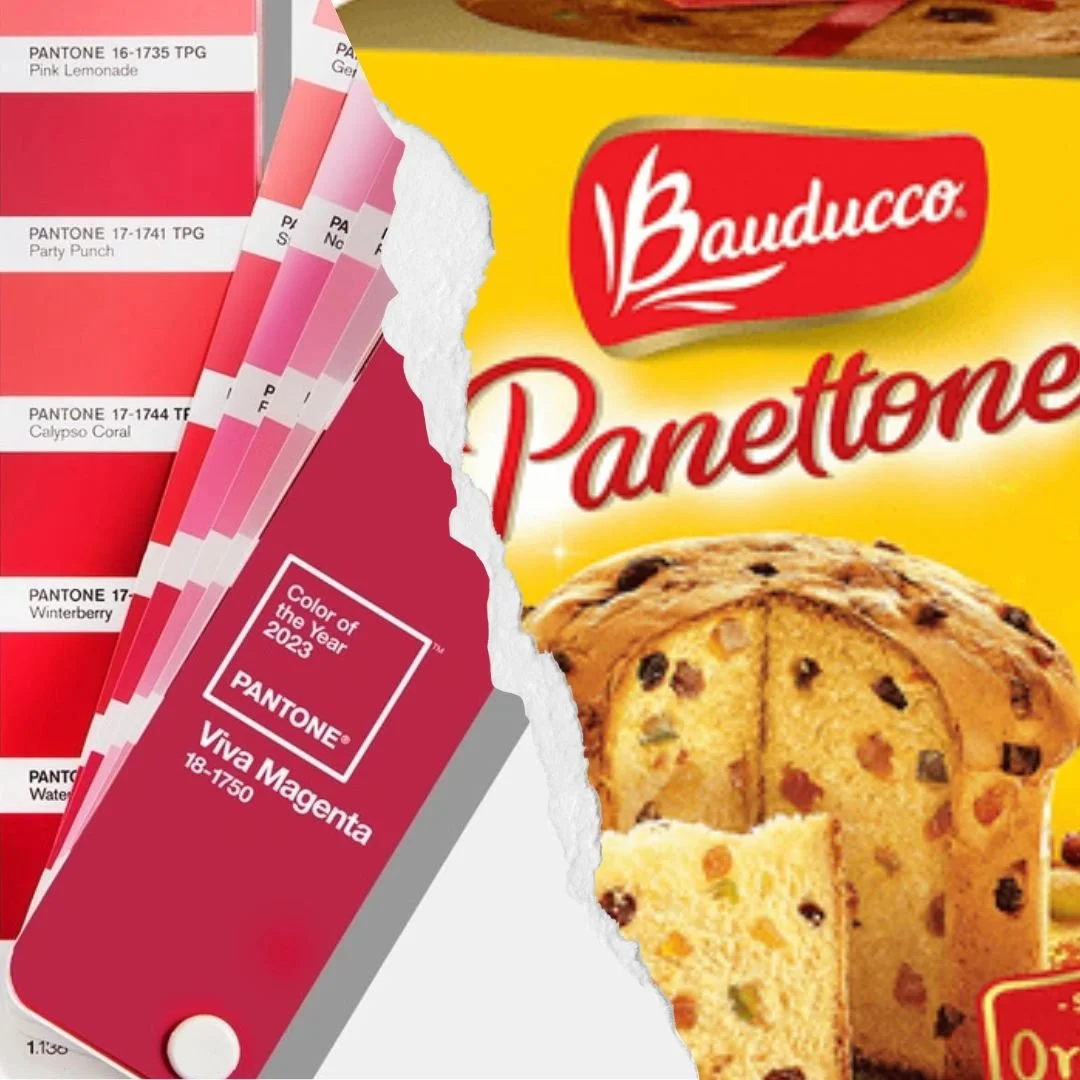
SO, why is this important? and who cares? Well, Pantone, not to be confused with the Italian sweet bread, Panettone (which is delicious toasted with butter :)), is a ‘language of color’. It is a widely used database of standardized colors used for color matching by printing and manufacturing companies around the world.
Unlike paint company color of the year announcements, which are largely marketing and specific to paint, a Pantone color direction will influence thousands of products, marketing, and packaging from cosmetics to toasters.
What this means to you is you can expect to see Viva Magenta as a popular color option in many consumer goods in the coming year.
Here are some ways to inject the energy of viva magenta into your home
Upholstery
Try an accent piece of upholstery, or even a whole sofa if you REALLY love the color. Or select a fabric that incorporates this color in the pattern somewhere.
This timeless sunroom from a past project, features two current trends: floral patterned upholstery, and viva magenta in the fabric! Here we see it used as a small but powerful vibrant accent in a sea of mellower tones of yellows, greens, and blues.
Sunroom design by JRL Interiors, Photo by Eric Roth
Wallpaper
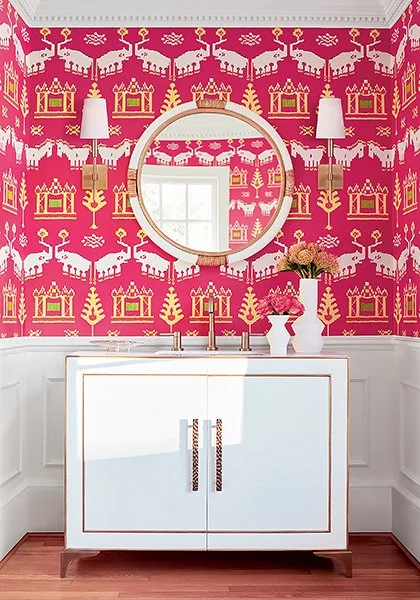
This wallpaper from Thibaut is such a fun and energetic pattern - it would totally transform a powder room, or inject a note (or maybe a whole symphony!) of playful whimsey into a living or dining space.
Ceylon Kingdom Parade Wallpaper, Image via Thibaut
Painted Furniture
A magenta painted dresser, table, chair, or sideboard would be a striking addition to inject some energy onto any room. This painted dresser on Etsy is a great example!
Paint
A whole room of this color might be overwhelming in many circumstances, but as an accent it has a lot more livability. I especially like the idea of adding it as a ceiling color. More ceiling ideas HERE and HERE.
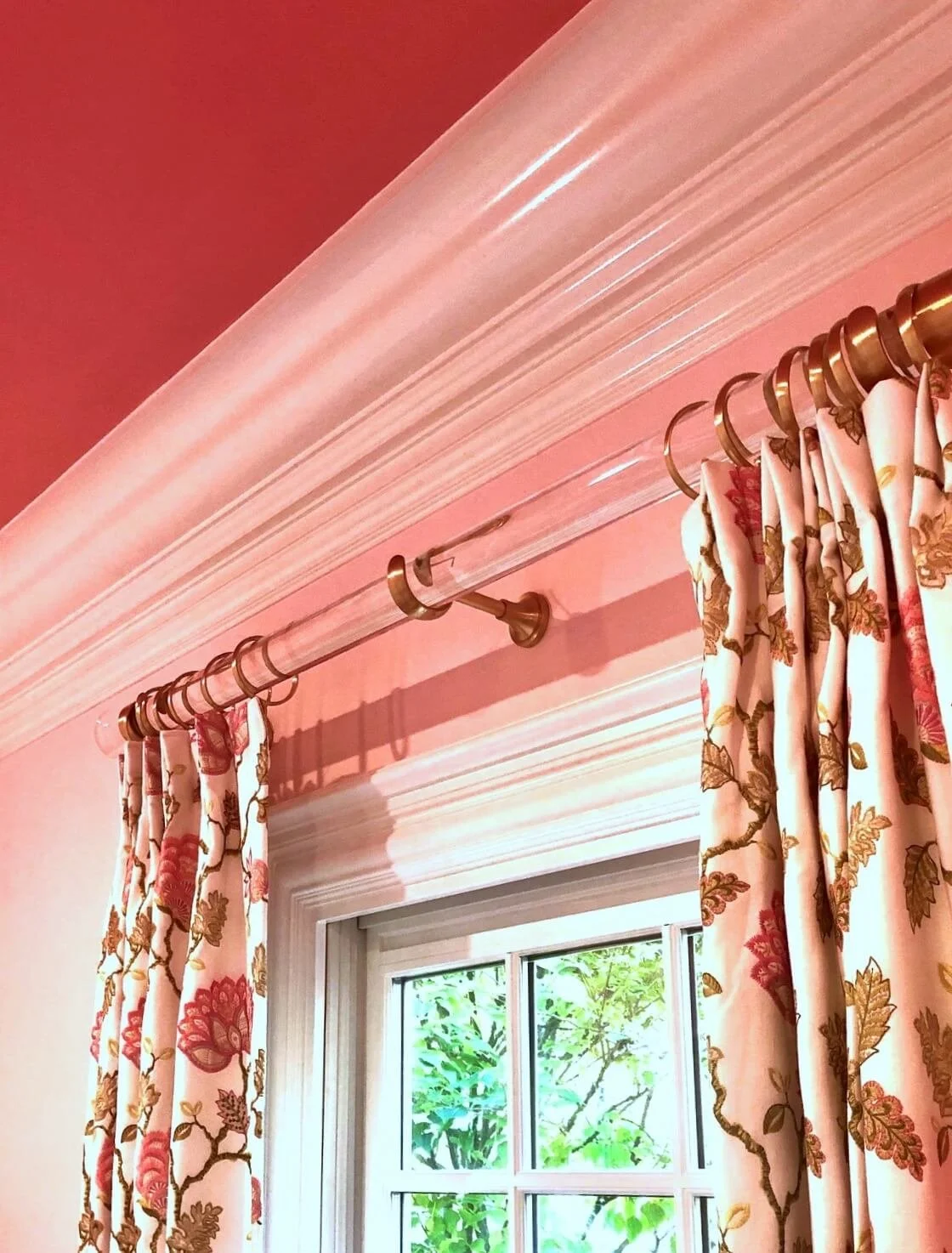
In this home office for a pink-lover, we painted the ceiling in a high gloss magenta and used fabrics with magenta alongside pink and green tones. You can see more about that project HERE.
A home office by JRL Interiors with a fuchsia pink gloss finish ceiling
I think viva magenta pairs really well with black and white for drama, or with shades of green and yellow and blue for a more garden-y feel.
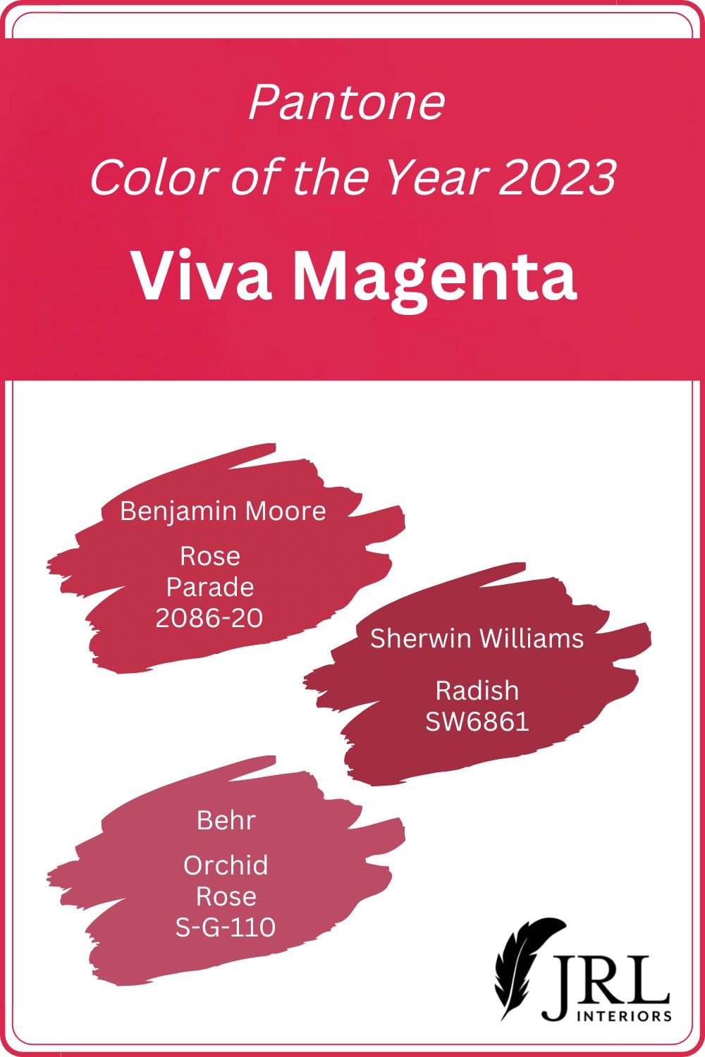
Here are some colors from three major paint companies that are similar to Pantone’s Viva Magenta. Benjamin Moore is the closest, I think.
And if you like the color but can’t talk anyone in your house into it…there’s always the Motorola Edge phone in Viva Magenta produced in partnership with Pantone.
I’m delighted to see such a happy, energetic Color of the Year from Pantone, but then, I’m just happy to be out of the #everythingisgray phase.
What do YOU think of this color? Yay or Nay?
