When our long-time clients contacted us about their sitting room project, we were delighted! We had worked together on nearly the entire rest of the home over the years…the living room/dining room, lower level family room, master suite, stairway gallery wall, various guest and bathroom spaces, and the kitchen eating area to name a few! The sitting room was the last space we hadn’t designed, though we had done a matching valance for it when we did the adjacent breakfast room.
The sitting room is one of the MOST used spaces since it is open to the kitchen. It is a sunny, pleasant space with skylights on a vaulted ceiling and a door to the courtyard patio that gets used constantly in warmer weather. It lies between the garage and the kitchen and is the main entry point for the homeowners day to day living. The furnishings were getting worn, and the artwork had been hung by default more than by design. The room was ready for repainting, and they were looking for a change to freshen the space.
Sitting room BEFORE. The only things that needed to stay were the custom valances and the one-of-a-kind table lamp - though even that was negotiable!
Design Brief
From our conversations about how this room is used we arrived at this list of parameters:
Comfortable seating for 4 (2 people most of the time)
A clear path to the garage door and to the patio door
Seating arranged to see the TV located in the corner cabinet built into the end of the kitchen counter
A comfortable place to read
Hard-wearing, fabrics
A footstool/ottoman
A new area rug
A place for the cool one-of-a-kind lamp
Retain the custom valance that matches those in the adjacent space
Select a wall color to run throughout the sitting room, breakfast area, and kitchen
Design Considerations
In addition, we wanted to be sure the furniture didn’t block the passageway by the island to the breakfast room, and wouldn’t land in an awkward place under the double window. The new rug needed to be larger anyway, but should either fill the walking path or be completely out of the walkway so you wouldn’t end up walking one foot on/one foot off the rug. It also needed to clear the floor vents, cover the discoloration on the floor from the old rug, and be cushy and inviting but low pile enough for the door to the garage to clear it when opened. We are asking a lot of this rug!
Design Solutions
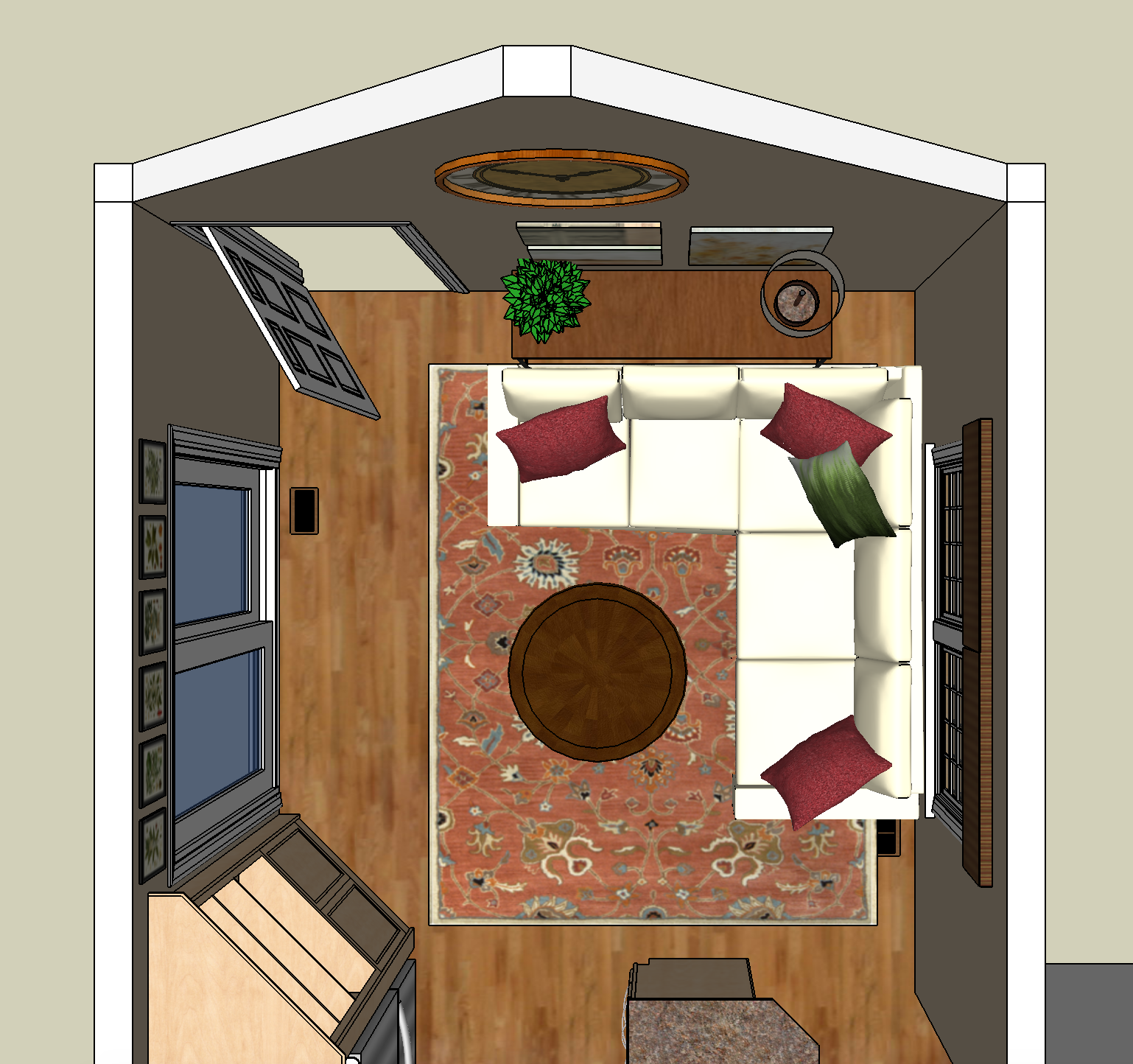
We always start a furniture design project with room layouts because this will drive the choices we make for furnishings and textiles. We offered 3 different layouts. The sectional was closest to what they had and were used to. We specified a small sectional for this option and added a console table behind it to hold lighting and bump it into the room far enough to line up with the edge of the double window. A round ottoman would double as a coffee table and footstool.
Sitting Room Layout Option 1: Sectional Sofa
The second solution used a small sofa, and two chairs, one a small scale swivel or side chair. An oval ottoman serves all the seating pieces.
Sitting Room Layout Option 2: Sofa and Chairs
The final option included 4 small swivel chairs around a center ottoman for comfort and conversation with the ability to turn easily to talk to the cook or view the TV or patio.
Sitting Room Layout Option 3: Four Chairs
Design Choices
We narrowed it down to the first two choices and ultimately decided on the second one. Concerned about crowding an area they were used to being empty, they opted to wait on the swivel chair since the space is primarily used for 2 people and it is easy to pull in one of the dining chairs from the breakfast room in the event they need seating for 4 on occasion. We could always add a second chair down the road since we weren’t specifying a pair anyway. They also had a nicely scaled and very comfortable wing chair with great lines in the living room that was a family piece that was underused in its current location. We opted to update it with paint and reupholstery and use it for the new sitting room. The current end table, lamp, and an extraneous small table from another room would be perfect for this arrangement. The oval ottoman was changed to 2 cube ottomans on wheels that can roll around to serve as tables, seats or footstools as needed.
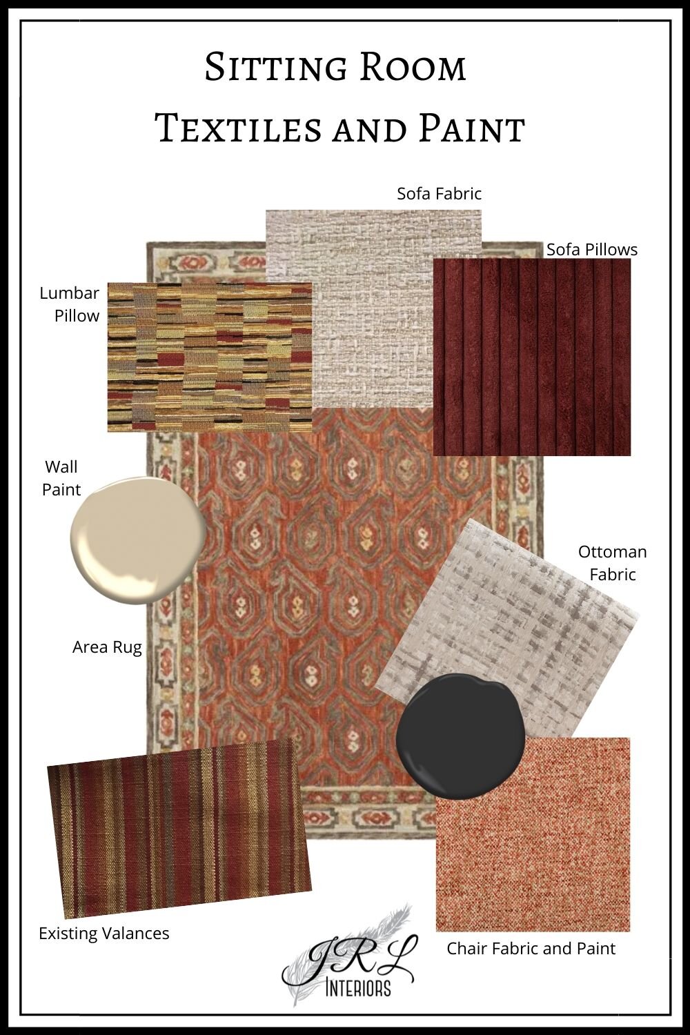
Textile options were presented to go with the current striped fabric in shades of khaki, brick, and taupe on the windows. Black as an accent color picks up on accent finishes in the neighboring spaces. Every room can use a touch of black! (click HERE for more inspiration on decorating with black)
One of the biggest changes to the feel of the space is the new wall color which was selected to go with the kitchen finishes and backsplash as well as the window fabric. It is a light-mid tone khaki/beige that warms up the walls and brings character and life to the space!
Seven different patterned textiles are used in this space (not counting the herringbone throw we added when styling the finished room!) Click HERE for tips on how to mix patterns
The finishing touches were some artwork from their travels which contained the perfect colors and would be ideal with a bit of reframing, and a new large scale clock to fill and highlight the peaked portion of the wall. The working side of the patio door is right adjacent to cabinetry so presented no space for drapery panels. Instead we opted to add a series of artwork over the door. From somewhere in the basement :-), our client came up with a series of collectible plates of Lewis and Clark expedition images that proved the perfect solution! The round shape would echo the clock, and the mix of colors and images worked beautifully. We selected and hung 5 of them.
3D Rendering showing artwork placement and approximating furnishings
Installation day picture of the sitting room
A pair of rolling cube ottomans serve as coffee table OR footstools OR extra seating in a pinch! #cubeottomans
A wood tray with black iron hardware turns the ottoman into a table surface and corrals remotes #woodtray
A herringbone throw and cozy sofa pillows are an invitation to relax #customthrowpillows #customottomans
The new and improved sitting room is a blend of familiar treasures and new and comfortable appointments, and our clients are enjoying it every single day!
We’d love to help you create a space that YOU love! Contact us to schedule your free discovery phone call to start the conversation.


