What in and what’s out for interior design trends in 2023?
While we always advocate for decorating your home in whatever pleases YOU, here are some trends to watch and some that we think should be left behind in 2023.
IN
Warmer colors
Reds, corals, mustard golds, and *gasp* beige have been trending for a while now in the home furnishings industry - often alongside a heavy dose of green (nature’s neutral) we’ve seen these colors emerging at the High Point Furniture Market since 2021.
Additionally, the Sherwin Williams, Benjamin Moore, and Pantone color of the year announcements all offer further confirmation that this trend is coming on strong. (Click on links for more info on using these colors…or not!)
OUT
Gray and white modern farmhouse everything
….or what the latest hilarious McMansion Hell post refers to as the greigepocolypse. Not that gray and white is BAD or even out of style, just the default of using it everywhere regardless of the circumstance (we’re looking at YOU spec builders, and flippers…) is blessedly waning in favor of more color in general and warmer neutrals.
IN
Traditional Style
Yes, classic style is back! Not that it ever really left, but it is enjoying a resurgence in popularity in a bit of a departure from minimalist and rustic styles.
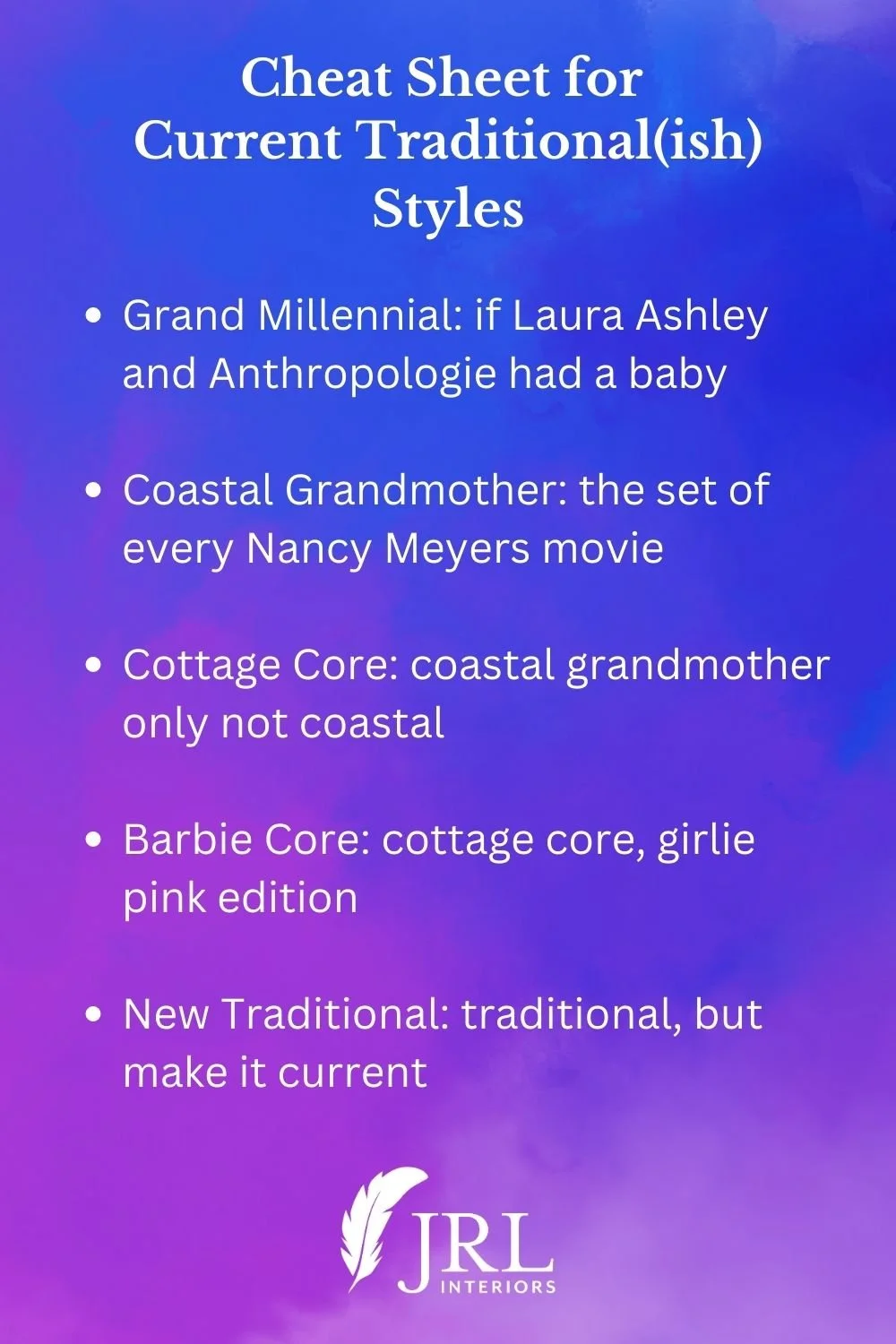
We’ve seen this manifested recently in the popularity of…if you’ve been keeping up…
Of course, there are way more options for “traditional” than that. Traditional generally means styles with roots in European classical styles.
Beautiful trims and glorious patterns and textures in fabrics are back in vogue.
Dressmaker details are appearing on window treatments, furniture, and pillows.
“Brown” (stained wood) furniture is rising in popularity as well - not as a suite of furniture, I don’t think that will EVER be in style, but as part of a collected look.
A smattering of antiques and/or vintage pieces add interest and patina and a sense of comfortable elegance and history to a newer space.
Scalloped piped details enhance dining chair slipcovers, and a layered table skirt features 3 fabrics and tassel trim in this gentleman’s farmhouse dining space. Design: JRL Interiors, Photo: Eric Roth
OUT
Faux farmhouse with its mass produced versions of corrugated tin, fake barn wood, and an army of instructional or inspiring ‘word’ signs is finally fading into obscurity (we can only hope!).
REAL farmhouse will always be in style…(check HERE to determine if your farmhouse vibe is on point)
IN
Natural elements and textures
Again, this trend has been building steam since the 2021 home furnishings markets. Our innate need for a connection to nature is driving this trend.
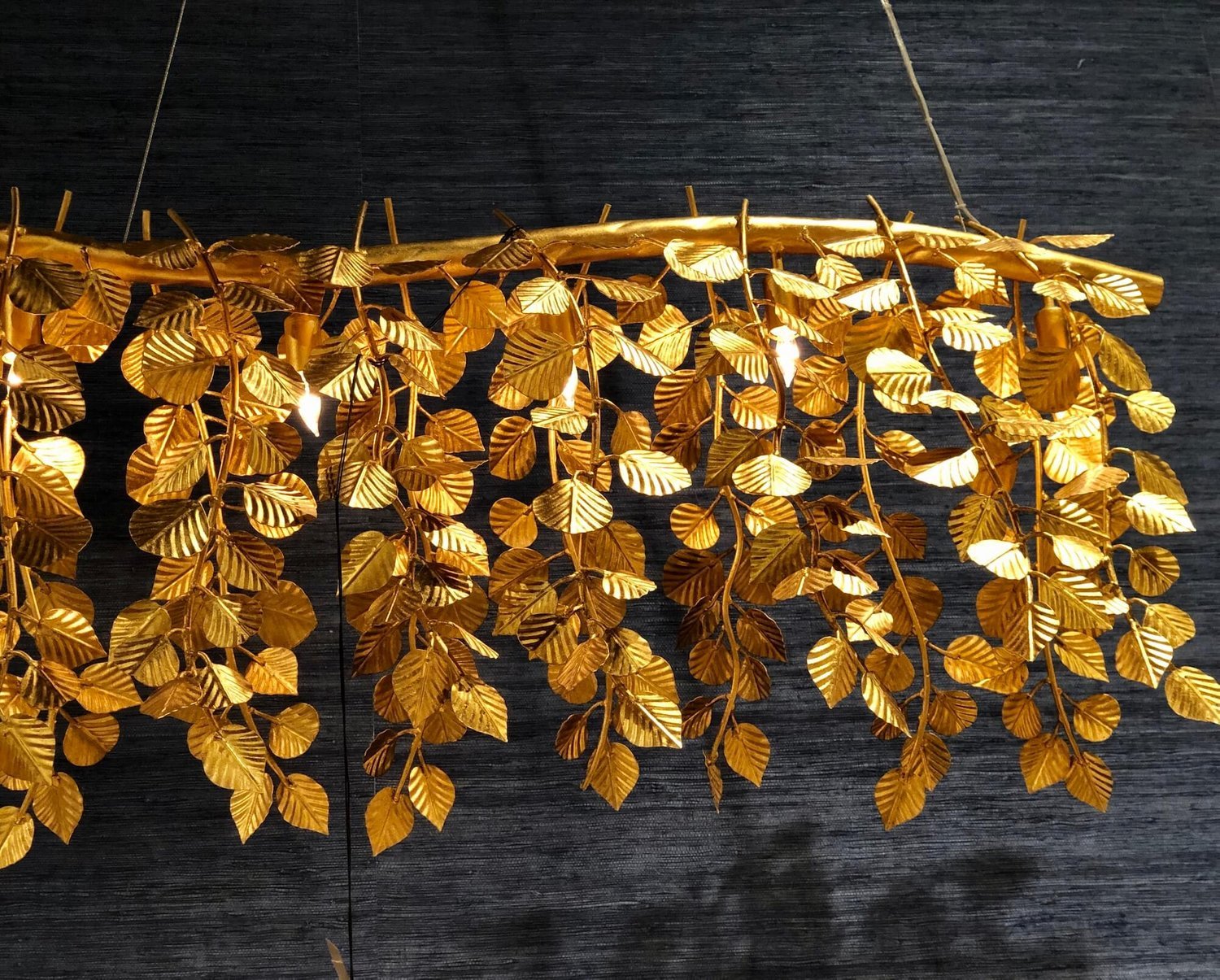
Reeding, caning, bamboo, rattan, and wicker are not just for outdoors anymore. They are showing up in everything from case goods and seating to light fixtures. And they are used in natural stained finishes as well as painted ones.
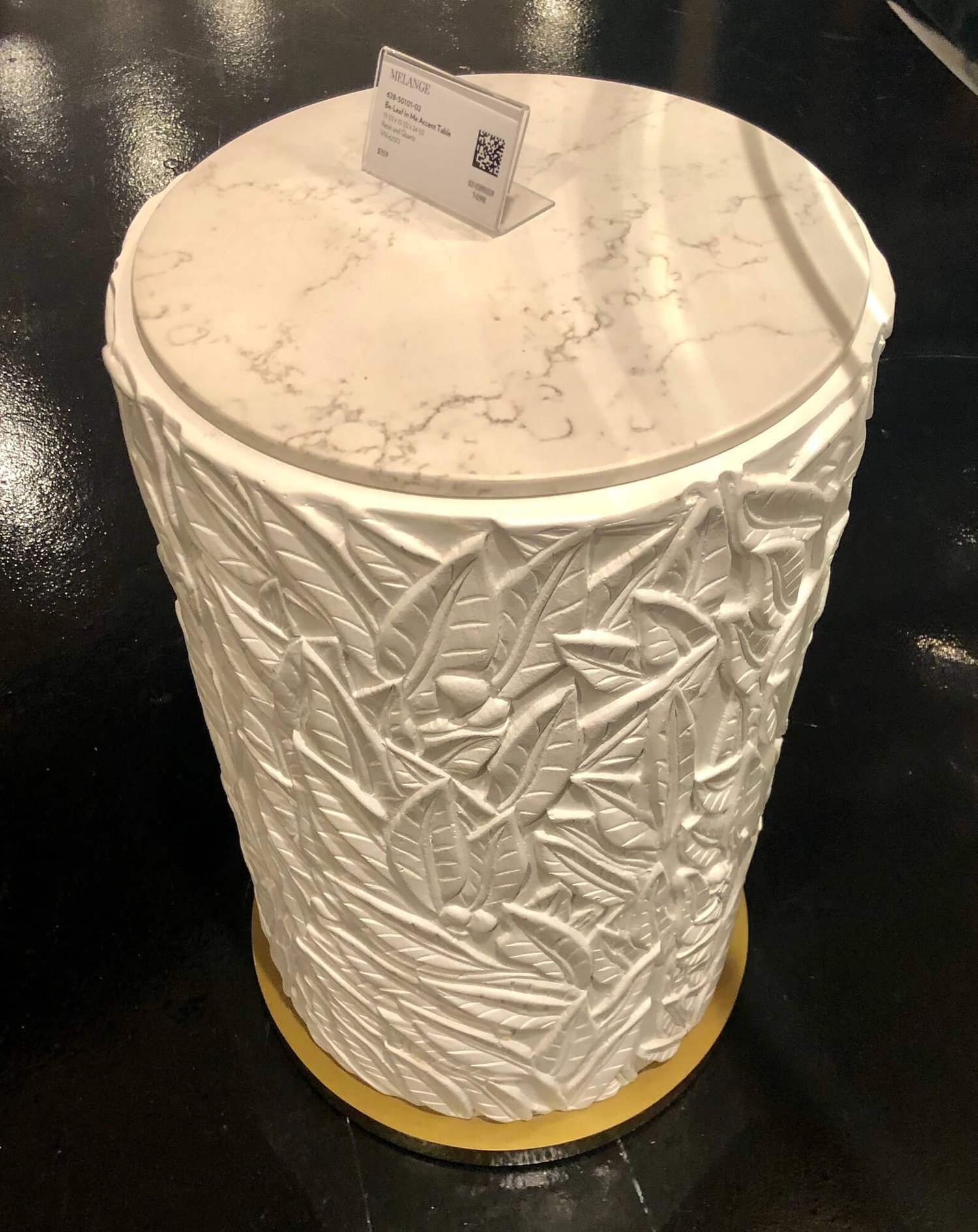
Leaf, vine and botanical motifs are details that appear in textiles, on carved details, and in the metalwork of lighting and cabinet hardware.
Also, actual plants. These add so much life (no pun intended!) to a room! Speaking of houseplants…the decade of the fiddle leaf fig as the only option for stylish trees has been dethroned by olive and citrus trees and palm varietals.
OUT
Uninviting surfaces and questionable greenery
A whole sea of slick ‘don’t touch me’ metal and plastic surfaces are best reserved for the doctors office.
Ditch the dust covered fake plants, especially the ones planted on top of the upper cabinets in the kitchen (why was this ever a thing??? - and yes, in the folly of my youth I admit to being guilty of it.)
Excellent faux plants in pots in logical locations and ones realistic enough you would be tempted to water them are fine (especially if you have the houseplant acumen of someone like me!) Plastic plants in shades of green not found in nature are decidedly not fine.
IN
LED bulbs (and the newer LED fixtures with integral bulbs)
While I will always mourn the demise of my beloved incandescent bulbs, even I will admit that LED bulbs are WAAAAY more efficient and are getting better at mimicking incandescent light all the time….as long as you choose the color temperature wisely (check our guide here to get your light bulbs right!)
LED ribbon chandelier with integral bulb
IN
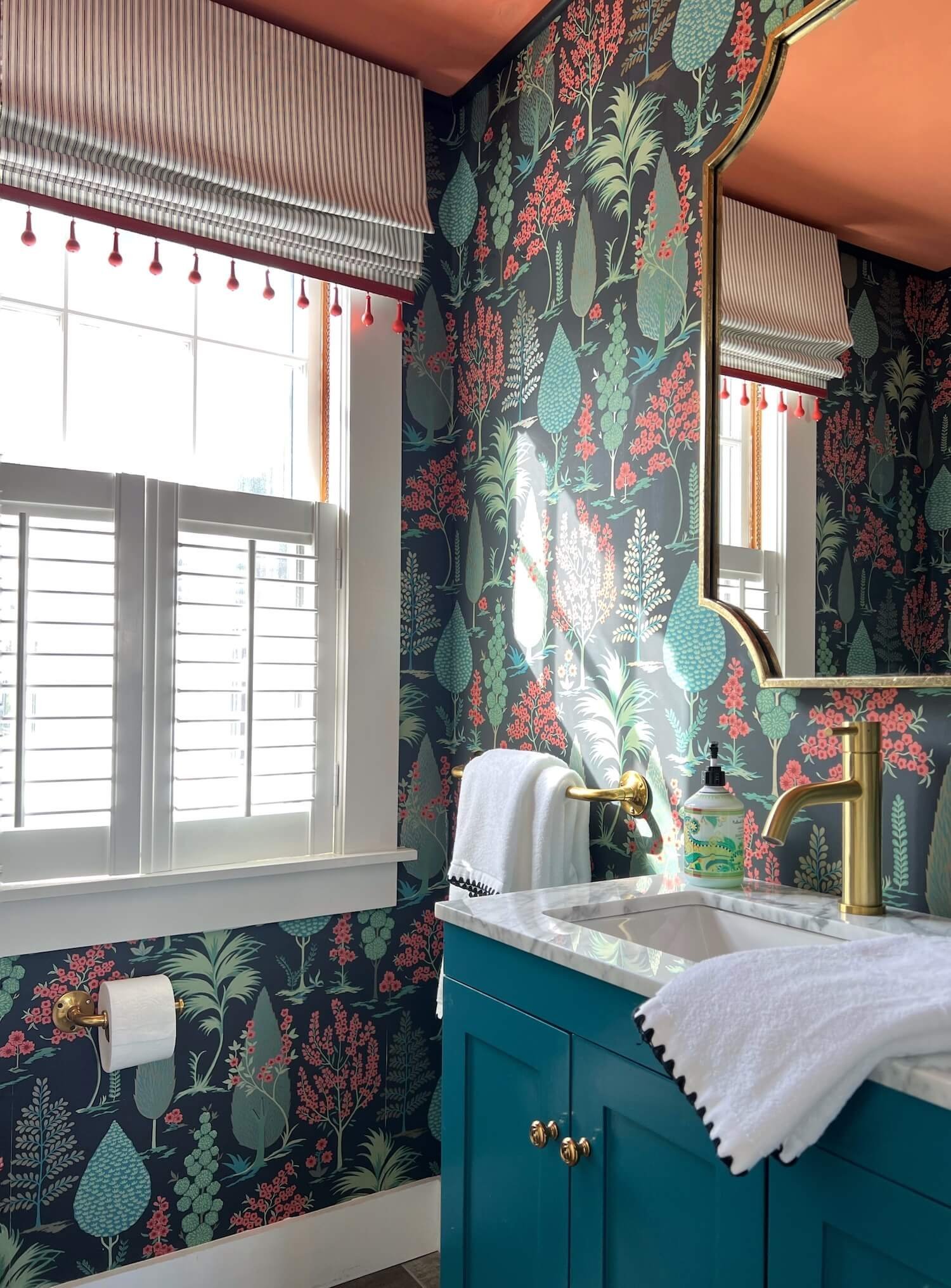
Wallpaper
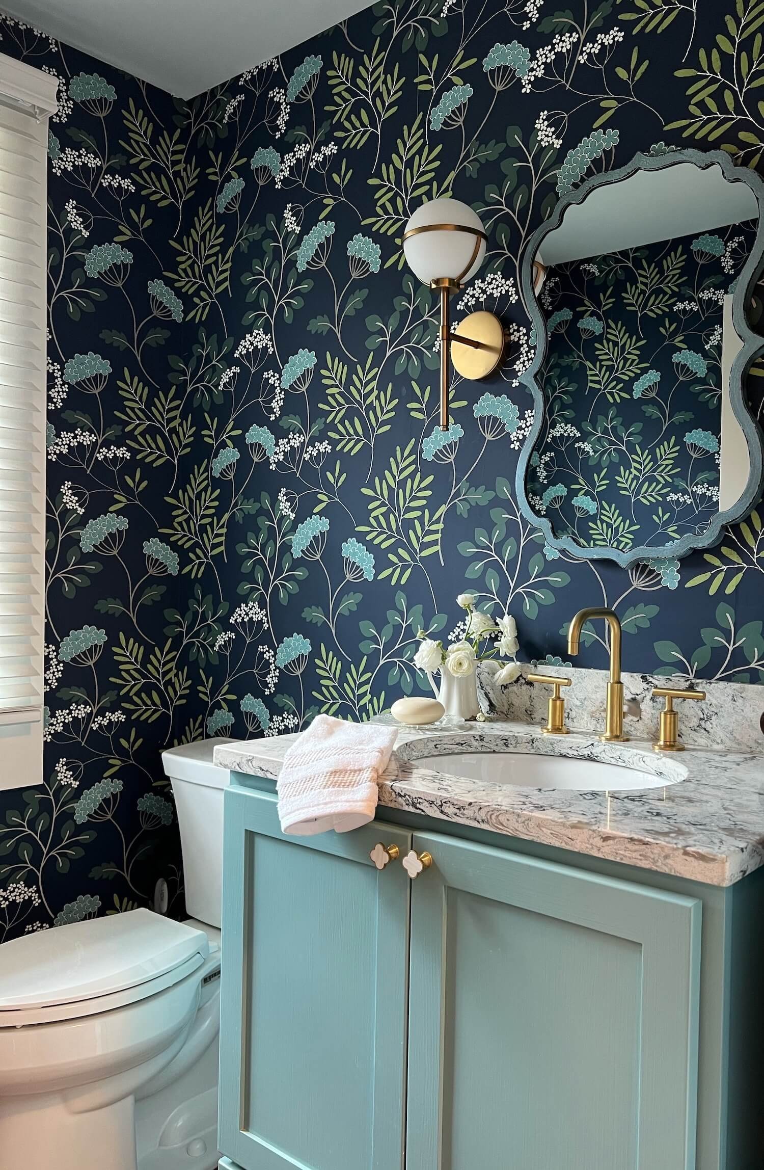
Yes really. And not that surprising since color and pattern are back in style. Wallpaper is the easiest color and pattern bang-for-the-buck.
It is a great way to add instant personality to a room, the back of a bookcase, a closet, or a feature wall. It is also an excellent disguise for less than perfect walls.
I love to use it in powder rooms where it has great dramatic impact, like these two from our recent antique farmhouse project:
OUT
Boring walls
Don’t default to a sea of boring, featureless neutral gray for a lack of decision making or because HGTV is still mistakenly stuck on the gray train for ‘resale appeal’.
Bland does not have any of the emotional appeal required for successful real estate sales.
AND, gray is rarely perfectly neutral - most grays are really another color masquerading as a neutral and they do not all play well together. Often with disastrous results.
Choosing paint colors, even neutrals, is part art, part science and depends on many factors. A gray might be the best choice, but it might not, and it should be a well thought out decision not an ‘I give up, there are too many options’ cop out.
If you have perfect walls and gorgeous millwork, a shiny lacquer paint treatment in a dramatic color (even a gray) can be a stunning option!
IN
Comfort and livability!
Honestly, the goal of good design is always to make life not only more beautiful, but easier, more comfortable, and more welcoming as well.
Hard working, easily cleanable performance fabrics (or treatments that turn any fabric into a performance fabric) are the standard for upholstery now.
Rooms and spaces that are flexible are critical. For example, a space that can double as home office AND guest room, or a living room comfortable and welcoming for empty nesters AND cleverly designed to accommodate gatherings of family and friends.
OUT
Rooms that are just for looking at, not for living in
Precious fabrics and furniture that is just for show is decidedly out.
If you are old enough, you remember the era of the “good” furniture - the stuff we weren’t really allowed to sit on unless it was a special occasion and we were dressed up. And lord knows, food was out of the question!
The minimalist stark white room is the modern equivalent of that. Honestly, any room where you ruin the design by being in it is no longer an ideal.
Houses are not museums to be observed, they are havens where we celebrate and embrace life and loved ones.
