The first announcements for paint Color of the Year (COTY for short) 2024 have started to roll in, coming first from Behr and Sherwin Williams HGTV Home this week.
And it’s ONLY August…I’m not in a hurry for summer to end and in no rush to get to 2024, but the color announcements are always interesting, even if they are more about marketing hype for the paint companies than anything else.
They are selected based on perceived trends in consumer habits and as such are *maybe* a slight predictor for what we’ll see more of in available home furnishings, textiles, and cabinetry colors.
It’s a bit of a chicken and egg thing as to whether the consumer or the manufacturer drives the trends. Manufacturers try to predict what consumers would buy, consumers buy what manufacturers make….so who is really making the trends happen? Are they even really trends at that point??
Of course, I am a big believer in using what you like regardless of what happens to be trending.
I am a test case of this as I have been planning on changing my kitchen cabinet color to an elegant black forrrrreever and am only now getting around to it 🙄. I WAS way ahead of the trend, in my mind at least!
Okay, on two the colors in question:
Behr Color of the Year 2024
The Behr pick for 2024 is another neutral - last year it was a light neutral with an uninspiring name (IMO), this year it is a dark one. This year is Cracked Pepper, a soft charcoal black with hints of brown undertones that nobody can really object to as a color AND it has a blessedly charming name! Not all colors do as evidenced by these doozy weird paint color names
This image via Behr of Cracked Pepper, Color of the Year 2024
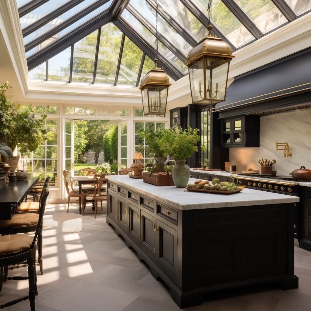
I think they could have done better with the images for it. I created a couple of AI images for it using text prompts in #midjourney that showcase it in much prettier surroundings!
imaginary kitchen with Behr Cracked Pepper cabinets created with AI via #midjourney
The beauty of this dramatic neutral is it can pair with a number of other colors nicely and still work. Use it to create a moody room, add dramatic contrast, or up the elegance of a piece - even inexpensive furniture looks more refined when painted black.
imaginary office with Behr Cracked Pepper cabinets created with AI via #midjourney
Black is a classic: Think Steinway grand pianos and glossy black entry doors!
I have always asserted that every room needs a touch (at least) of black, so naturally I give this COTY an enthusiastic thumbs up!
Sherwin Williams HGTV Home Color of the Year 2024
Well that is a mouthful! And a bit confusing, as this is the HGTV Home pick of SW colors. Later in the season Sherwin Williams will pick THEIR choice for color of the year 2024 as well.
After the 2023 COTY from Sherwin Williams there is nowhere to go but up IMO (I was NOT a fan - you can see why here).
The Sherwin Williams HGTV Home color last year was markedly better than the SW pick - it was Darkroom, a soft black-brown not dissimilar from the Behr pick this year, but with more purple and brown in it.
I like Sherwin Williams a lot and specify their paints fairly often - they have a number of really beautiful colors. You can see a whole house palette of Sherwin Williams from a project HERE.
This year is a color in the same family as last years unfortunate SW (not SW HGTV Home) pick, but with a little more oomph so ever so slightly better, but still not the hit I had hoped for.
Persimmon is the Sherwin Williams HGTV Home selection for COTY 2024. I would argue that persimmon is a lovely name and actual persimmons are often a beautiful orange almost tomato color, but this paint is not anything like the color of most actual persimmon fruits.
And the SW and HGTV website images it is featured in are not doing it any favors by mostly pairing it with stark whites and blacks. Bleck! It looks like Halloween gone wrong.
I think under the right circumstances, it might be successful as a wall color with warm creams and wood tones and/or some patterned fabrics, but straight up by itself, it is a little uninspiring.
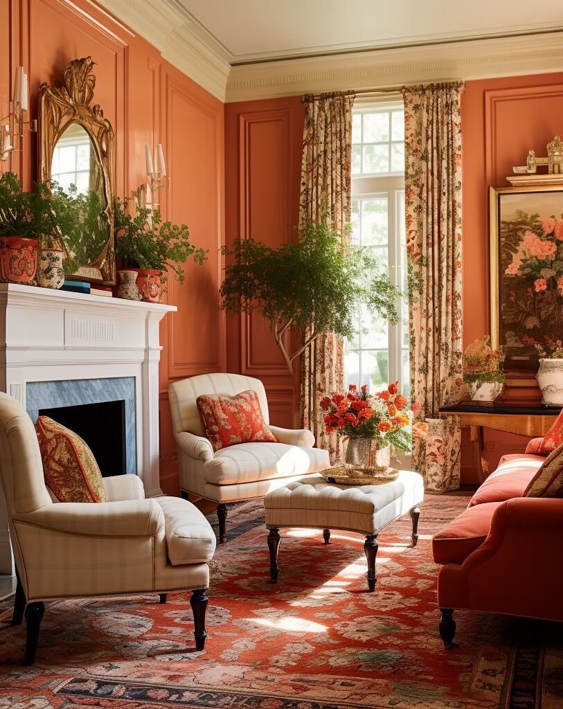
I tried generating some imaginary rooms with AI using text prompts in #midjourney. Even the AI bots thinks persimmon should be a deeper color…even specifying pale persimmon walls got me this image on the left, so I tweaked the image to get closer to the SW paint color (right).
Here is another AI incarnation with this color, this time a bedroom…I again had to tweak the color in editing to get it close…the AI bots solidly refuse to produce this paint color 🤣. I do think it is WAAAAY more successful paired with warmer tones even if it is just shades of cream and warm woods.
imaginary bedroom with SW Persimmon walls created with AI via #midjourney
It resembles a peach more than a persimmon, but that name is already used in several other colors in the SW paint line so I guess they had to get creative!
These photos illustrate the importance of pairing the right neutrals with your colors. I’m definitely warming up to this color seeing it with the creamier tones and some patterns, but I still prefer either paler or deeper versions of it.
What do you think of Behr’s Cracked Pepper and SW HGTV’s Persimmon? (Independently, not necessarily together - I don’t love Halloween and am really not a fan of black and orange as a combo!)

