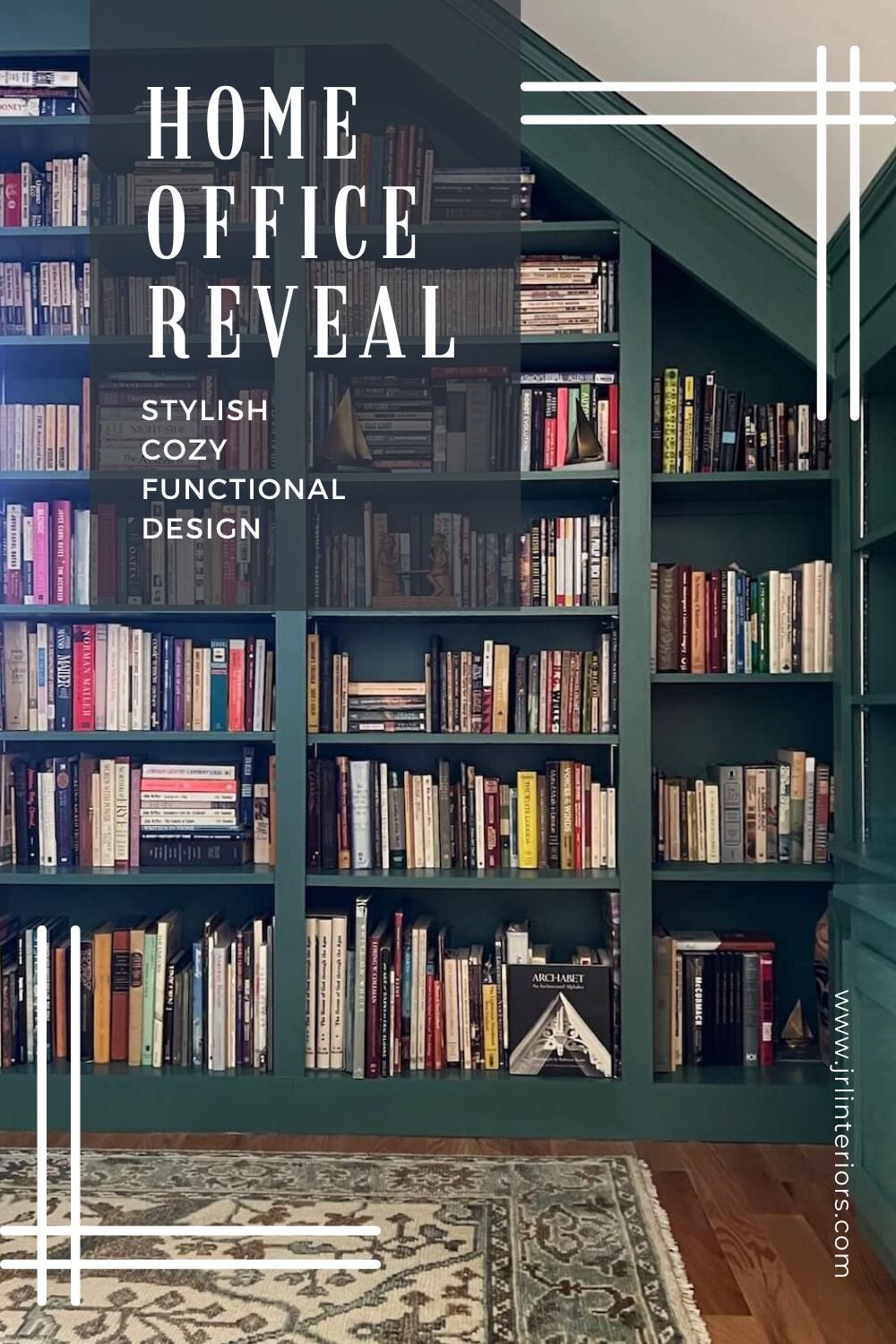
As part of a new build project with mostly open plan living spaces, these lovely empty nesters wanted a place for a home office to showcase some family heirloom pieces and to house their many books.
This is the same new build project where we revamped the builders kitchen plans to give the homeowners the kitchen of their dreams. You can also see the photos of the finished kitchen here
The clients moved in over a year ago, but I just got back to get some pictures, so today I wanted to share the process of maximizing the space for this small library.
An alcove under the eaves just off the loft area on the second floor was the location of choice. It was not a large space, but with careful planning would be perfect for a pocket sized office/library space.
As with all projects, we started with the clients needs and wants for the space.
On the wish list:
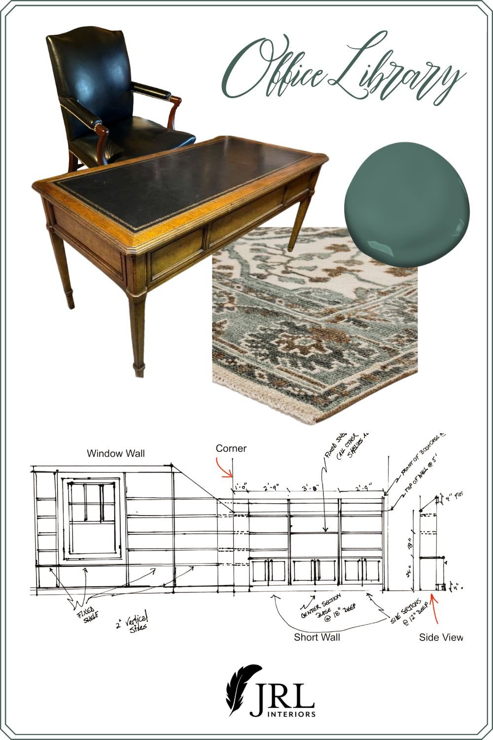
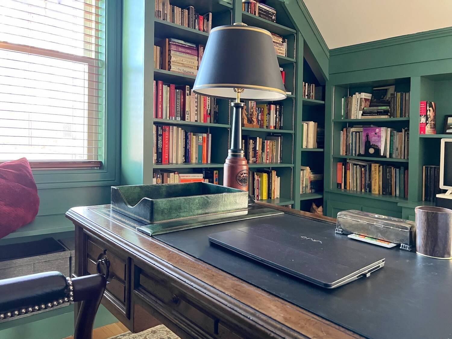
Use a beautiful antique desk and chair they had
Provide space for some eventual extra seating
A place for a small television
Ample storage for a lot of books
Some covered storage for office supplies, etc.
Design Solutions
Built-Ins
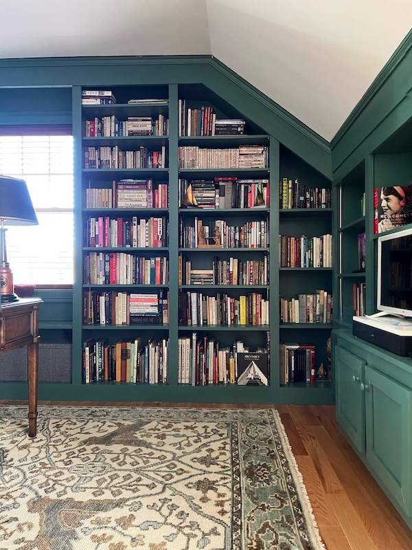
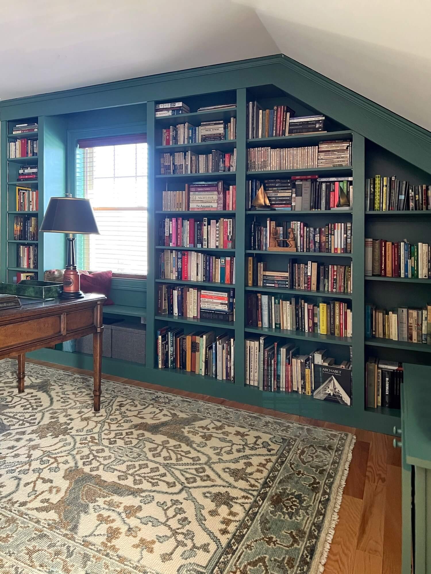
I knew building in the short wall under the pitched roof as well as the adjacent wall would be the best way to maximize storage for books and supplies. You may remember the draft of the bookcase design from this post on custom bespoke design details.
The short wall also houses a lower section of covered storage with a deeper center section for storing bulkier items. This wall also has a space carved out of the shelves for a small television.
The window wall was built with fitted shelves floor to ceiling and under the the window, creating a small windowseat ledge.
Furniture Layouts
As a bonus, in several of the layout options, I was able to fit in a beloved corner cabinet piece from their former home. The wood tones of it blend beautifully with the antiques. The alternative was to build in more bookshelves .
Decisions, decisions…use a furniture piece they loved or have even more book storage?
In the end, they opted to use the corner cabinet, and to float the desk.
Finishes and Textiles
For a cozy library feel, I wanted the walls with the built-ins and the window millwork all painted in a deep color. Green is a favorite color of the husband and this was primarily his domain.
It is also a great foil for the antique wood pieces.
To determine the exact paint shade, we first needed to select a rug. (paint is always the LAST thing to select). I offered these four options in green and blue-green colors.
The window blinds were ordered in a stain that echoes the tones of the wood pieces.
Accessories
Accessories are the finishing touches that give a space personality. Whenever possible, I like to use things that are meaningful and important to the clients.
These clients already had perfect items for the space - a pair of ship paintings, and a model ship on a shelf adorn the walls. A wood and black lamp is an ideal companion for the desk.
Rooms are living spaces…in the sense both that they are spaces for living and in the sense that they are ever evolving not ever ‘done’.
In this space, there is plenty of room to add a comfy barrel chair - which the homeowners are finding they would like to have.
I’d also add an ottoman for put-your-feet-up comfort, and a small drink table - every chair needs a handy available surface to set down a book or drink!
See? You CAN use dark colors in a small space to great effect! This cozy library space is big on function and style!
Other posts you might enjoy:

