I have had the privilege of working with the loveliest couple for the last year on a project to transition to a new living space.
I was originally hired for our ReNesting services to create a moving plan to help them know what furnishings would translate to their new space and where they would go.
Moving is stressful enough without having to worry about how your furnishings may or may not fit in your new place, and these clients were moving from a sprawling five story Victorian home to a more open plan condo converted from a decommissioned cathedral. The soaring scale and open layout could not have been more different than their original home, but it was magnetic in its appeal.
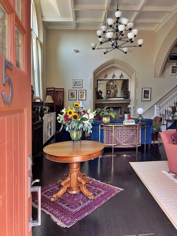
This particular unit appears to be part of the original church nave. Arched stone windows no longer have stained glass, but the stone arches remain, as do the two foot thick pillars, arched partitions, wall niches where icons once resided, and vaulted ceilings.
Project Goals
Reuse as much of their furniture as was workable
Plan for additional storage
Plan for display of their cherished collections gathered from around the globe
Provide spaces that are cozy for two people but also work beautifully for entertaining a crowd for frequent book groups and dinner parties.
Our ReNesting services presented floor plan options and color schemes, showing the locations for existing furnishings and rugs and specifying sizes for any new furnishings and rugs and the footprint for various built-ins to add key storage.
As often happens, they hired me beyond the ReNesting plan to help them realize the vision.
In any house, but of utmost importance in an open plan one, a consistent color story needs to be established for at least the public spaces. Existing pieces from various rooms coalesced around a common color palette of reds, golds, greens and blue tones providing the logical color palette for the new space.
I specified new fabrics and sisal-look rugs and some key furnishings and drew up plans for various custom and built-in pieces.
The condo had been professionally decorated by the previous owners, so many of the finishes and fixtures remained.
Artwork was curated and used to create a number of gallery walls, giving life and personality to this new home.
The Results
Here are some of the spaces:
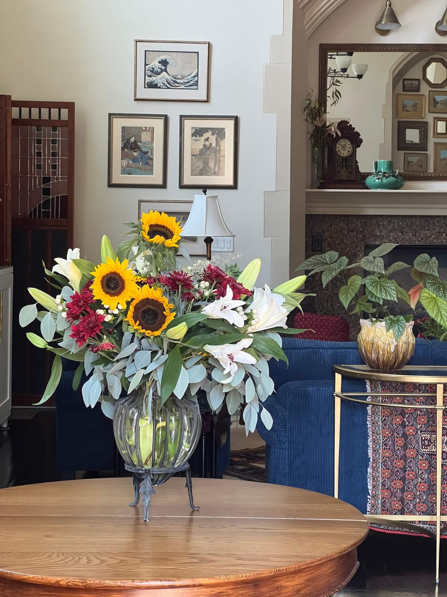
Their original kitchen table was repurposed as an entry table.
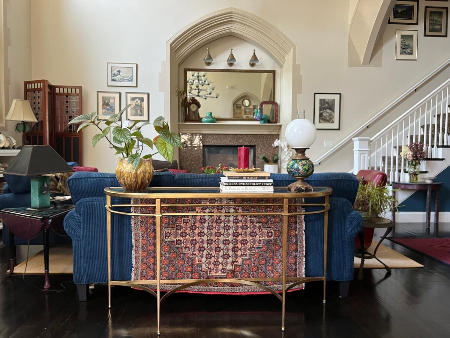
New sofas, console table and coffee table join existing chairs, rugs, side tables and lamps for a fireplace seating group.
A pair of 8’ new custom consoles under the windows provide bookshelves, display space, and concealed storage.
A new (and very popular!) cocktail area comprised of 4 new swivel chairs and a table ottoman reupholstered in a kicky gold leopard print creates a seating area adjacent to the kitchen and the nearby television.
The arched niche that houses the television and a built in shallow cabinet, served as the perfect space to arrange our clients collection of vintage Venice prints and a smattering of decorative mirrors.
Their existing dining table and Victorian chandelier grace a dining area (not shown).
The top floor houses a primary bedroom and home office.
The home office already had a Murphy bed surrounded by some dubious built-ins. We designed the new built-ins to frame the bed and stretch wall to wall adding ample bookshelves and storage for office supplies and files. Trim and crown molding added to the top finished the piece and allowed space for recessed lighting to be incorporated above the bed.
In the primary bedroom, the existing shelving, wallpaper, chandelier, mirror, and draperies all worked perfectly with an existing crewel upholstered chair our clients were nearly going to give away! The remaining furnishings were gathered from various rooms in the Victorian.
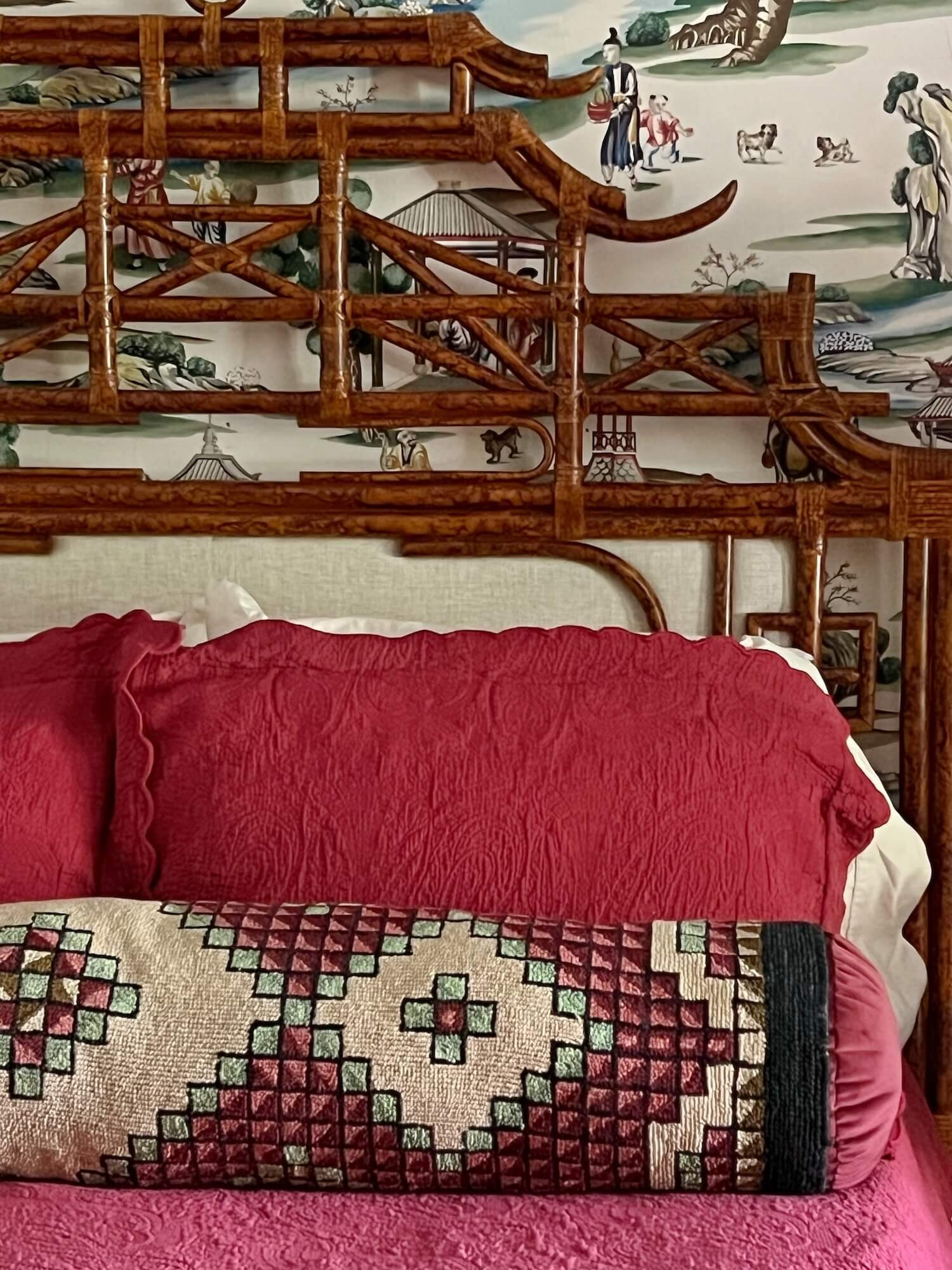
We found the perfect chinoiserie rattan headboard for the bed and had a small rug made into a long bolster pillow.
Five of their antique brass bird cages adorn the sitting area alcove.
In the stairwell, 12+ foot ceilings allow display space for some of their antique quilt collection and gallery walls of dozens of photographs by the talented homeowner taken around the world. A favorite Victorian chandelier from their previous home lights the space, replacing a more generic one.
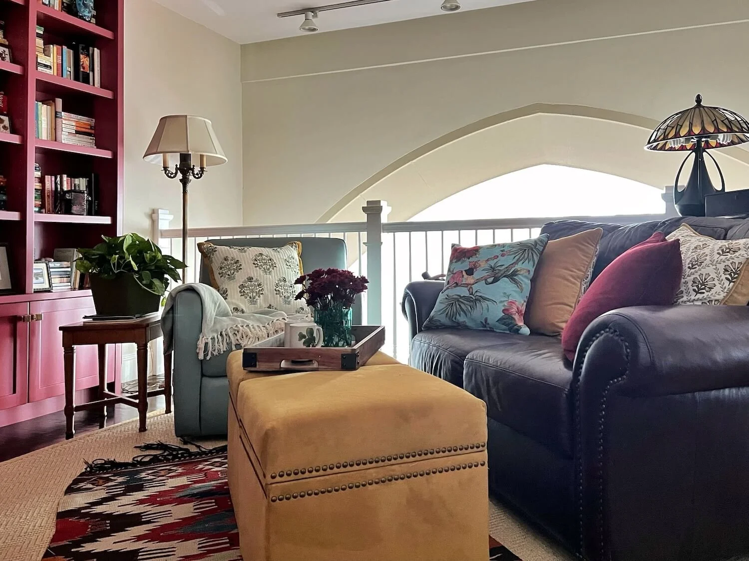
On the mezzanine level, overlooking the living room, is a space we have converted into a library/TV space aptly called ‘the snug’ by the homeowners. New built-in burgundy shelves and cabinets house books, artwork and curiosities.
An angled end softens the transition to the open railing and offers display space for some of their cast iron door stoppers. Others of these are displayed in the wall niches scattered around the living room.
Shelves are topped with brass library lights from Visual Comfort and cabinets feature brass knobs from Top Knobs.
A cozy seating area contains an existing leather loveseat and swivel chair along with a pair of new ottomans that double as coffee table and footstools.
Our clients are thoroughly enjoying this new chapter in this delightful space surrounded by so many things that bring them joy.
Other posts you might enjoy:

