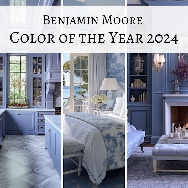
The latest of the paint Color of the Year (COTY) 2024 announcements came this week from the paint giant, Benjamin Moore and it was….a medium toned blue in the periwinkle/wedgewood blue family. Not quite as dark as navy, it is a slightly grayed blue leaning in the direction of lavender.
Many of the larger paint companies, in a fit of marketing genius, select a color of the year for each year, and while they are more or less arbitrary - though I think the companies have whole teams devoted to this selection that assess cultural and consumer trends - they try and come up with something relevant that will resonate with the public mood.
Benjamin Moore describes their selection, Blue Nova, as having “depth and intrigue balanced by an undercurrent of reassurance”. Right. Whatever. It is a more complex grayed lavender blue, so I guess that gives it some intrigue, and blue is associated with calm, loyalty, and steadfastness, a la the phrase ‘true blue’, so I guess that works.
Our innate need to connect to nature keeps the popularity of blues and greens going strong, I think. Green may be natures neutral, but various and ever changing shades of blue are a constant in the sky and water and so arguably also a ‘neutral’ as they provide a backdrop for pretty much everything else in nature.
Interestingly, Sherwin Williams also selected a shade of blue although theirs is paler and much less lavender-leaning.
The Benjamin Moore COTY is a very pretty color and given that it is reminiscent of vintage Wedgewood china, a classic with a long history.
Color is very personal and emotional and should NEVER be used just because a paint company said so, but if you find it appealing or at least intriguing, here are some ideas for ways to use it!
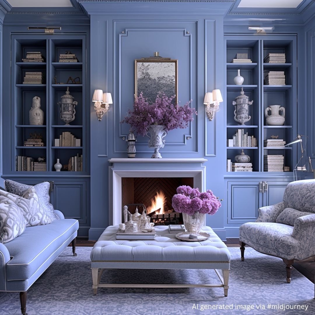
It would be pretty used in a gloss finish on a room full of millwork like this fantasy library or kitchen cabinetry like this one. Both of these are imagined spaces I created using text prompts with AI in #midjourney.
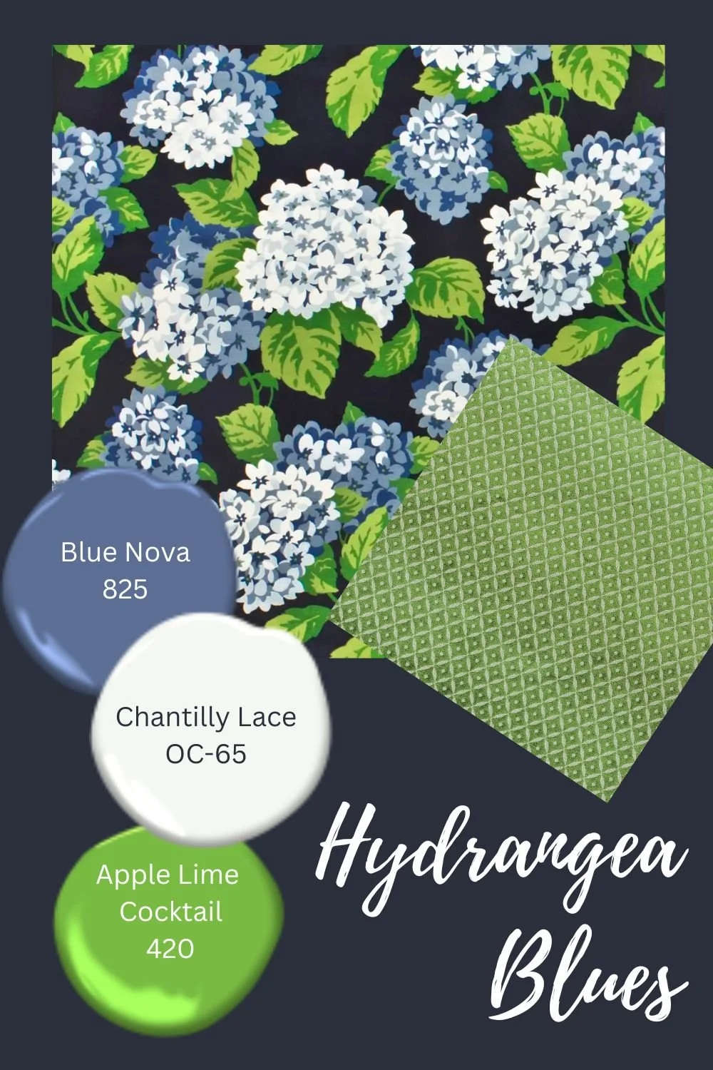
As a classic blue, it can be paired with analogous colors (colors near it on the color wheel) like other shades of blue, greens, and purples. This results in a more calm and soothing space.
If millwork is too much of a good thing for you, try the color in a fabric or wall-covering.
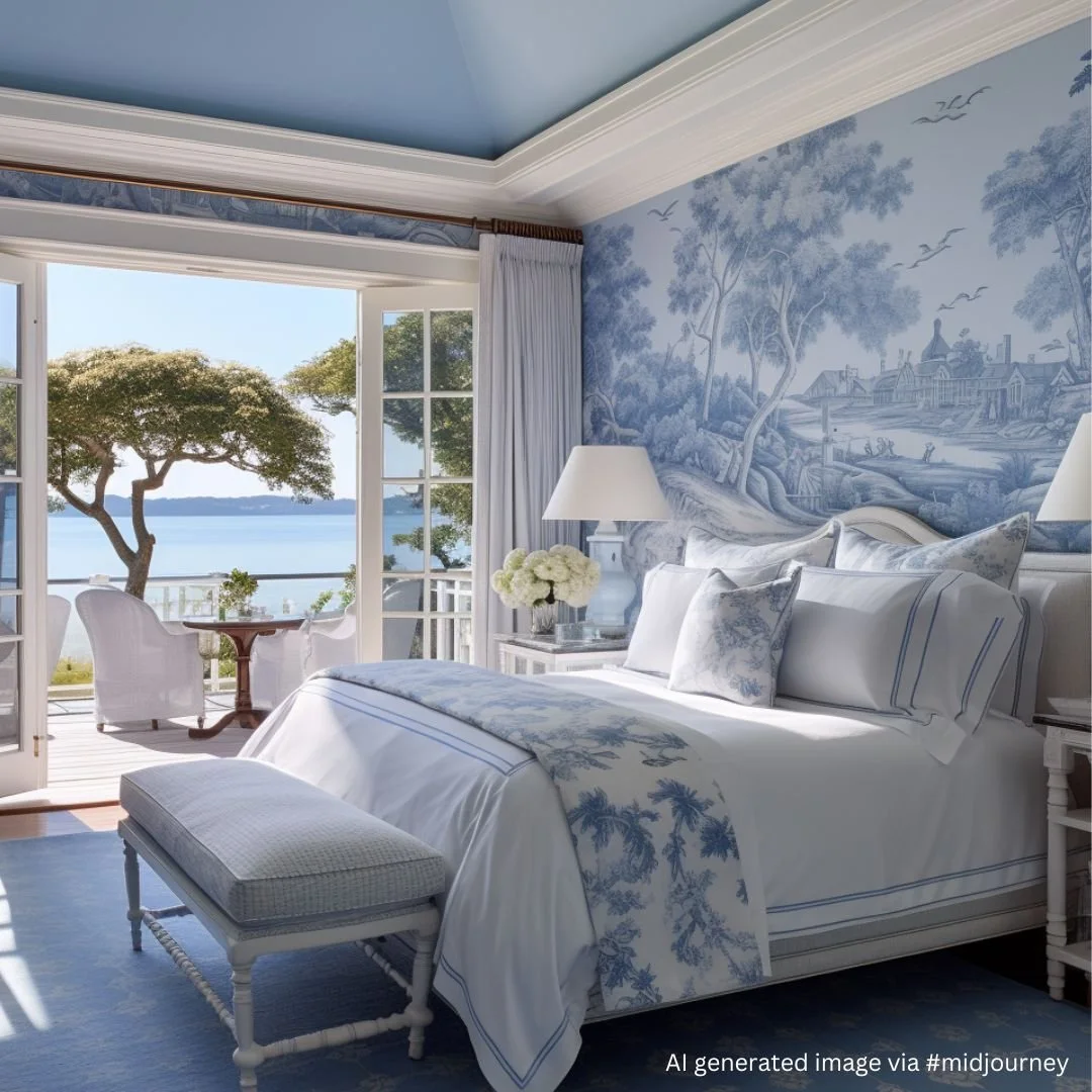
This fantasy AI image of a bedroom uses a toile wallpaper in Blue Nova shades paired with other shades of blue and whites.
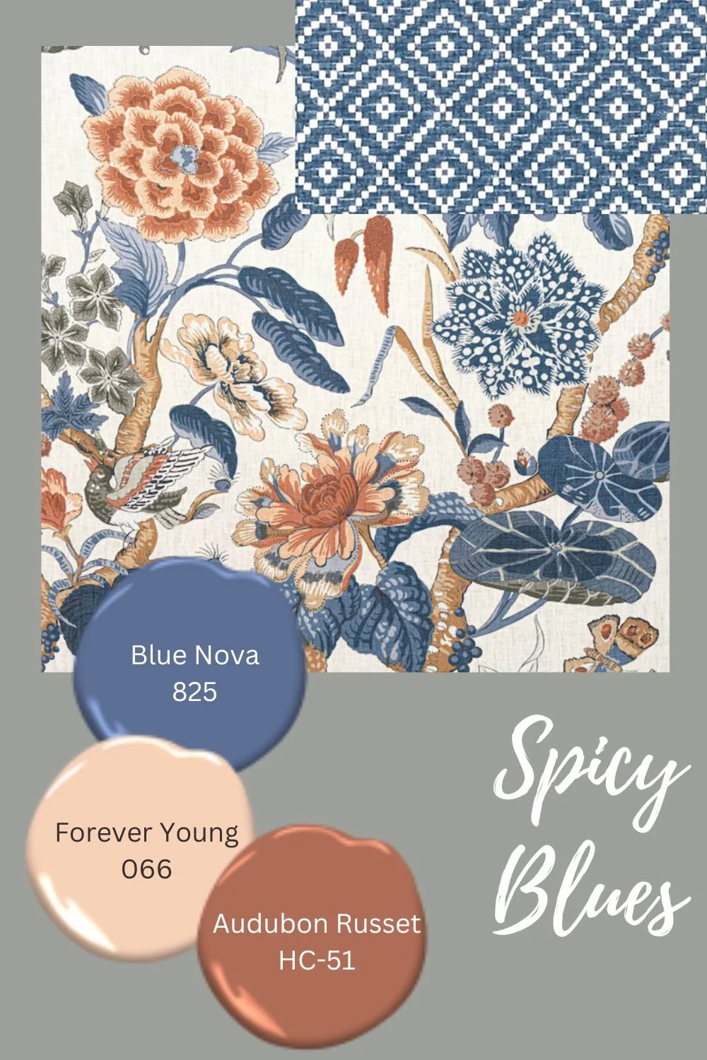
OR it can be paired with complementary colors (colors opposite it on the color wheel) which are warmer and create a more dynamic space with the tension and balance of warm and cool shades. Warm wood tones, and yellow and orange tinged colors like peach and terracotta are lovely pairings.
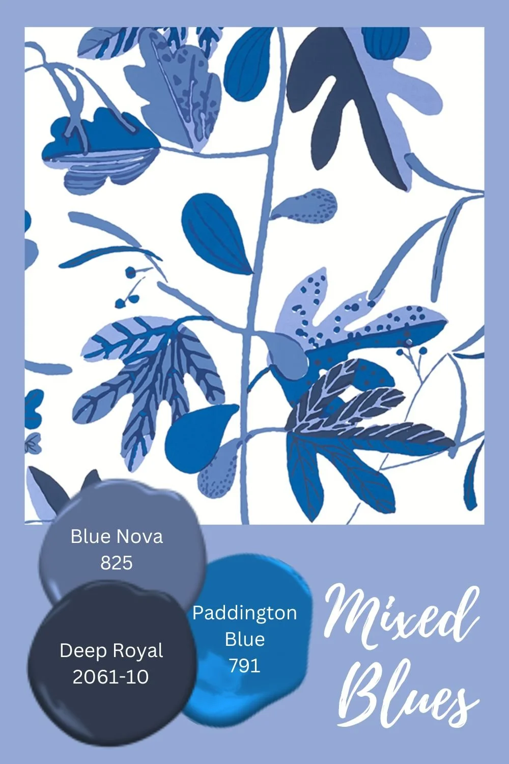
We’ve assembled some textile and paint pairings that show the versatility of this color in pattern mixes.
The only remaining Color of the Year Announcement will be the one from Pantone - that one actually holds some sway over products, advertising, and packaging, so it is always interesting to see what they choose! And they blessedly actually wait until the end of 2023 to announce a 2024 color. How civilized!
So what do you think of Blue Nova? Do you see it as an appealing color for your home? Do you like it more or less than the Sherwin Williams COTY?
Other posts you might enjoy:

