And so it begins! The 2025 Color of the Year announcements have started already!
We always cover the colors as they are announced by the major paint brands and by Pantone, the manufacturing and design industry standard color deck, which generally announces last .
First out of the gate is the Sherwin Williams HGTV Color of the Year (NOT to be confused with the “Sherwin Williams” Color of the Year?!) I know…they double dip this way.
BUT, I will forgive them because this one is a beauty!
I’ve written about this trend-predictor/marketing strategy of crowning a “color of the year” beauty queen before, I’ll link some of the previous color posts at the end of this one.
The Sherwin-Williams HGTV Home color of the year is: SW 6212
Sherwin Williams HGTV Home COTY for 2025: Quietude SW 6212
Called Quietude it is in my favorite blue-green palette - a dusky quiet green with a healthy dose of blue in it.
Here is the Sherwin Williams website image of it in a room - it looks far greener here than it does on the actual color chip.
“We want something that feels very comfortable and derived from nature, but we want that elegance as well…We want to come into a space that feels sophisticated and where we can unwind and relax.”
Ashley Banbury, HGTV Home by Sherwin-Williams color marketing manager
Color Trends
Blues, greens, and blue-greens have been trending in popularity in recent years and seem to be still going strong.
Last year, a large proportion of the color of the year choices were shades of blue.
Personally, I especially love the green leaning blues, so this one is right up my alley!
Where to use these colors
These are nature-inspired tones which are easy to live with and naturally calming making them perfect for bedrooms, baths, and relaxation spaces.
My own bedroom seen in this One Room Challenge project is awash in a similar favorite shade: Benjamin Moore Palladian Blue.
Bedroom windowseat JRL Interiors, Acton, MA
Not that they can’t be used in pretty much ANY room!
The breakfast room walls and the ceiling in the adjacent library/family room also reaches to this classic color family in our updated family colonial project.
Breakfast room in Lincoln, MA by JRL Interiors
garden inspired library in Lincoln MA by JRL Interiors
Our family room makeover project (click on highlighted text for more before and after pictures!) featured shades in this palette. Though here we used Benjamin Moore Palladian Blue on the walls and a deeper teal on the backs of the new built-ins.
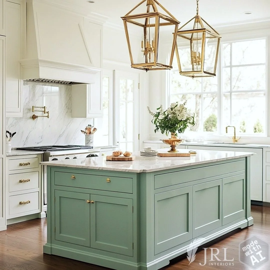
This AI generated kitchen has a fresh coastal feel imparted by a seafoam blue-green like quietude on the island.
AI generated kitchen with SW Quietude Color of the Year on the island
Fabric and Finish Pairings for SW Quietude
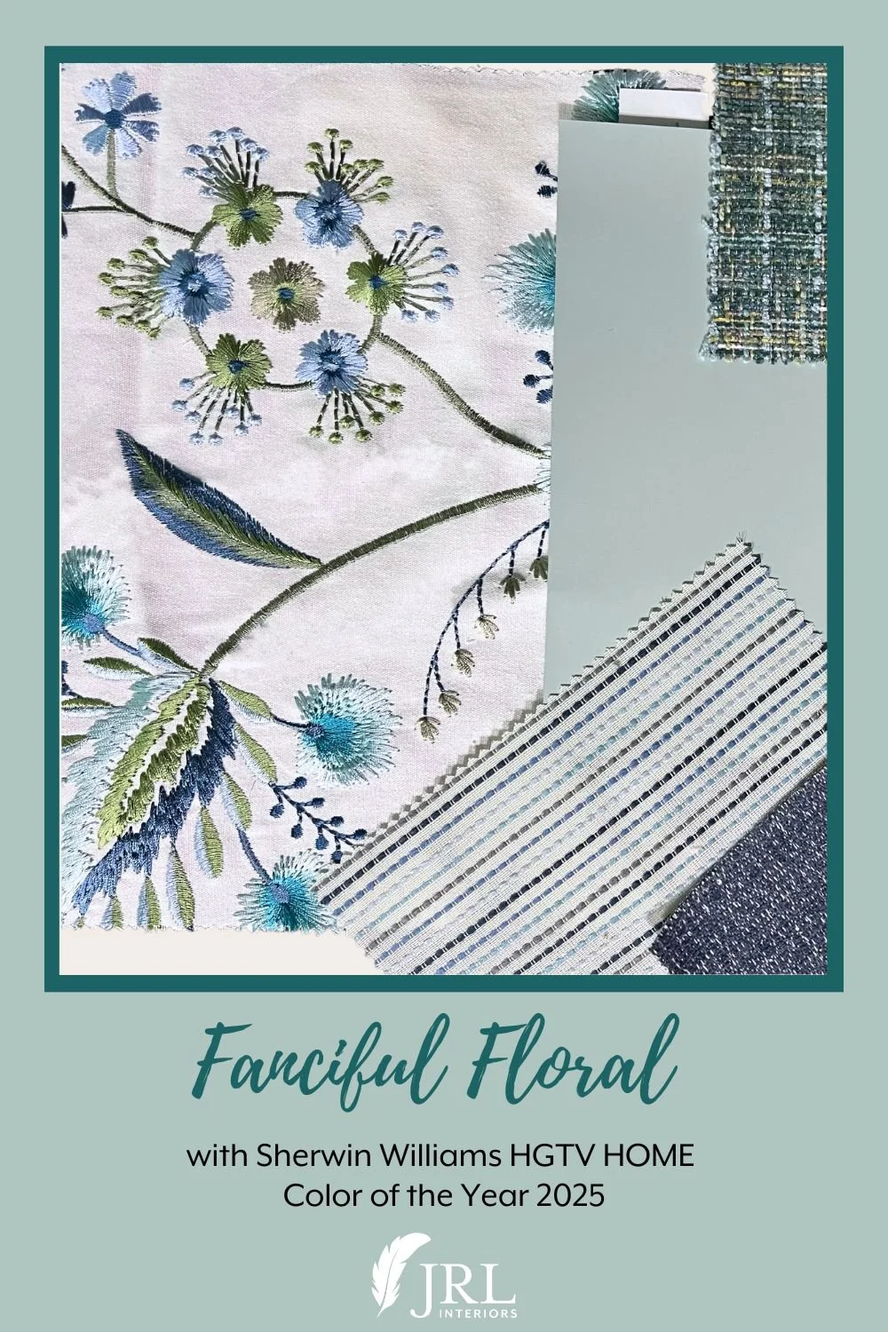
We paired the paint samples of this versatile color with some fabrics and finishes in our studio and photographed a few combinations!
This spa-like color is perfect for a calming bathroom space. Here it appears in the nature-inspired wallpaper and art glass tile. Quietude would be the perfect color to paint the vanity.
This calm, elegant, more neutral palette includes the quietude tones in an embroidered leaf fabric, a trellis leaf carpet, and a tweedy upholstery fabric.
Here it pairs beautifully with navy in an embroidered floral that would make stunning window treatments, alongside paler basketweave and tweed fabrics, a sliver of navy chenille - perfect upholstery and pillow options.
And here it is paired with a mossier green, and neutrals, all tied together with an exquisite embroidered floral linen containing some flowers in a quietude-like shade.
Here we’ve chosen some geometrics in shades of blue and blue-green as foils for this paint color. Stripes and ikat diamond patterns lend a more tailored approach.
And here paired with a fanciful embroidery and various shades of blue, aqua, and green in assorted drapery and upholstry fabrics.
What do YOU think of this color? Where would you use it?
Other posts you might enjoy:


