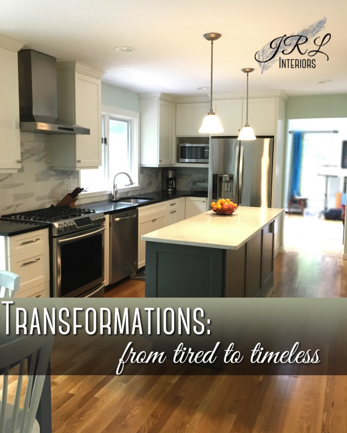
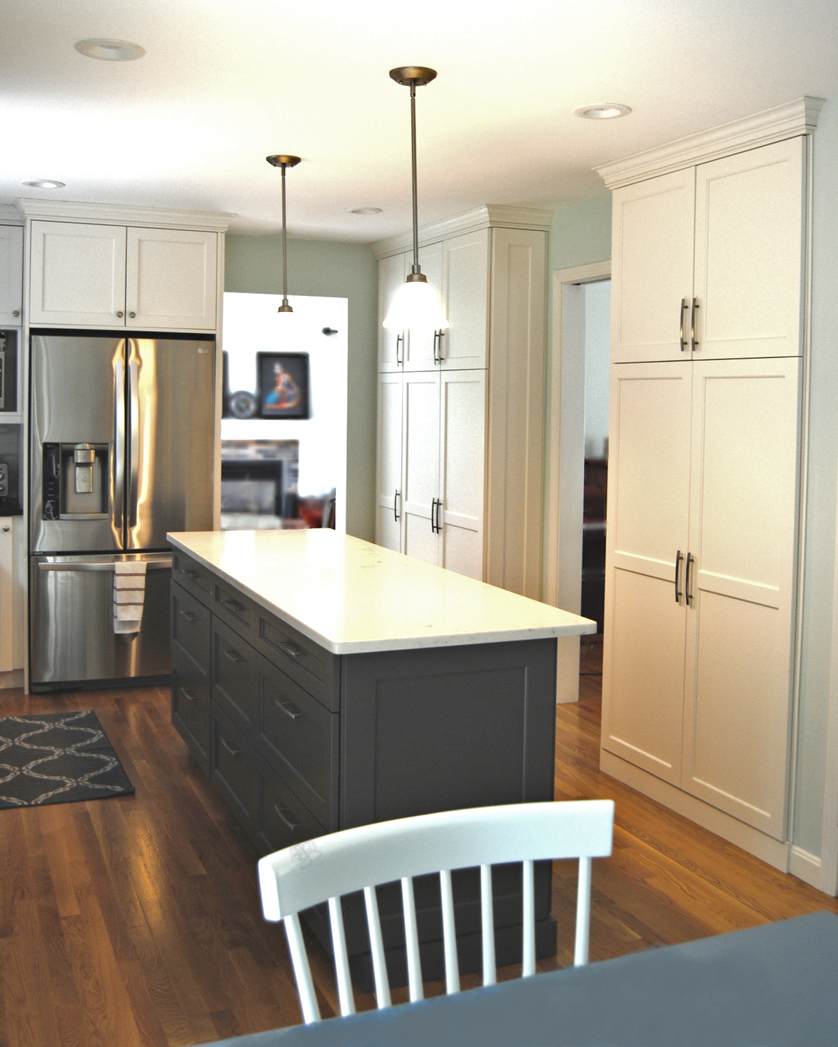
Frustrated with her dark and dated kitchen, our client knew it was time for an overhaul. Traveling extensively for her job, and short on time, she wanted her kitchen to be a welcome retreat for cooking, not an exercise in perseverance when she was home.
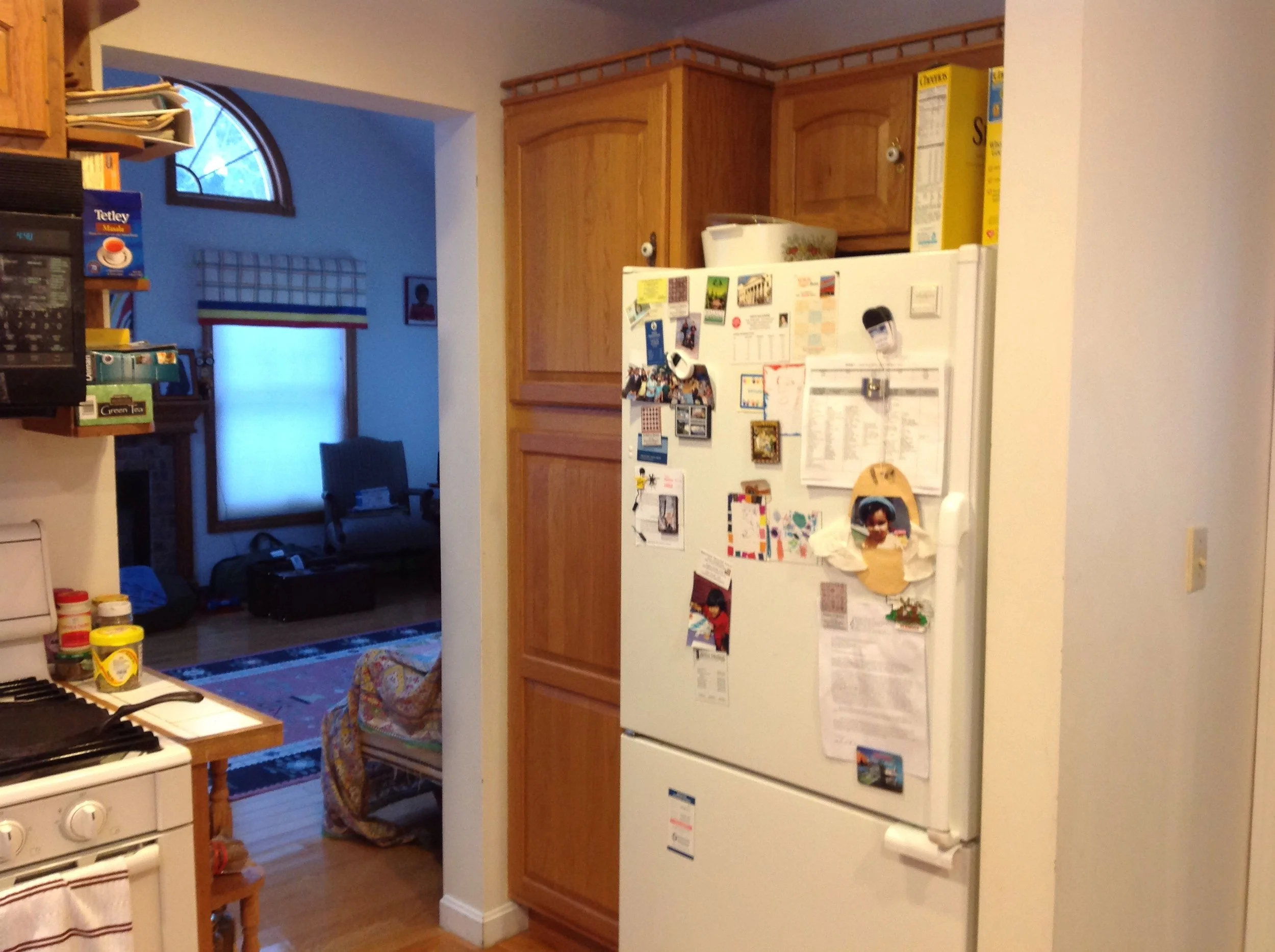
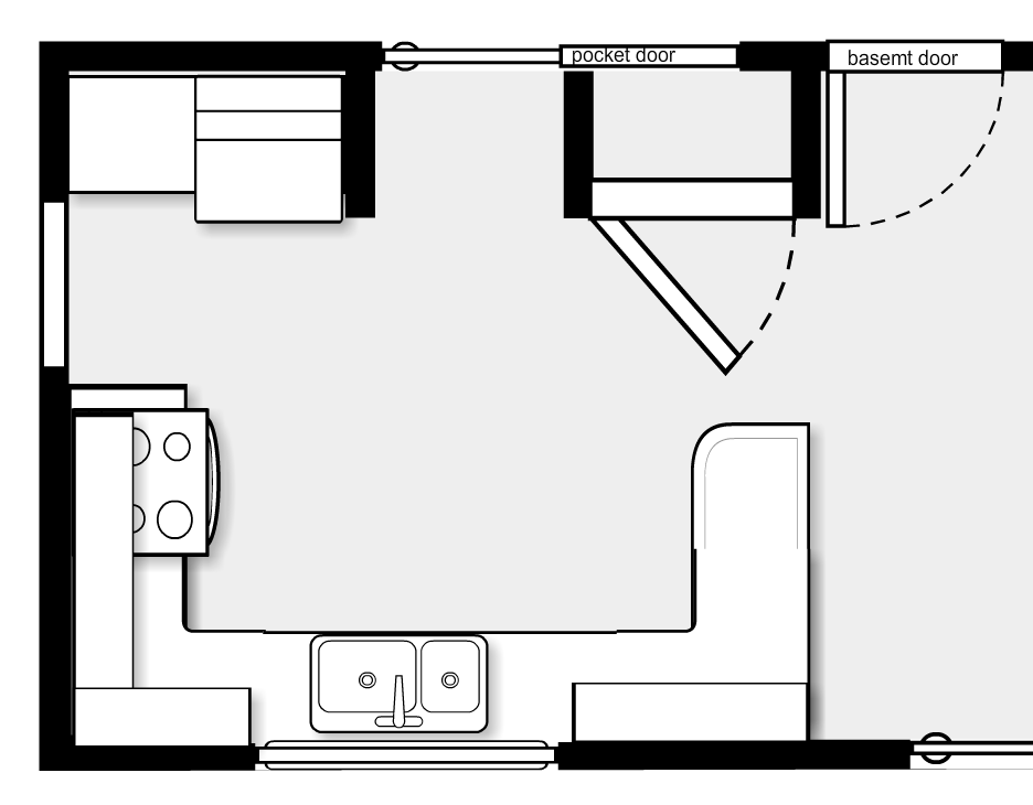
The first step to change is identifying the problem, and this kitchen had several issues; it was dark due to the abundance of wood tones, it was dated - with honey oak cabinets and tiled counters, and the layout was awkward - with a peninsula and a closet cutting off the work space, and the fridge on the opposite side of the main path to the family room.
She wanted a light, bright atmosphere with a timeless classic style befitting the style of the house, and easy to care for surfaces that wouldn't stain.
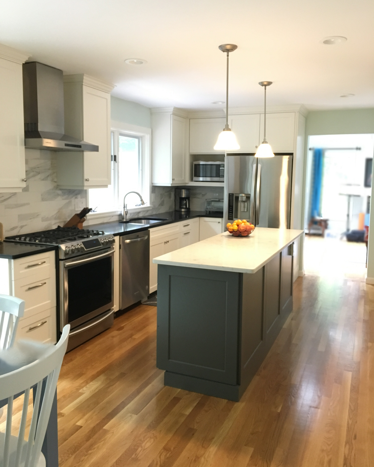
Step one: revise the layout to transform the functionality. By removing the closet and a wing wall, and shifting a door opening, we were able to create a design that moved all the appliances into an L-shaped work area and created a better traffic flow. We added an island with abundant work and storage space, and designed a storage wall to put pantry staples, small appliances, and serving pieces all in easy reach. Removing the soffit allowed for taller upper cabinets with more storage - this has the added bonus of making the room feel taller and more spacious as well!
Step two: select finishes to transform the mood. We selected a timeless style in a soft white for the majority of the cabinetry to lighten and brighten the space. An island in a contrasting dark grey feels more like a piece of furniture. The countertops are hard working, easy to maintain quartz with black on the perimeter cabinets and the island topped in a white marble look-alike. The backsplash is covered in a large scale porcelain subway tile that looks like stone. Walls were painted in a pale blue-green giving a fresh feel and providing a touch of color in the otherwise neutral space.
Step three: select the details to create a timeless classic appeal. Stainless steel was selected for appliances, a range hood, and the faucet and under-mounted sink. Cabinet hardware is the jewelry of the kitchen and for this we selected a mix of simple but elegant handles and knobs in a brushed nickel finish. Sleek pendants with satin nickel fittings and white alabaster shades light the island, and a matching chandelier OR a complimentary, but trendier globe chandelier were offered as two alternatives for the dining area.
The client is delighted with her new kitchen and it has added so much value, both physically and emotionally, to this lovely home.

