In bedroom design, especially in smaller rooms, there is often not an obvious place to put the bed.
Bed placement dilemma
In children’s rooms, a twin bed often goes against a wall - both as a safeguard to keep younger children from having too many ways to fall out of bed, and because children’s rooms are sometimes quite small and pushing the bed into a corner leaves the most floor space.
But in most bedroom situations for adults, and certainly for beds meant to sleep two people, the bed should be approachable from both sides.
And, ideally, the bed should be facing the entry if possible for a nice view as you enter the room, though the ‘not shoved against a wall’ trumps that if you have to choose between the two.
Because bedrooms typically contain closets and sometimes an additional door to an en suite bathroom, the walls are often broken up with a variety of doors and windows.
Builders rarely worry themselves with where furniture might need to go when designing a house! (One of many reasons why you might want to consider having a designer on your team if you embark on a new build or renovation.)
Placing a bed under a window
Sometimes the only wall that makes sense for bed placement contains a window.
This sends some people into a panic, but I do not think it is a bad thing to have a bed that overlaps a window (or windows).
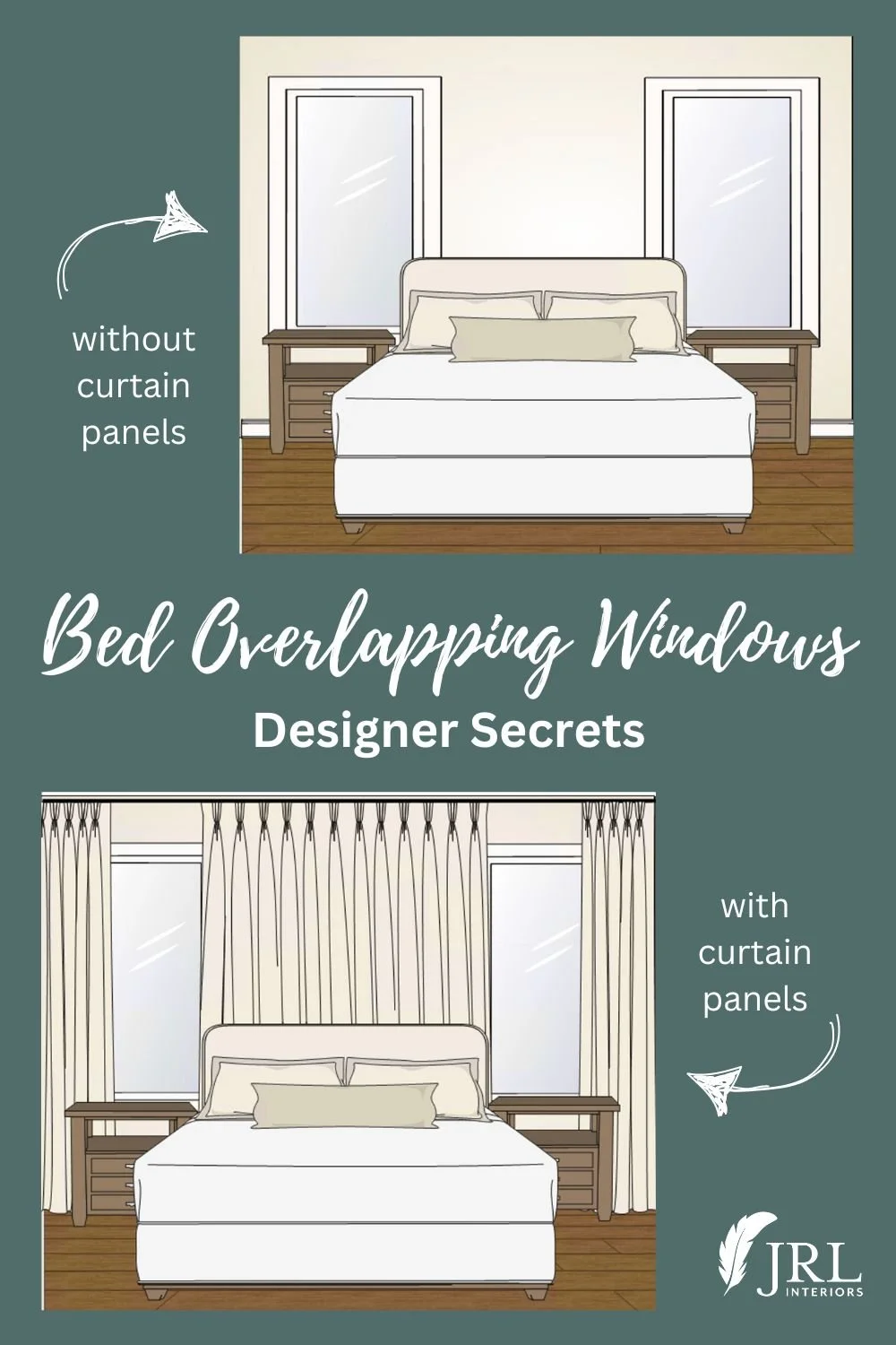
I’ve dealt with this situation on numerous occasions and the designer secret to making it work is to use window treatments that disguise the size of the window(s)!
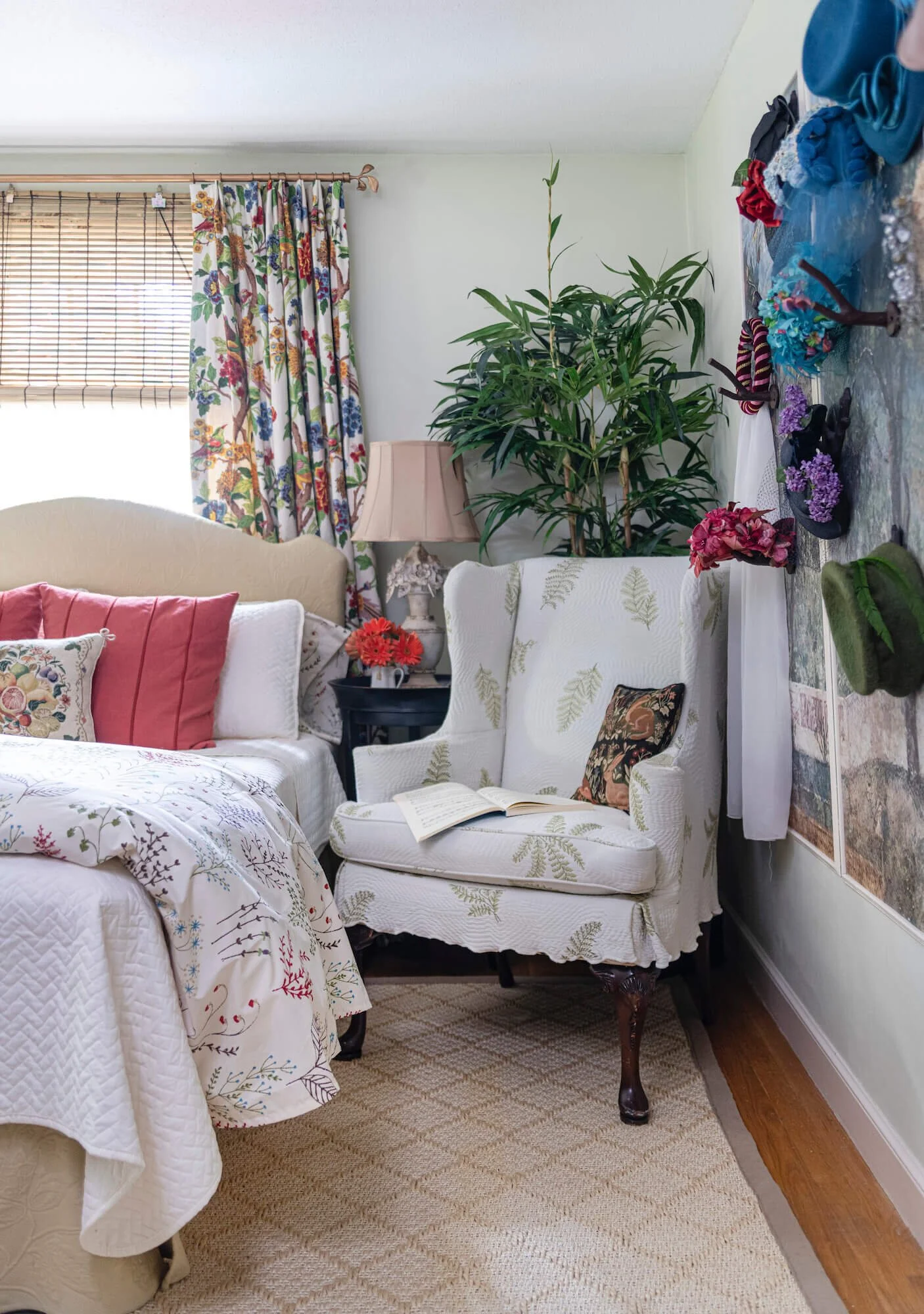
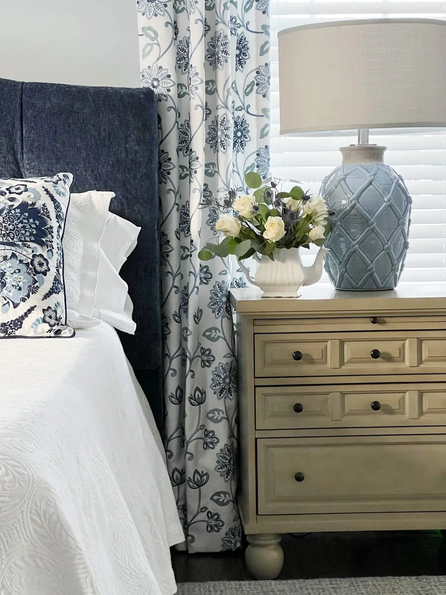
Panels that span the width of the headboard make a nice backdrop for the bed and can incorporate the windows into the design.
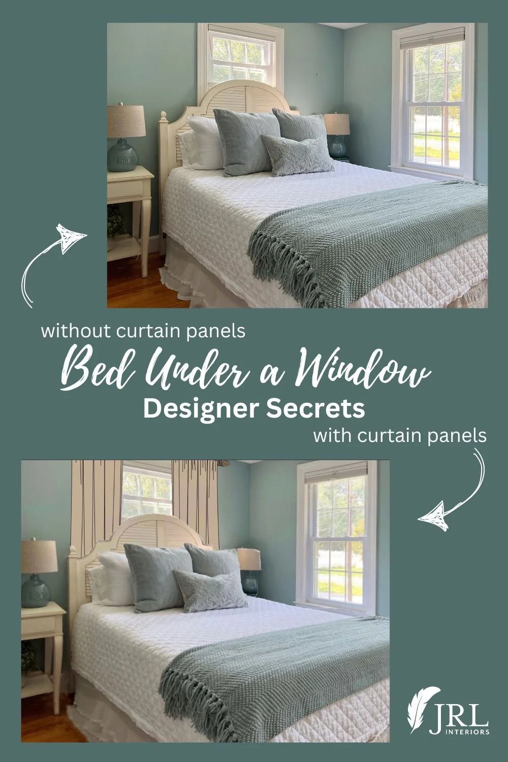
I recently ran into this with a staging project where I recommended moving the queen size bed out of a corner and onto a window wall to give the room a more spacious and gracious feel.
They opted not to add the drapery panels and it still works effectively to make the room more gracious, but would be so much better with the panels to balance the big headboard.
I’ve drawn in panels below to illustrate the difference. It makes the ceiling look higher too!
If there is a single window - like in this modest size room we did for the One Room Challenge, center the bed under the window and flank the window with panels that extend beyond it at least to the edges of the bed.
This makes a nice backdrop for the bed, still allows access to the window for light and air (or the panels can be used to block light if desired), and makes the window look more generous than it might be and in better proportion to the bed. For a 3’ wide window behind a queen size bed, this means the rod would be a little more than 5’ long and the panels would be full enough to draw if needed.
Placing a bed between two windows
We worked with the builder from the beginning to design a bedroom for our clients with wall space between the windows to accommodate a king size.
If the bed is between two windows, but wider than the available wall space, curtaining the whole wall behind the bed and then the outside edges of the windows will make this work in a similar fashion and give the impression that it is one big window wall.
This is the case in the primary bedroom of a new build beach cottage we are currently working on that required using the existing footprint of the former cottage, so room sizes are limited and trade offs needed to be made.
The space between the windows is a little over 5’ - wide enough for a queen bed, in which case I might just use shades or asymmetrical panels on the outside edges of the windows.
But the homeowners want a king size bed, and that would be 18” wider than a queen and overlap the windows by almost 9” on each side. The solution will be to curtain the whole wall and draw open the panels over the parts of the windows beyond the bed as illustrated below.
Draperies are more than just fluff - they can be functional and restore a balanced proportion to a bedroom when used wisely.
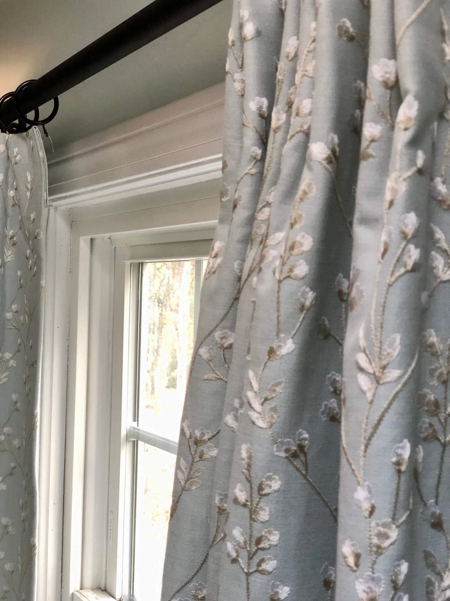
We most often design custom window treatments for our clients anyway because these are so much nicer and can be tailored exactly to the needs of the room from fabric pattern to construction details so they are totally worth the investment.
Can it be done with ready made panels? Yes, you can achieve the same idea with ready made panels if you buy blackout lined ones and sew together as many panels as you need to get the necessary fullness. Be sure to buy them long enough to span the ceiling to floor height (buying extra long and hemming is preferable to too short!)
Blackout lining is key to not giving away the fact that the draperies extend way beyond the window and help reinforce the illusion that the window is a more generous size.
If hanging panels at the ceiling line, or just below any crown molding, makes a large gap between the top of the window and the wall, I often cover this by layering a tailored shade or matchstick blind mounted at rod height under the panels. This, once again, gives the illusion of a taller window and magically makes the ceiling feel higher.
A gracious and inviting bedroom is important to living well - don’t miss an opportunity to make the most of yours!
Other posts you might enjoy:
Curtain hardware, choosing the right rods
Blinds vs shades, which is right for you?
Arranging furniture in a long narrow room
Tips for making store bought window treatments look more like custom

