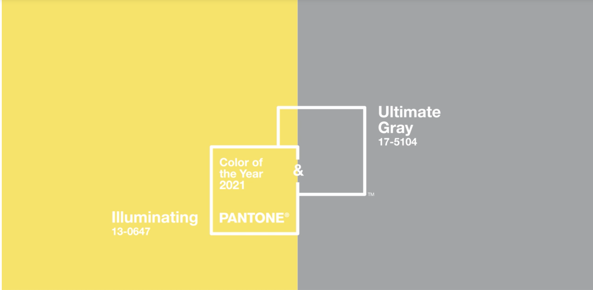
Oh My. The Pantone Color(s) of the year for 2021 just came out - they hedged their bets and picked two this year. Illuminating and Ultimate Gray…supposedly these speak to sunny, cheerful vivaciousness paired with solid and dependable strength and resilience.
Pantone’s color of the year picks for 2021…love them, hate them, or undecided?
I applaud the sentiment, but the actual shades? I see caution tape yellow and battleship gray…po-tay-to, po-tah-to…and while the caution tape yellow and battleship gray hues are certainly reminiscent of 2020, I am hopeful for 2021 to be a better year!
Pantone’s COTY for 2021. Sunny or Crime Scene? Calming or Battleship?
Pantone’s picks generally inform the products and packaging for everything from homewares to makeup for the coming year and I sincerely hope this is not what we are going to be seeing! I like gray - I really do - and if HGTV hadn’t been shoving it down our throats for the last 10 years and often in shades or places that don’t do it any favors, maybe I wouldn’t be so tired of it. Add to that this mid range blah version of gray and nope. Not delighted. There are, however, a number of gray shades of paint that are quite lovely, which I talked about in this post. So if you have your heart set on gray, these are a good starting point. And then there is yellow. Now normally, yellow should be an optimistic, sunny hue, a harbinger of brighter days ahead, which is what they were aiming for I think. But this particular shade is more in the neon acid-yellow family and evokes more of a crime scene tape vibe than sunshine. Yellow paints are particularly challenging as the cooler yellows often have the opposite of the desired effect on a room. This post offers some favorite shades of yellow paint that are more appealing.
The combination of this yellow and gray together bring to my mind the flight deck of an aircraft carrier for some inexplicable reason…This combination (and particularly these shades) is rarely seen in classic interiors, but I will admit it works in retro or modern looks. Still, not my favorite combo. I did find a few items that are kind of fun interpretations, though…
Please Note: this post contains affiliate links meaning I may make a tiny commission on any purchases at no additional cost to you.
These lamps remind me of candy, so that’s never a bad thing:-). Also, this bright yellow is a tiny bit warmer than the Pantone Illuminating
These inexpensive yellow lamps are quite cute (and come in a bunch of other colors). They remind me a bit of hard candies!
These 3D butterfly decals are an adorable temporary solution for decor in a nursery or children’s space. Pair them with some elephants and you’ve got the yellow and gray combo of the moment.
These 3D removable butterfly wall decals would make adorable nursery decor!
Add cute modern nursery decor with this gray elephant pillow
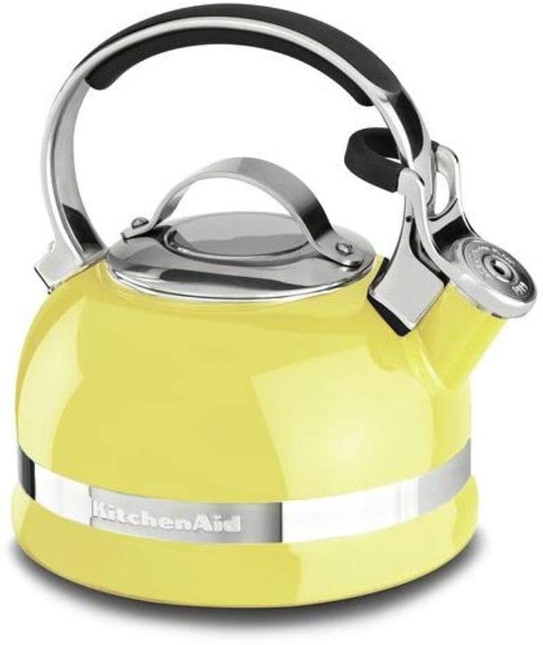
And, of course, appliances from mixers to toasters to utensils are appearing in these hues - stainless steel is already gray, so you only need to add the yellow.
Citrus teakettle from Kitchen Aid
Yellow silicone utensil set (other colors available too!)
Kate Spade yellow toaster It also comes in a really pretty pastel blue, a pale pink, and a lavender!
This yellow and gray wallpaper is a classic chinoiserie. It looks more buttery in this image, less so in some of the other pictures online - as always, get a sample, or buy a roll to check the color before committing!
Yellow is a great color that gets used a lot in timeless, classic interiors to impart a sunny disposition to rooms. Yellow paint colors can be tricky and I would encourage you to err of the side of warmer, buttery yellows for the most likely success!
Soft buttery yellow walls make the sunroom space in this Gentleman’s Farm sunny and inviting in any kind of light. Design by JRL Interiors. Photo, Eric Roth
Another view of this classic yellow sunroom. Design by JRL Interiors, photo by Eric Roth
As you might have guessed, I’m underwhelmed by the Pantone picks for 2021, but everybody has different preferences. What do you think? Are Pantone’s Illuminating and Ultimate Gray a hit or a miss?


