So, I’ve run into several, let’s just say, unusual bathtubs in the last few weeks doing some research, and it got me thinking that perhaps it was time to devote a whole post to the subject of bathroom fixtures and finishes.
As I have trumpeted many times, choosing your bathroom fixtures and finishes wisely is important because they have a VERY long shelf life. With trendy choices, you will tire of them/they will look dated loooooong before they wear out and need replacement. If your budget allows for a bathroom rehab every 10 or 15 years, by all means, trend away. But if, like most people, you would like your renovation to stand the test of time, you will want to make more classic choices. To see some of the trends that have come and gone and what has survived as classic, we first need to take a sprint through bathroom history.
A brief history of bathrooms
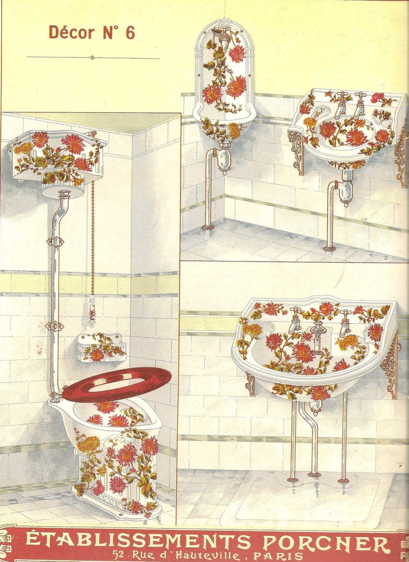
The modern bathroom, as we know it, first appeared in the Victorian era here in America. Early bathrooms were always white or white and marble…IF one had money. Floors and walls were covered in tile or stone at least to wainscoting, and sometimes to the ceiling. White was the obvious choice for a room designed for cleanliness. White subway tile abounded along with white hex tiles sometimes with black accents. Bathrooms contained a toilet, sink and tub, and sometimes a shower fixture. There are few, if any, pictures of Victorian era baths outside of catalog drawings. But here is a beautifully restored one inspired by the vintage of this Minnesota house:
via This Old House design by David Heide, Photo by Karen Melvin
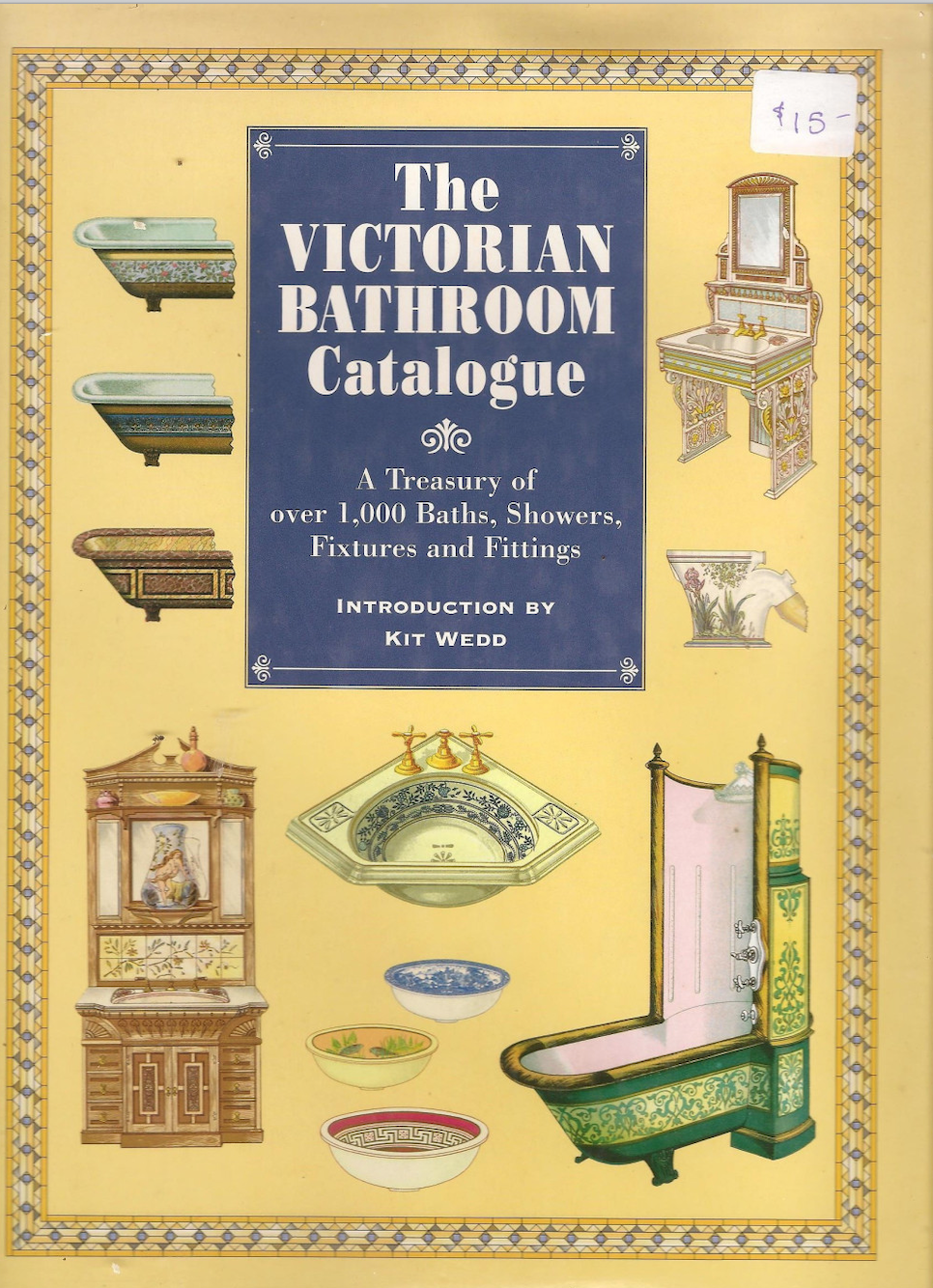
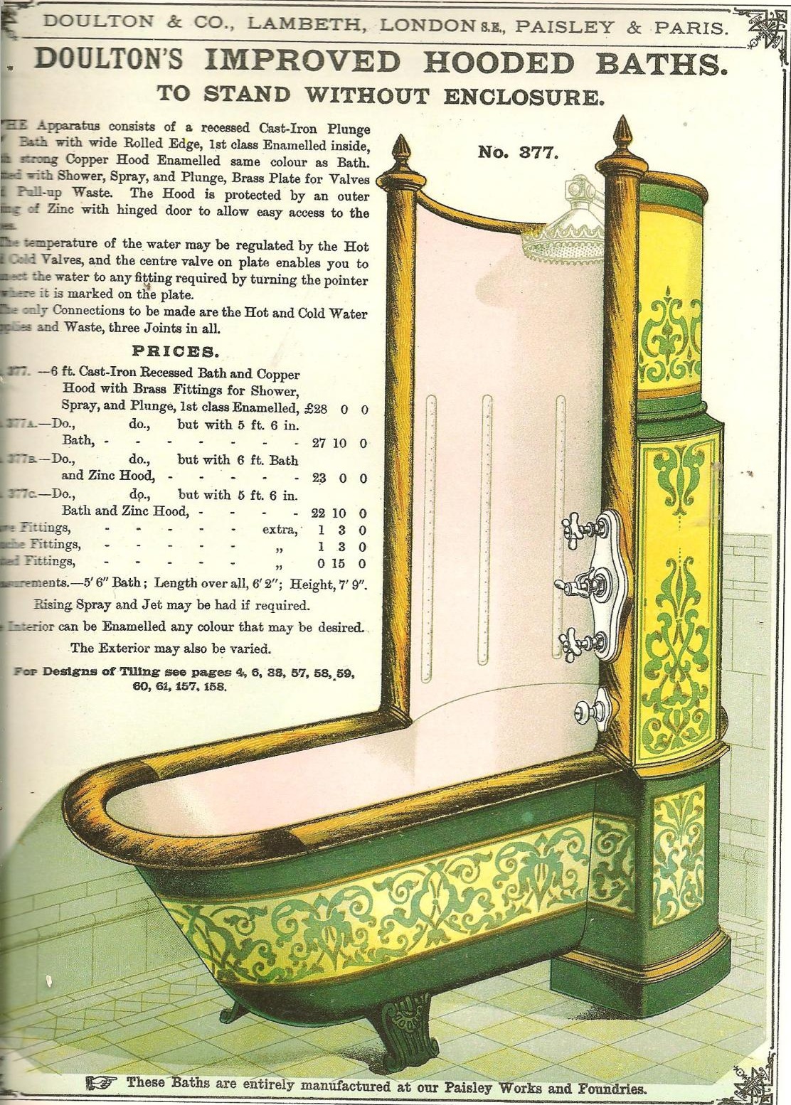
Victorian bath options expanded and got more elaborate as time went on as evidenced by these catalogs shown on the Cogpunk Steamscribe blog:
For many years the household had one shared bath, but as wealth increased so did the offerings and America’s obsession with bathrooms. Eventually, colored tiles and fixtures began to appear, creating the need for suites of fixtures in the color du jour with matching wall tiles – sometimes accented with contrasting borders. Some of these retro bathrooms have enjoyed a renaissance in popularity.
via Retro Renovation
via Retro Renovation
via Houzz by Tim Barber Architecture photo by Karyn Millet
Retro from the 50’s and 60’s is in right now, but there are no guarantees. For example the 70’s, that desert of design, spawned the “harvest gold” era, which has become something to get rid of whenever possible…this harvest gold bathroom got a makeover to make the color work, but even so, it already (blessedly) contained a mostly white vanity top/sink. We traded out the harvest gold toilet for a white one, and then painted all the brown wood black. Black paint can make almost anything better (see THIS post for more on how).
More bathrooms also began popping up – the powder room for guests in the public areas of the house and the family bath near the private rooms, then the en suite bath – most especially for the master bedroom. Today the master bath is de rigueur for any new construction and larger homes feature en suite guest baths and jack and jill shared children’s baths. Nowadays it is not uncommon for the bathrooms to outnumber the bedrooms in a luxury home.
The bathroom is still an important room to home buyers and, alongside the kitchen, one of the most imperative rooms to have updated for a successful home sale.
Current trends in bathroom fixtures
Advances in technology and engineering have invaded the bathroom with self cleaning, self flushing, or sound and light system equipped toilets, like this one that Kohler just unveiled with Alexa built in. I can totally get behind self cleaning, but personally, I don’t want to carry on a conversation with my toilet!
The Kohler Numi 2.0 toilet via Daily Mail
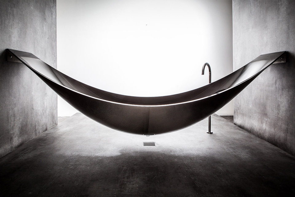
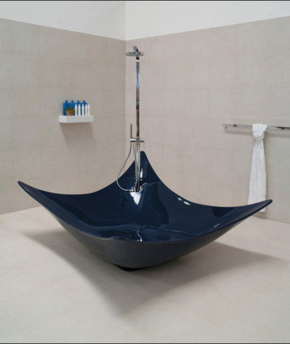
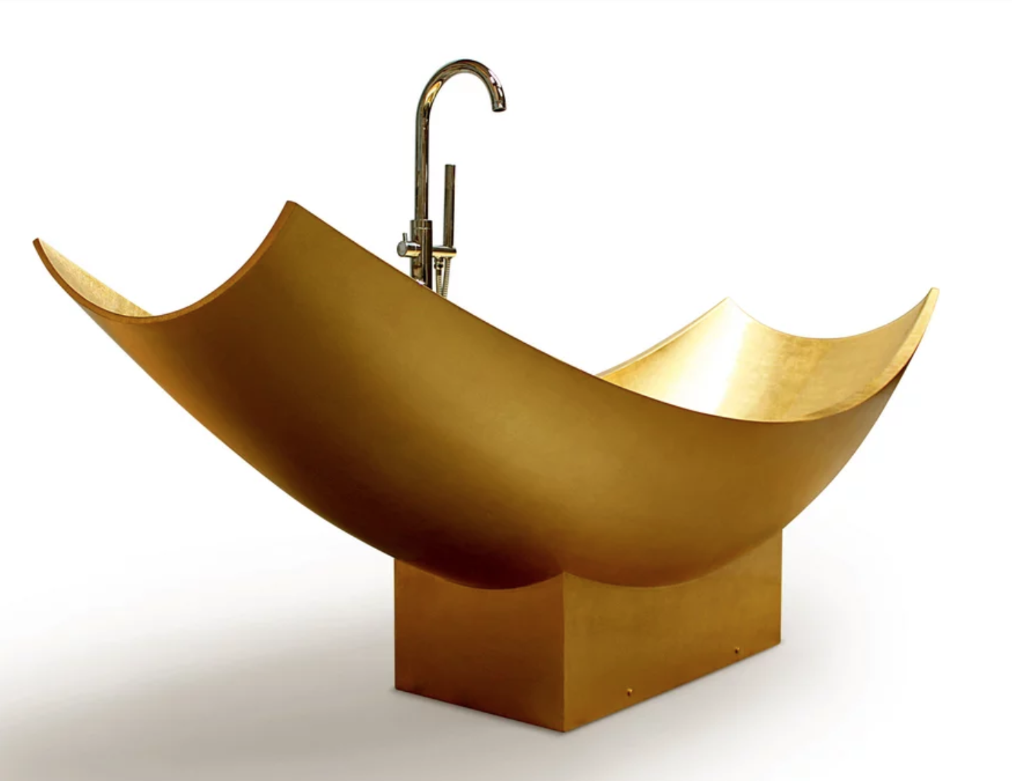
There are programmable temperature and remote controlled shower systems with various jets, sprays, and steam capacities. Nearly anything you can dream of is available — for a price. But creativity seems to REALLY be on display in bathtubs, which come in every shape and configuration imaginable – including some that really shouldn’t have been imagined. We’ve looked as some other ‘unique’ tubs HERE and HERE.
via Architonic: bathtub, Little Tykes wading pool, or very large cat/dog bowl, you decide…
And then there are these…hmmm.
This Texas farmhouse bathroom features neutral colors and a clean design except for the creativity that got away from them with the tub…it looks interesting…but uncomfortable. I suppose this does make it easy to feed and shower your horse simultaneously, should the need arise?!
One of the bathrooms in a lovely Texas farmhouse via Homebunch by Todd Glowka Builder, Inc.
While this modern minimalist bathroom certainly qualifies as neutral, it’s a bit austere in a well-appointed prison cell kind of way…
Classic bathroom design
I will always advocate for the classics in neutral colors because…say it with me…”tile is forever”. And so are bath fixtures. But neutral doesn’t have to be boring.
This gorgeous bathroom by the queen of classic, Phoebe Howard, is a shining example.
This classic bath is anything BUT boring! Design by Phoebe Howard
You can keep classic design with a clawfoot or pedestal tub and inject a bit of color and whimsey that is easily changeable by re-painting the outside in an accent color.
Painted clawfoot tub via Southern Living photo by Laurey W Glenn, Styling by Elly Poston
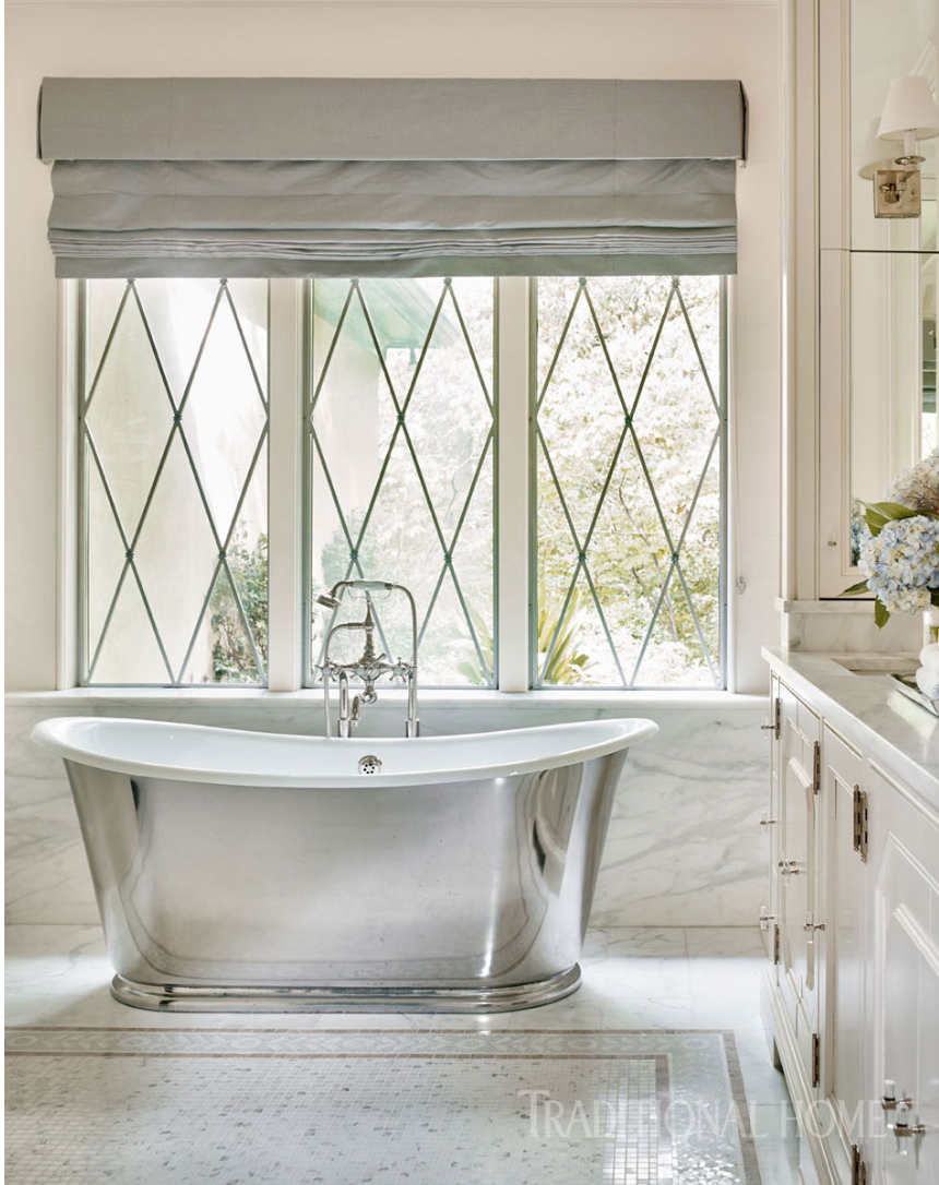
This gorgeous Atlanta bath by Suzanne Kasler is another classic style bathroom I could happily live in.
Design by Suzanne Kasler, Photo by Emily Jenkins Followill via Traditional Home
This classic master bathroom we did was a renovation primarily to replace the builder tub/shower with a curbless shower for the homeowners. They are, wisely, planning for future needs, and so we included several aging-in-place features, allowing them to stay in the house safely and comfortably for a long, long time. The choice of classic chrome fittings and marble-look porcelain tile and quartz in neutral colors ensures timeless appeal.
Read more about luxury bath remodeling HERE
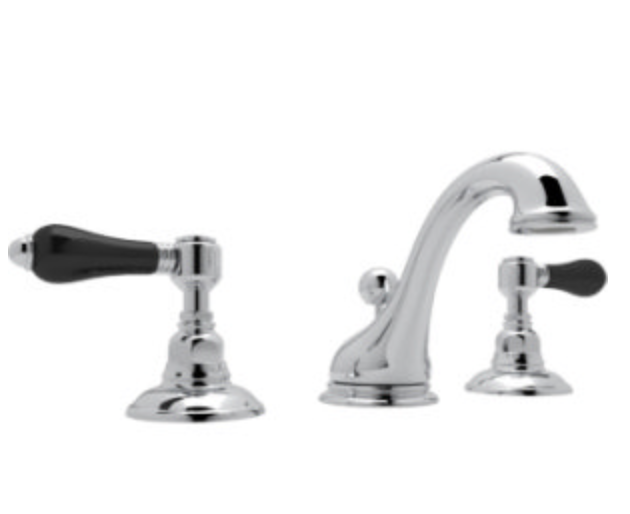
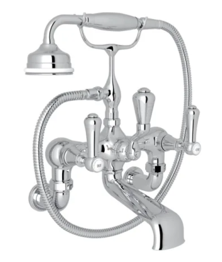
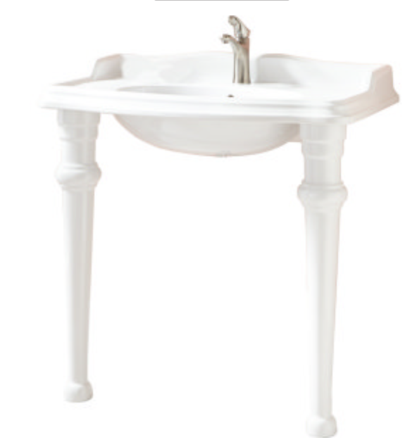
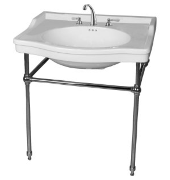
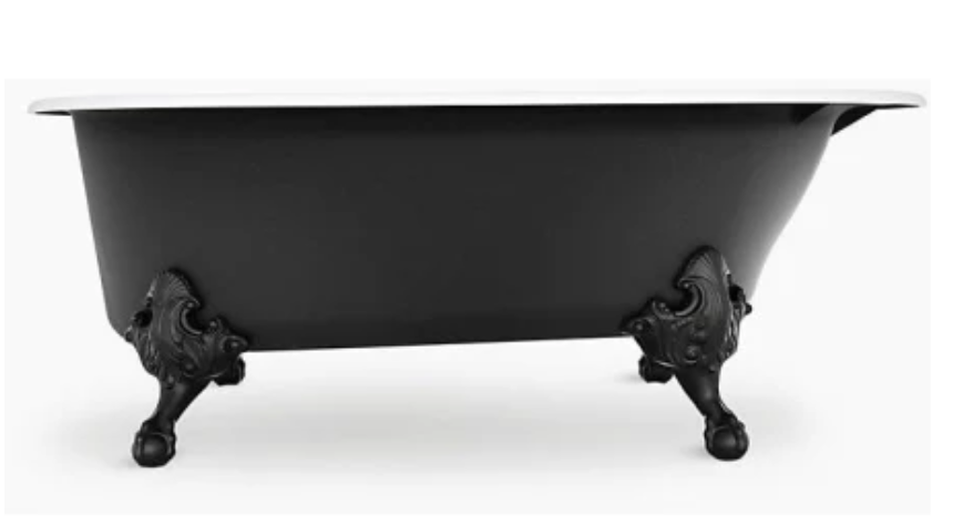
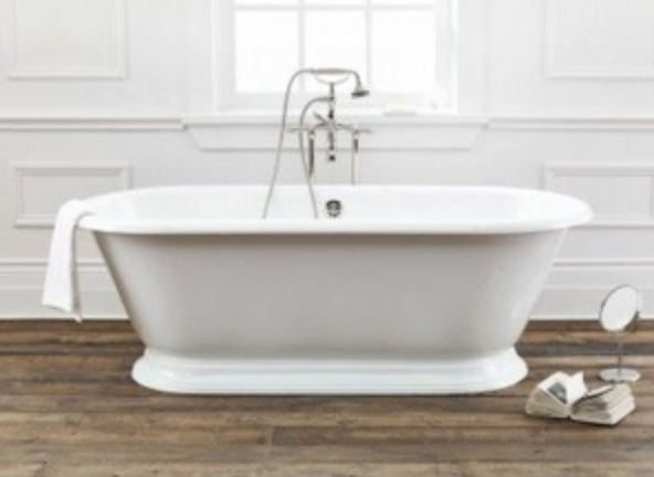
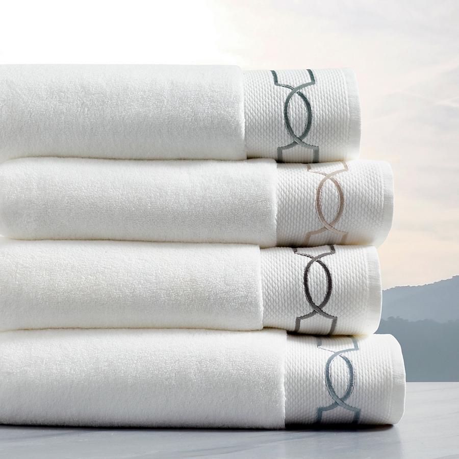
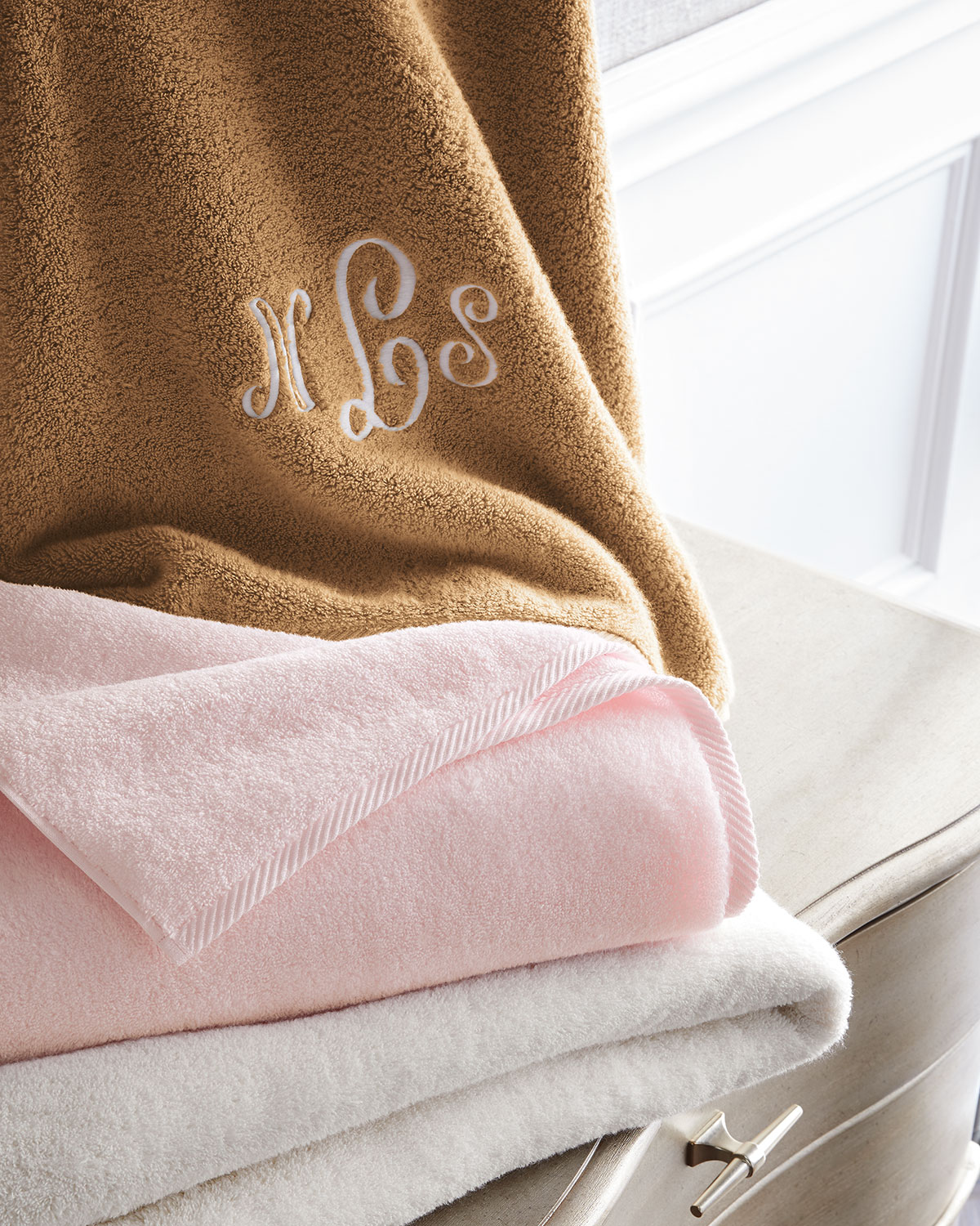
Shop some classics (click on each image for more information). And don’t forget to add the finishing touches like luxury towels with embroidered borders or monogramming - is anything more classic than that?
XO,
*Please note that this page contains affiliate links meaning that if you make a purchase, I might make a small commission at no extra charge to you.
