Exterior lighting…Can we talk? So, being a designer has its down side…we notice things and once we notice them it is impossible to NOT notice them. The dialog currently running in my brain is all about exterior light fixtures. Every house has them and some are simply a train wreck I can’t look away from…I shake my head and mutter to myself every time I drive (or walk) by.
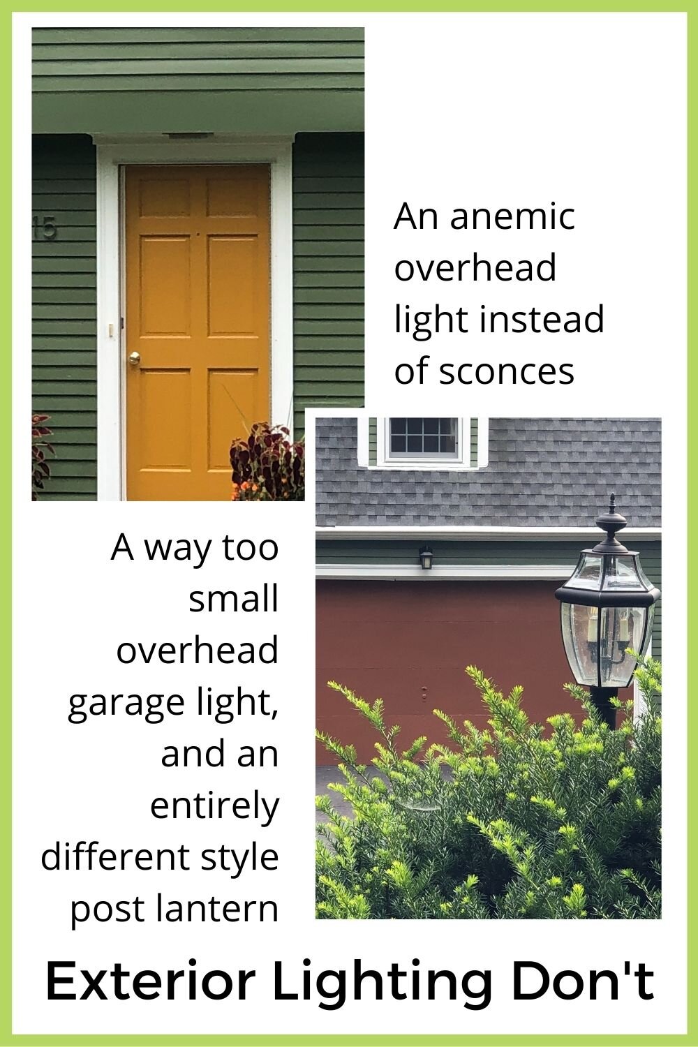
Take this house for example - a utilitarian overhead light for the front door misses the opportunity for decorative sconces. Of course, they put a toy-sized craftsman style sconce over the double sized garage door instead. And neither fixture relates to the post lantern, but at least that one is a decent size!
Lighting is a feature – like jewelry for your house - and as such should enhance the house. So if you are considering replacing your exterior lights, here are some guidelines to ensure you get it right.
Style
Style matters. Tempting though it is to just pick something you like, your exterior lighting, first and foremost, should complement the style of your house. So before you start shopping, educate yourself about what styles work with the architecture of your home.
Here in Massachusetts we have an abundance of Cape Style homes which work well with classic onion lights.
image via HGTV
Craftsman fixtures with their simple square lines are best suited to craftsman style homes and bungalows.
image via oldhouseonline
Lantern fixtures come in numerous variations which are each appropriate to different architectural styles from Georgian Colonial to Gothic
image via Luxe
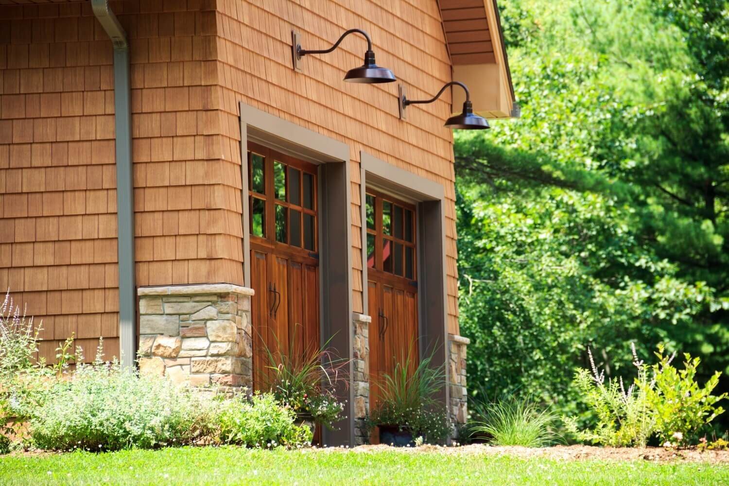
Currently popular, barn lights are best reserved for, well barns of course, or country and farmhouse homes. They work especially well over garage doors on these house styles.
image via The Barnyard Store
And (hopefully) needless to say, there really isn't an architectural style that pairs well with Darth Vader fixtures.
Just please don't...
Image via Oddity Mall
Scale
As with all good design, scale is of the utmost importance...too small and they look like toys, too large and they look like they might swallow visitors whole....I would choose to err on the side of too large rather than small and stingy. But aim for just right - your light fixture should ideally be between a third and a fifth of the height of the entry.
Most builder issue light fixtures are too small…primarily because smaller fixtures have a lower price tag. My neighborhood, built mostly as spec homes in the late 60’s/early 70’s, has a rash of the same front door style flanked by undersized carriage lanterns. Apparently there was a sale…
Placement
Functionally, exterior lights should illuminate the entry points of the house. Entry lighting can be sconces above the door, flanking or beside the door, and/or a pendant light if there is a porch with enough ceiling height to accommodate one. Sconces beside the door should generally be aligned with the upper third of the door and adjusted up or down depending on the proportions of the fixture.
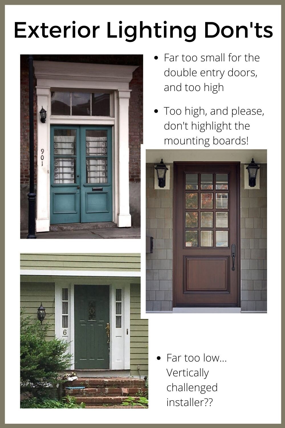
Often times, inexplicably, homes are built without giving any forethought to light fixture placement. When millwork is not designed to accommodate lighting, fixtures must sometimes be mounted directly on the siding and a block of wood is inserted to provide a flat mounting surface. This is a work-around solution for poor planning NOT a feature, so PLEASE, I beg you, don't paint this a contrasting trim color and draw attention to it! Paint or stain it to blend into the siding or to look like part of the backplate of the light fixture.
The image below is one giant DON'T...contrast painted mounting blocks squashed into a too small space so that they overlap part of the millwork, undersized light fixtures, and a mashup of carriage lantern lights flanking a vaguely Art Nouveau style door with a vaguely Georgian style overdoor pediment on a building of indeterminate and questionable style…the only saving grace is that it isn’t a color that draws too much attention.
Just so not to leave you there...here is a perfect timeless classic dressed for fall. Beautiful architecture, and complementary, well placed and scaled light fixtures.
This gorgeous home is perfectly dressed for a fall tour at Nell Hill’s
Landscape lighting is another category of exterior lighting that deserves its own post but for now, suffice it to say pathway lighting should not look like a miniature airline landing strip…
Other posts you might enjoy:

