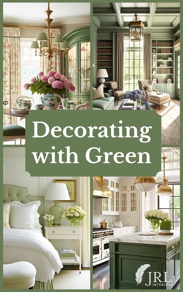
The possibility of new beginnings always feels like the color green to me. Green brings to mind the promise of spring with its life and growth, as well as the vitality of the evergreens that gracefully stand strong all through the winter…I’m sure there’s a deep metaphor in there somewhere?!. In any case,
green is nature’s neutral
If green had a report card it would say “plays well with others”. Green is such a versatile color it is no wonder it is so enduringly popular in interiors.
There are greens that evoke less pleasant associations, of course…hospital green for instance…the color of hospital scrubs and, inexplicably, a lot of institutional walls.
Hospitals only add insult to injury by throwing fluorescent lights into the mix. THAT combination would make any sensible person run screaming the other direction…but I digress. Let’s get back to the PRETTY greens!
Evergreen, sage, seafoam, grass green, forest green, kiwi, lime, spring green, celadon, jade…the shades of green are endless - so how do you choose which one(s) to use in your decor??
Let me just say that nearly any shade of ANY color can be used successfully SOMEWHERE in some proportion.
Our perception of color is so dependent on so many other factors; the natural light in the room, the other colors in the room, the light bulbs and lampshades you choose (PLEASE don’t choose fluorescent…for how to choose the right lightbulbs see THIS) that certain colors will sing and certain ones will ‘swear’, as a friend of mine used to say, depending on the conditions.
As always, I urge you to select your colors in the space you will be using them. Please don’t select them just from a picture in a magazine or online, or even from a paint chip whilst standing in the paint store. It will not look the same in your house. THIS POST has more tips on the do’s and don’t of paint selection.
Back to green. Green can be used in so many different ways in a room, from wallcovering and paint to cabinetry and built-ins, you can wrap a whole room in shades of green to create any mood from dramatic to soothing.
Or you can choose to use green as an accent color in furnishings or on a kitchen island, or in fabrics or accessories.
Green always works and, deployed well, you can mix many different shades of green to great effect…just look outside for inspiration!
Please note: The following images are a mix of real life projects and AI assisted images generated using midjourney to illustrate the ideas. AI images are labelled as such for clarification.
Green Walls, Ceilings, and Built-ins
Green can evoke a variety of moods depending on the shade and the circumstances…
This moody imaginary powder room with green millwork and wallpaper is elegant and dramatic.
Dramatic powder room, JRL Interiors inspiration image created with AI via midjourney text prompts
A deep green can be warm and cozy like in this pocket library/office project (you can see more HERE). We designed built-ins for two walls of the room and painted them all in a forest green.
Cozy pocket library under the eaves, Westford New-Build Project, design by JRL Interiors
This soft green that wraps the millwork, walls, and ceiling in this fantasy library, creates a tranquil mood.
Fantasy library, JRL Interiors inspiration image created with AI via midjourney text prompts, wall color is similar to Benjamin Moore Seedling
We chose a soft sage green for a fresh look in this master bath with its sage and gray marble mosaic tile floor. A wrought iron vanity stool echoes the leaded glass pattern in the cabinetry and interior windows.
Elegant primary bath, Gentleman’s Farm Project, design by JRL Interiors, walls in Benjamin Moore Thornton Sage
Green is a natural (no pun intended) with wicker, bamboo, and brick and stone.
Sunroom, JRL Interiors inspiration image created with AI via midjourney text prompts
Green Cabinetry
Another very effective way to use green in your decor is to paint the millwork or cabinetry green.
This predominately white kitchen is given life and interest with a vibrant green island. Green loves brass too!
White kitchen with a green island, JRL Interiors inspiration image created with AI via midjourney text prompts, island color similar to Benjamin Moore Sweet Basil
Green and white is always fresh and classic. This butlers pantry would be a timeless addition to any home - we did a similar pantry in navy blue for our antique farmhouse project
Forest green pantry, JRL Interiors inspiration image created with AI via midjourney text prompts
Green Furnishings
Green is also a great introduction in large furniture pieces. As nature’s neutral, it adds a shot of color, but goes with pretty much whatever other color you want to add - making it infinitely flexible should you want to update your color scheme at some point.
In this garden inspired library (more images HERE) we used a velvety chenille stripe in a rich green on the two largest upholstery pieces. It is a color that won’t readily show dirt in this heavily used space AND it furthers the garden feel. We also painted the backs of the bookcases in a contrasting soft celery green.
Garden inspired library, Lincoln Colonial Project, design by JRL Interiors
A green painted china cabinet adds color to this pretty dining room space, and a green headboard is a nod to color in this otherwise neutral bedroom.
Garden dining room, JRL Interiors inspiration image created with AI via midjourney text prompts. Hutch color is very similar to the Benjamin Moore Courtyard Green OR Central Park Green which I used on the table and door in my own kitchen refresh
White bedroom with pale green accents, JRL Interiors inspiration image created with AI via midjourney text prompts
With a strong warm color on the walls, the green furnishings in this room play a balancing role. Moss green chenille on the sofa and hunter green leather club chairs peacefully coexist, tied together with throw and pillow fabrics, drapery trim, and the variety of shades in the carpet we selected.
Inviting cozy sitting room with green accents, Gentleman’s Farm Project, design by JRL Interiors
Almost Green
Not all “green” rooms are obviously green. Khaki with just a hint of green was the ideal color in this master suite. The starting point for this room was the oriental rug and we found the perfect fabric in the silk and linen woven used on the windows - the client fell in love with the pale apricot, green and cream watery floral. Varying shades of green in furnishings, accessories and paint were the perfect complement to accent these foundational patterns.
Elegant primary suite, Gentleman’s Farm Project, design by JRL Interiors
Green Wallpaper and Fabrics
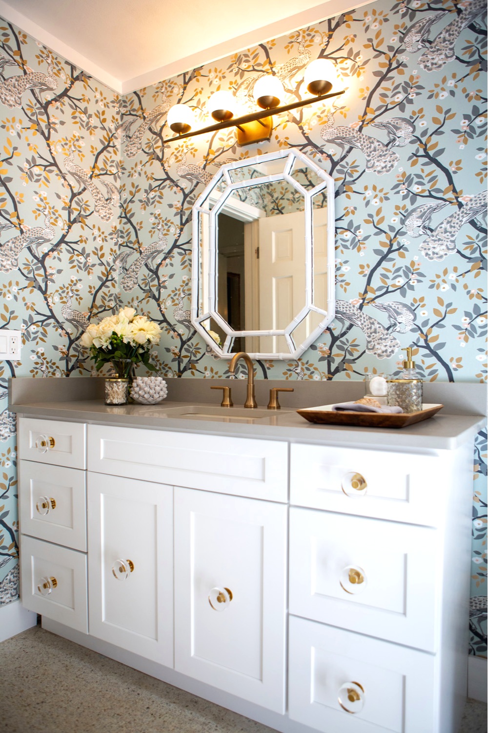
Wallpaper is trending in bathrooms again, as seen in this glam Florida bathroom remodel. This spa green peacock wallpaper absolutely MAKES this room! Julie did the remodel as part of the 6 week One Room Challenge and you can read all about the process HERE on her blog, or see more pics of the finished product HERE.
Wallpapered bathroom, Design by Paradigm Interiors
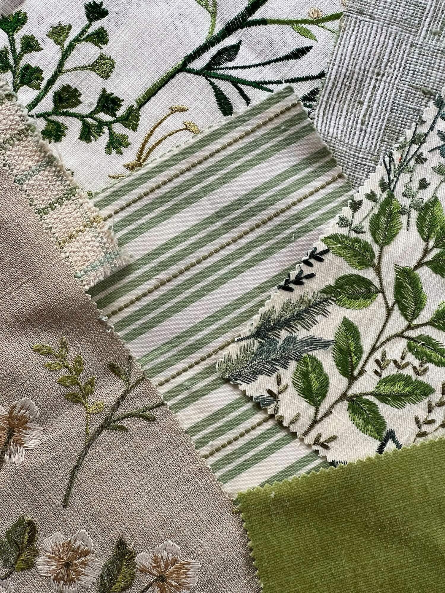
These gorgeous new fabrics just arrived from Stout in glorious greens and I am loving all the texture. They are all wonderful, but the embroidered fabrics are my kryptonite!
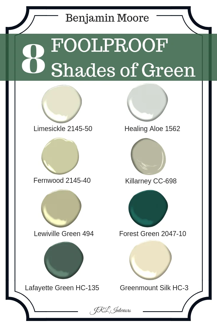
There are so many great shades of green paint, from sagey pale gray blue greens like healing aloe to taupe tinted grey greens like killarney and pale yellow greens like greenmount silk.
Limesickle is my go to color for a mid tone yellow green that works in almost any space.
The deeper tones look great in a finish with a bit of sheen to reflect some light - beware though, the higher gloss the finish, the more it will highlight any imperfections on a flat surface.
Here are 8 great green paint options from Benjamin Moore
It IS easy (on the eyes) being green!
Other posts you might enjoy:
