A kitchen is probably the most important room in the house when it comes to resale. Your renovation choices will depend on the length of time you plan to stay in the house, the price range of the house, and the state of the current kitchen.
In this kitchen the homeowner was selling soon, the price of the house would be in the mid range given the size and location of the house, and the current state of the kitchen was abysmal.
The challenges
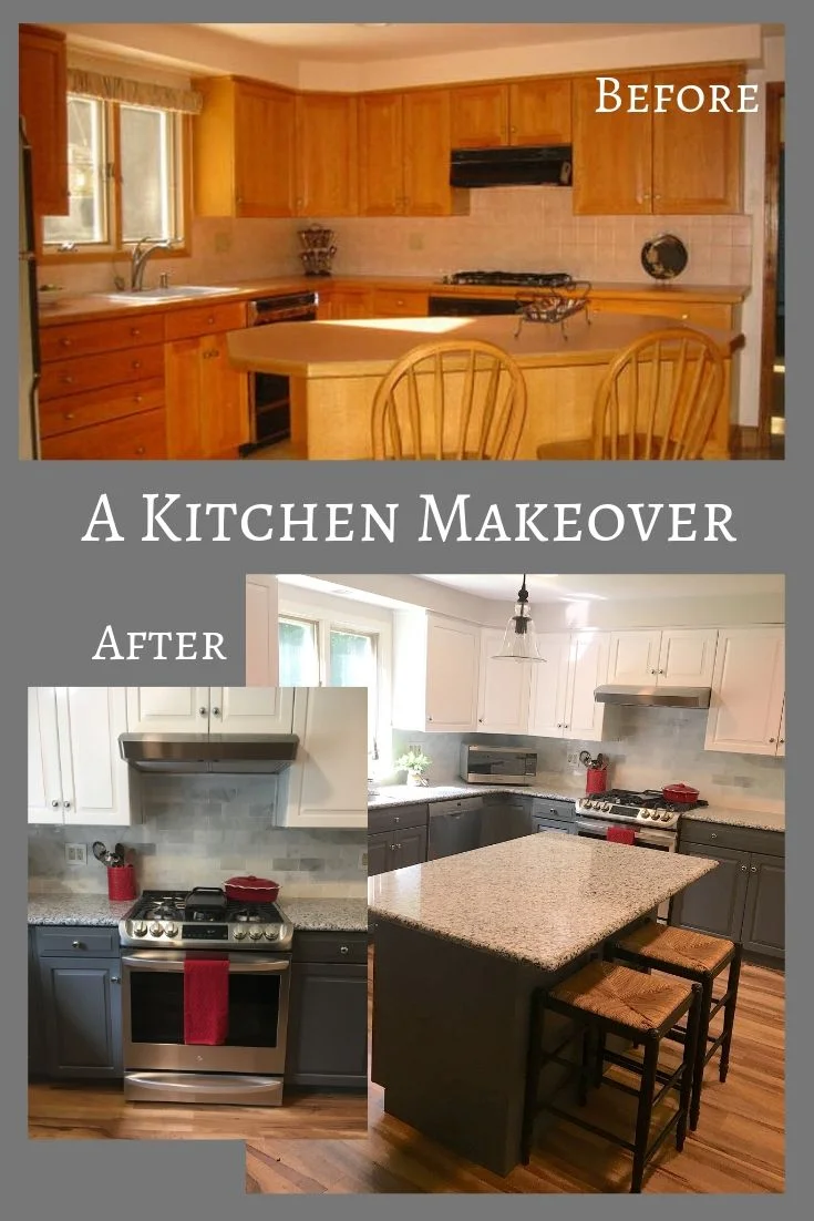
Dated peach laminate counters with oak edges
Peach 4” square backsplash tile
The ever popular honey oak cabinets EVERY builder dropped into houses of this era in our area
Appliances that were in varying stages of demise
An oddly shaped and awkwardly placed island
Cheap sheet vinyl flooring in a yellow-beige faux tile pattern that was beating a hasty retreat at the edges (I mean can you blame it?) This was one of the 6 (?!) flooring materials used on the main level
The peach palace features peach laminate counters and peach backsplash tile for a contrast with the black appliances, I guess?!
And a bizarrely shaped triangle island with a weird angled placement. Someone took the meaning of the 50’s “work triangle” concept a bit too literally?!
The storage wall and main walkway through the kitchen…the ill-placed island is kind of IN THE WAY. Did the builder not notice this? You could host a dance party on the business side of the island and on this main thoroughfare, you need to shimmy by in single file.
The Salvageable Elements
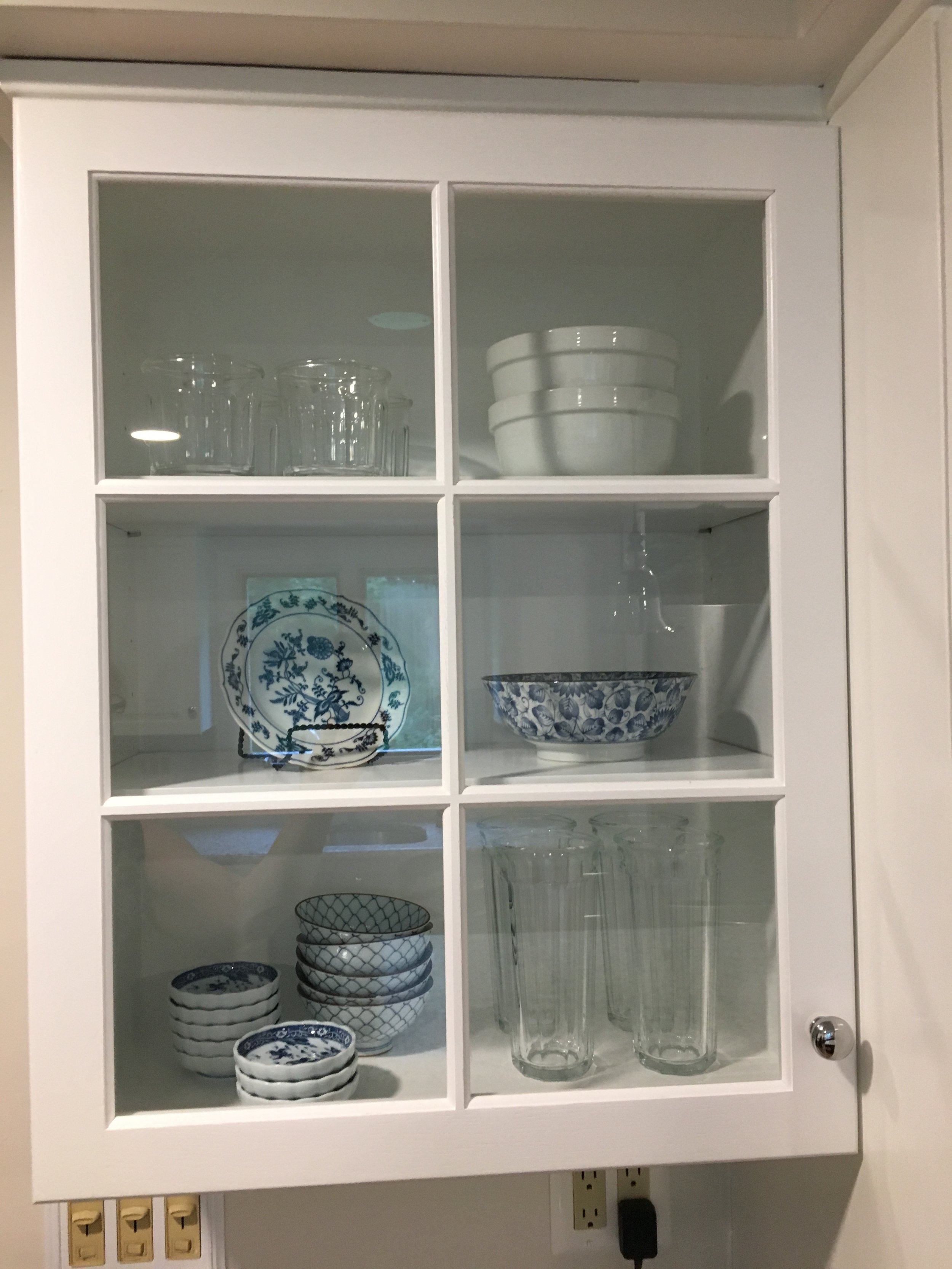
The cabinets were plentiful, solid wood, and with a classic raised panel door style. The storage wall included two pretty glass-doored cabinets
The layout, except for the island, was functional
The island cabinetry was a normal rectangular configuration - only the top was a ridiculous shape
The Solutions
Paint the cabinets - Since the cabinets and layout were perfectly fine except for the color, we opted to paint them which saves an enormous amount of money as well as time. We selected a charcoal gray for the island and the base cabinets in the work area and a warm white for the upper cabinets and the storage wall to lighten and brighten the space. Walls in this and the adjacent family room and sunroom space were painted a pale grey, and all the dark brown stained millwork was painted white.
Change the cabinet hardware to simple updated brushed nickel pulls and handles - since we were painting the cabinets, the holes could be filled and new, extra long skinny handles could be added to the drawers totally upgrading the look of the cabinetry.
Replace the appliances - as the appliances died, our client had replaced them with stainless steel models planning ahead for the kitchen upgrade - the oven and cooktop were the last ones to go and instead of a separate oven and cooktop, she chose a cost effective range she got a great deal on at a Memorial Day Sale.
Turn the island cabinets to square with the L-shaped work area, and add a rectangular top with an overhang on 2 sides for stools This transformed the traffic flow and look of the kitchen, but necessitated removing one of the island pendant lights that was now beyond the edge of the counter. With more time and a little more money, I would have moved both lights to hang over the new counter placement, but removing the one that appeared to be trying to run away was the most expedient solution.
Replace the counters - our client chose mottled grey/white stone counters and selected from the least expensive grades offered and standard edge profiles. When upgrading for sale it is wise to add obvious quality elements like stone counters, but don’t stray from the budget by creeping into more expensive categories unless the price point of the house is high enough to warrant something special and unique.
Replace the faucet and sink - when replacing the counters with a solid surface or stone, upgrade the sink to an under-mount model.
Replace the backsplash - our client chose a classic subway tile in a grey/white marble from a big box home center for an inexpensive upgrade that makes a big difference.
Replace the flooring - this had to be done anyway, and we were able to cover 3 different floorings with a nice quality luxury vinyl plank floor relatively easily for a very durable wood look floor that blended with the existing hardwood in 2 adjacent rooms nicely.
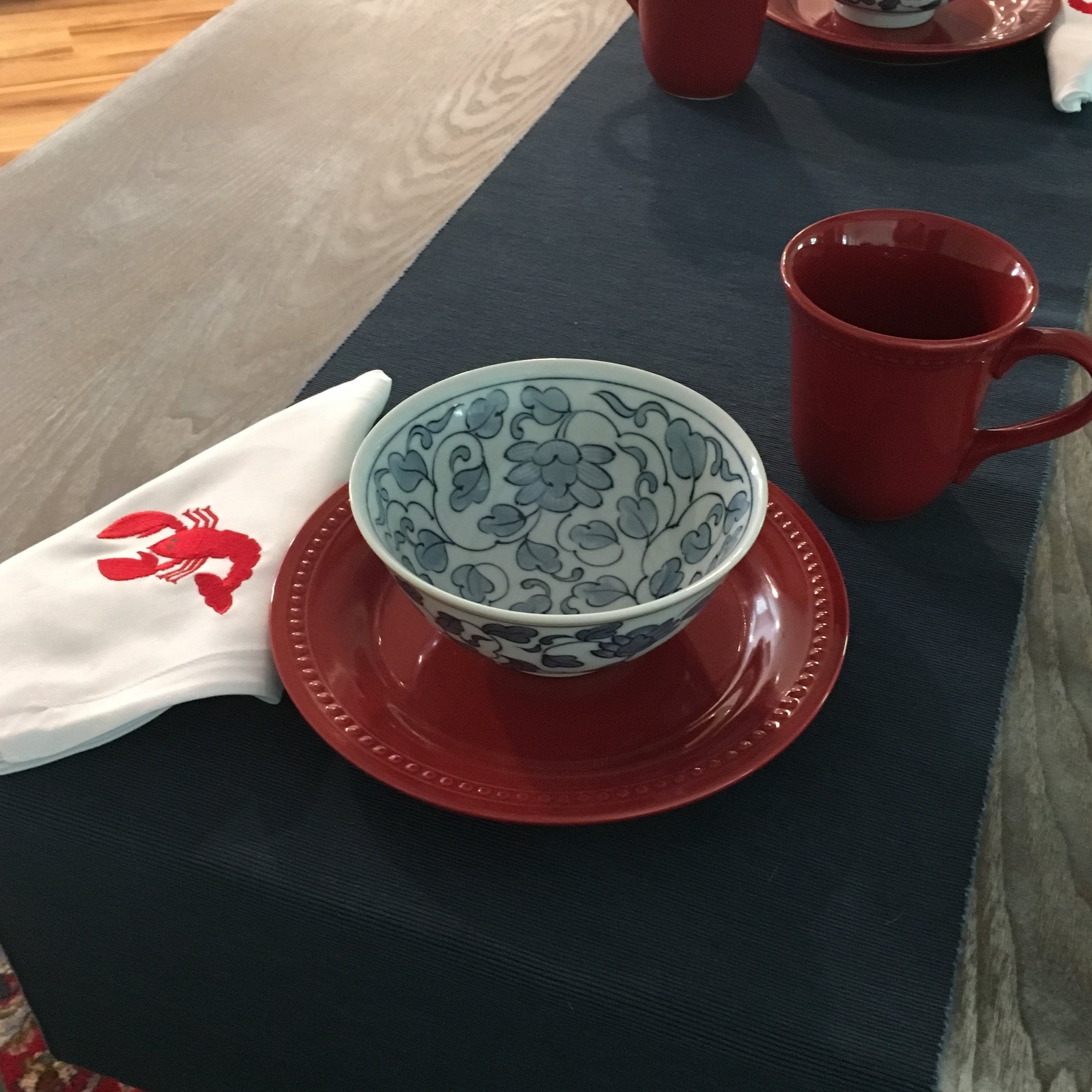
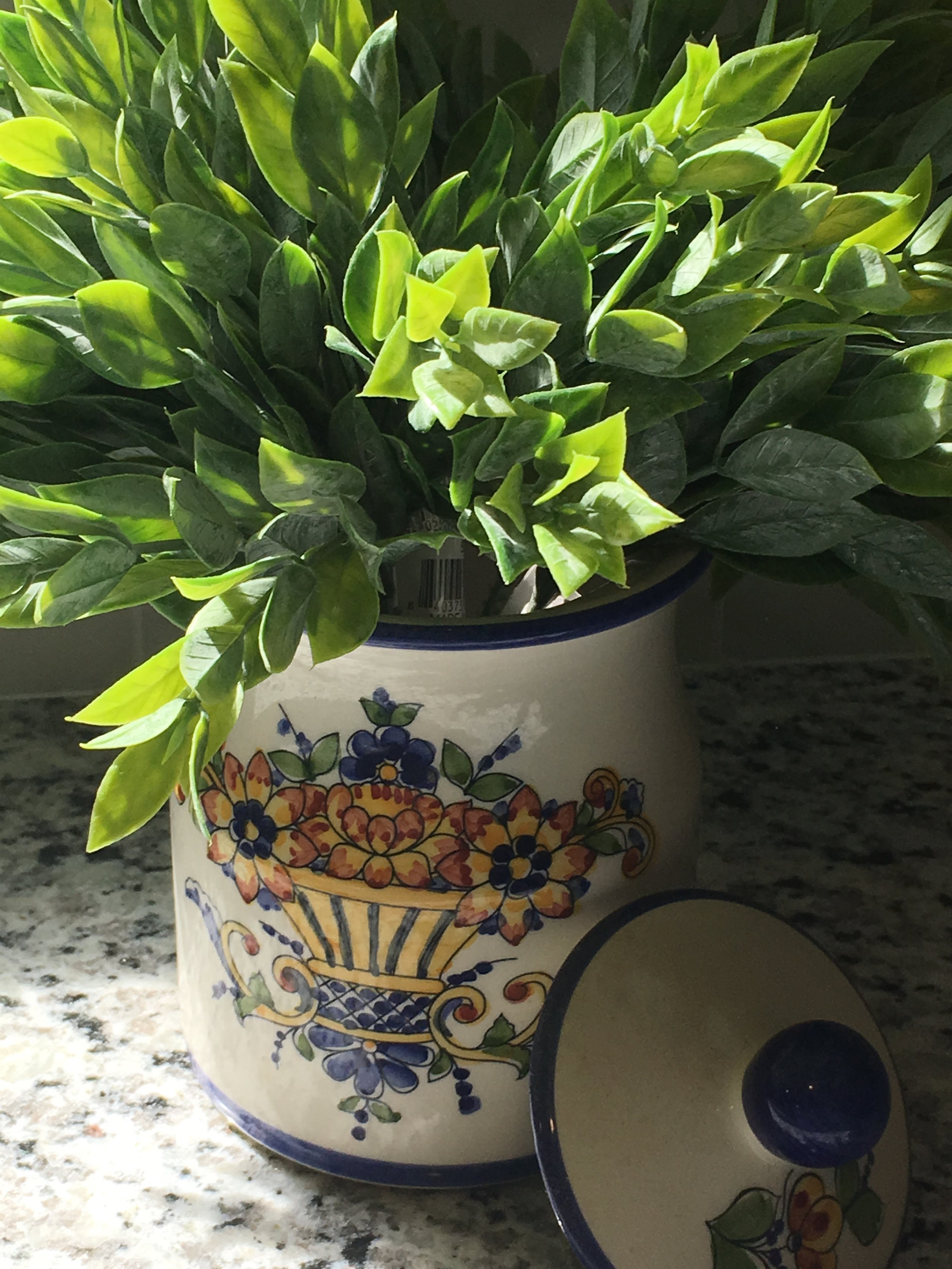
When staging a neutral kitchen for listing photos, choose a color or two from an adjacent space as an accent color. We chose red and blue from the rugs in the adjacent family room and eating area as our accent colors. Glass front cabinets were styled with glassware and blue and white dishes. Red towels, soap, bakeware, and a utensil crock add color to the neutral space and give some personality to the listing photos. Organic elements are another essential addition. Rather than the typical vase of flowers, we used a crock of faux herbs and a stoneware bowl of shiny red apples. Limiting the fruit to a single type has greater visual impact in room scale photographs. The table was set with blue and red dishes and textiles including these cheeky embroidered lobster napkins.
